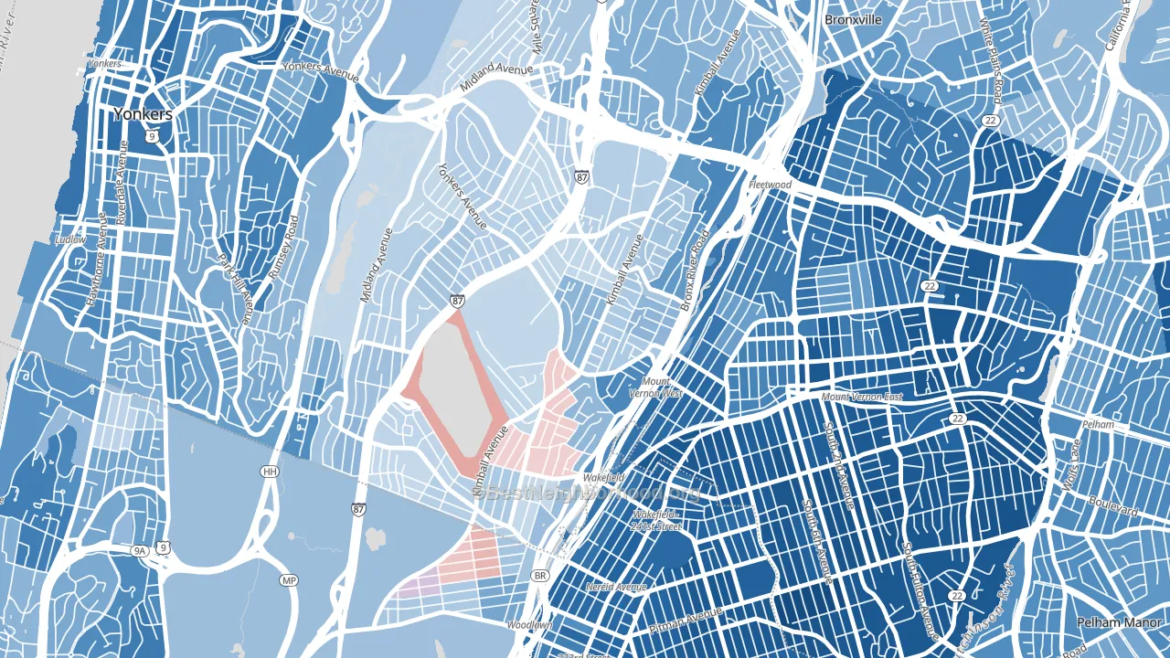
Southeast Yonkers leans slightly Democratic by roughly 12 points: about 56% of voters vote Democratic and 44% Republican.
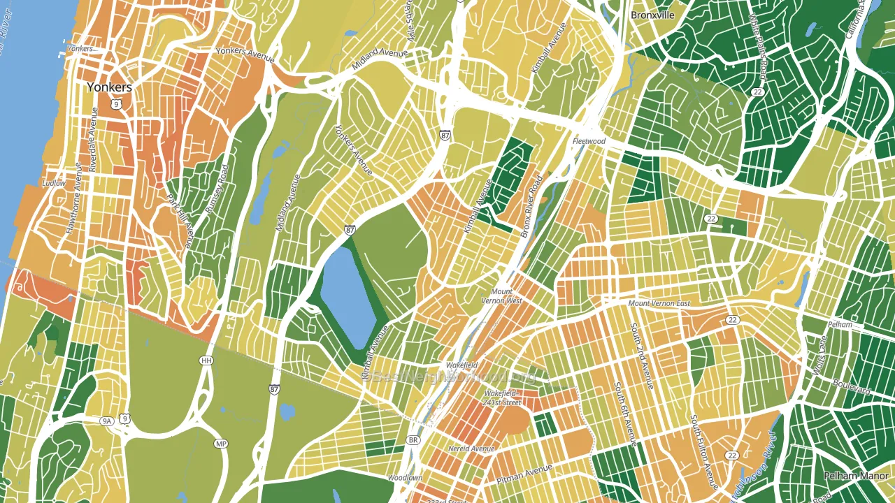
About 57% of adults in Southeast Yonkers typically vote, near the U.S. average of about 62%. Among adults in Southeast Yonkers, ~32% vote Democratic, ~25% Republican, and ~43% don't vote. The map below shows estimated turnout by block group.
How Southeast Yonkers compares
Among neighborhoods within 5 miles, Southeast Yonkers leans more Democratic than 4 of 31 neighbors.
Politically, Southeast Yonkers sits close to the rest of New York.
Politics vary noticeably by block within Southeast Yonkers. The northeast side runs the most Democratic (D+24) and the north side runs the most Republican (R+4), a spread of about 28 points.
Why Southeast Yonkers leans the way it does
Density, race composition, education, and family structure all sit close to their national averages in Southeast Yonkers. The lean here lands roughly where demographic data alone would predict.
Paved land cover and Democratic lean
Places with extensive paved surfaces tend to lean Democratic; Southeast Yonkers, Yonkers, NY sits in the top quarter nationally on this measure. Paved ground does not change how people vote; it mostly reflects how urban and built-up a place is.
Why turnout in Southeast Yonkers looks the way it does
Crowded housing lines up with lower turnout. About 8% of homes in Southeast Yonkers have more than one occupant per room, above 88% of neighborhoods. Learn more about the findings and methodology on the political spectrum map.
Nearby Neighborhoods
- Lincoln Park, Yonkers, NY D+6
- North Side, Mount Vernon, NY D+61
- Lawrence Park, Bronxville, NY D+22
- Woodlawn, Bronx, NY D+26
- South Side, Mount Vernon, NY D+75
- Park Hills, Yonkers, NY D+28
- Wakefield-Williamsbridge, Bronx, NY D+73
- Nodine Hill, Yonkers, NY D+34
- Bryn Mawr, Yonkers, NY D+6
- Ludlow, Yonkers, NY D+31
Neighborhoods with Similar Populations
- Park Forest-Louisiana North, Baton Rouge, LA D+45
- Cascade Heights, Atlanta, GA D+87
- Westside, Santa Cruz, CA D+73
- Alden Bridge, The Woodlands, TX R+24
- Kaimuki, Honolulu, HI D+32
- Chatham, Chicago, IL D+85
- Merrlam Park, St. Paul, MN D+65
- Cherry Creek, Denver, CO D+31
- Upper State, Santa Barbara, CA D+51
- Kenwood, Chicago, IL D+84
Sources and methodology
Precinct-level voting records used to fit the model come from New York State Board of Elections, distributed by the Voting and Election Science Team. Demographic inputs come from the U.S. Census Bureau (ACS 5-year estimates and the 2020 Decennial Census). Health and environmental inputs come from the CDC (PLACES and the Environmental Justice Index). Land cover comes from the USGS and EPA. Election-day and lead-up weather come from PRISM 4km daily grids and the NOAA Global Historical Climatology Network. Mail-voting and election-administration patterns come from the MIT Election Lab's Survey of the Performance of American Elections. Block-group crime detail comes from CrimeGrade. Internet data and modeling support provided by ISPreports.org.
Modeling and analysis by the BestNeighborhood data science team. Full methodology and findings: political spectrum map.
Methodology reviewed by the BestNeighborhood data team. Last updated May 2026.