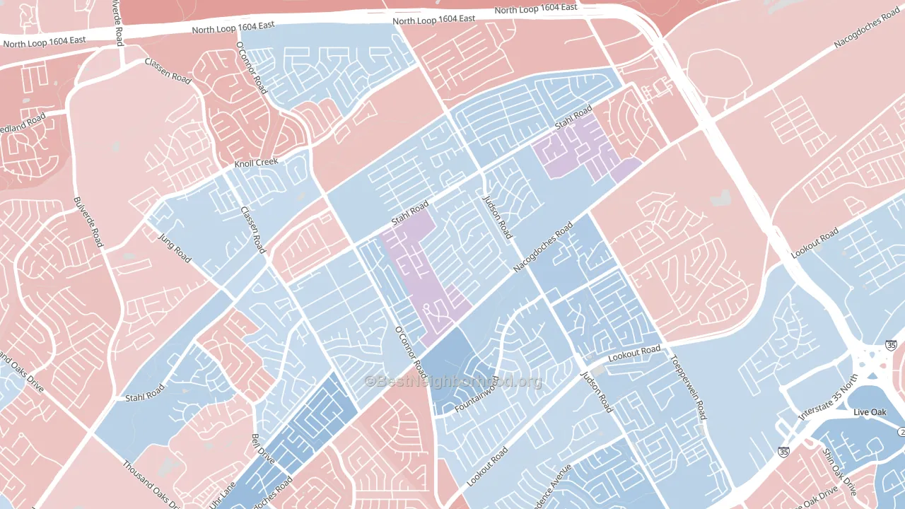
Spring Creek is a true toss-up. About 51% of voters here vote Democratic and 49% Republican.
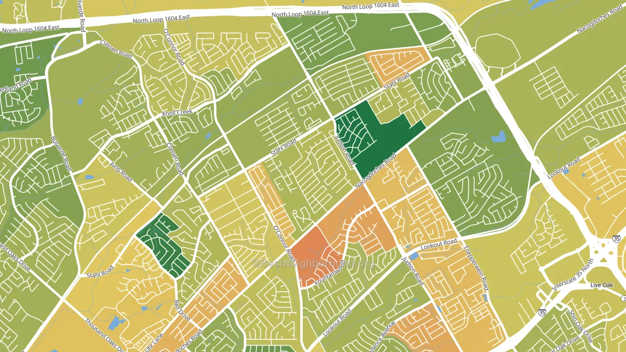
About 65% of adults in Spring Creek typically vote, near the U.S. average of about 62%. Among adults in Spring Creek, ~33% vote Democratic, ~32% Republican, and ~35% don't vote. The map below shows estimated turnout by block group.
How Spring Creek compares
Among neighborhoods within 5 miles, Spring Creek sits roughly in the middle of the political spectrum, with 2 neighbors leaning further in the place's direction and 8 leaning the other way.
Spring Creek runs about 16 points more Democratic than Texas as a whole. Texas leans Republican overall, while Spring Creek sits closer to the political middle.
Why Spring Creek leans the way it does
This analysis examined 14,881 data points per neighborhood to find what predicts political lean and turnout. The items below are a few correlations that stood out for Spring Creek, not a ranked or complete list of what matters most.
Spring Creek votes against the grain of Texas. Texas leans Republican overall, while Spring Creek runs about 16 points more Democratic.
Developed land and Democratic lean
Places with a heavily developed built environment tend to lean Democratic; Spring Creek, San Antonio, TX sits in the top quarter nationally on this measure. Developed land does not change how people vote; it mostly reflects how urban a place is.
Why turnout in Spring Creek looks the way it does
Areas with limited routine healthcare access turn out at lower rates. Spring Creek is in the bottom quarter nationally for routine-care measures such as insurance coverage, preventive screenings, and dental visits. Learn more about the findings and methodology on the political spectrum map.
Nearby Neighborhoods
- Woodstone, San Antonio, TX D+6
- High Country, San Antonio, TX D+3
- Steubing Ranch, San Antonio, TX D+5
- Northern Hills, San Antonio, TX D+3
- The Hills of Park North, San Antonio, TX D+15
- Royal Ridge, San Antonio, TX D+9
- Sun Gate, San Antonio, TX D+9
- Thousand Oaks, San Antonio, TX D+6
- North Central Thousand Oaks, San Antonio, TX Even
- North Central Heritage, San Antonio, TX Even
Neighborhoods with Similar Populations
- Highlands, Manchester, NH D+11
- The Lanes, Waltham, MA D+29
- Center City, Midland, MI D+5
- Maple High-Six Corners, Springfield, MA D+44
- Thornwood, South Elgin, IL R+4
- Midtown, Oklahoma City, OK D+40
- Downtown Huntsville, Huntsville, AL D+8
- Lakeshore, Jacksonville, FL R+14
- Valley College, San Bernardino, CA D+17
- Cielo Vista South, El Paso, TX D+20
Sources and methodology
Precinct-level voting records used to fit the model come from Texas Secretary of State, Elections Division, distributed by the Voting and Election Science Team. Demographic inputs come from the U.S. Census Bureau (ACS 5-year estimates and the 2020 Decennial Census). Health and environmental inputs come from the CDC (PLACES and the Environmental Justice Index). Land cover comes from the USGS and EPA. Election-day and lead-up weather come from PRISM 4km daily grids and the NOAA Global Historical Climatology Network. Mail-voting and election-administration patterns come from the MIT Election Lab's Survey of the Performance of American Elections. Block-group crime detail comes from CrimeGrade. Internet data and modeling support provided by ISPreports.org.
Modeling and analysis by the BestNeighborhood data science team. Full methodology and findings: political spectrum map.
Methodology reviewed by the BestNeighborhood data team. Last updated May 2026.