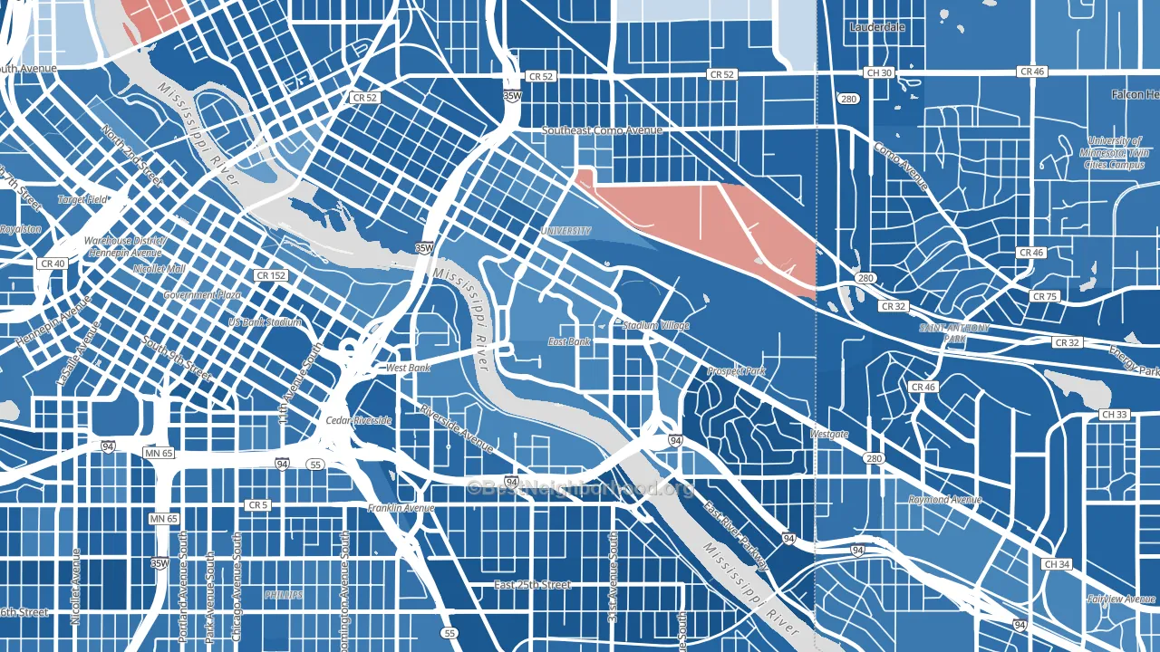
University District is a Democratic stronghold. About 77% of voters here vote Democratic and 23% Republican.
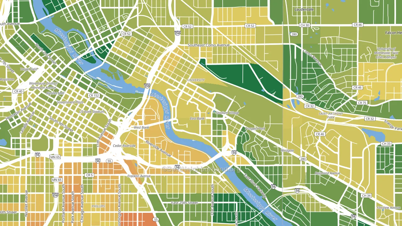
About 55% of adults in University District typically vote, below the U.S. average of about 62%. Among adults in University District, ~42% vote Democratic, ~13% Republican, and ~45% don't vote. The map below shows estimated turnout by block group.
How University District compares
Among neighborhoods within 5 miles, University District is the least Democratic-leaning.
University District runs about 49 points more Democratic than Minnesota as a whole.
Why University District leans the way it does
This analysis examined 14,881 data points per neighborhood to find what predicts political lean and turnout. The items below are a few correlations that stood out for University District, not a ranked or complete list of what matters most.
Areas with many never-married adults vote Democratic. About 97% of adults in University District have never been married, far above similar-sized neighborhoods (around 43%).
Cancer-screening access and voter turnout
Places with low colon-cancer-screening access tend to turn out at a lower rate; University District, Minneapolis, MN sits in the bottom tenth nationally on this measure. Cancer screening does not drive turnout; it reflects income, insurance, and healthcare access.
Why turnout in University District looks the way it does
Renters vote less often than owners. About 99% of households in University District rent, about 74 points above the U.S. average of 25%. High food insecurity lines up with lower turnout, and about 37% of adults in University District report food insecurity, above 91% of neighborhoods. High-crime urban areas turn out at lower rates, and University District sits in the top 15% on a violent-crime measure. Learn more about the findings and methodology on the political spectrum map.
Nearby Neighborhoods
- Prospect Park, Minneapolis, MN D+70
- Cedar-Riverside, Minneapolis, MN D+66
- Marcy Holmes, Minneapolis, MN D+59
- Seward, Minneapolis, MN D+78
- Southeast Como, Minneapolis, MN D+66
- Downtown East, Minneapolis, MN D+65
- Saint Anthony, St. Paul, MN D+73
- East Phillips, Minneapolis, MN D+63
- Elliot Park, Minneapolis, MN D+63
- Ventura Village, Minneapolis, MN D+62
Neighborhoods with Similar Populations
- Sayre Park, Bethlehem, PA D+36
- Southside Columbus, Columbus, OH D+59
- South Harrison, Tucson, AZ Even
- Lake Frederica, Orlando, FL D+19
- Braddock Road Metro, Alexandria, VA D+65
- Palm City, San Diego, CA D+20
- Westlake, Seattle, WA D+64
- Fulton, Minneapolis, MN D+68
- Country Squire Estates, West Valley City, UT D+6
- Bessemer, Pueblo, CO D+17
Sources and methodology
Precinct-level voting records used to fit the model come from Minnesota Secretary of State, Elections, distributed by the Voting and Election Science Team. Demographic inputs come from the U.S. Census Bureau (ACS 5-year estimates and the 2020 Decennial Census). Health and environmental inputs come from the CDC (PLACES and the Environmental Justice Index). Land cover comes from the USGS and EPA. Election-day and lead-up weather come from PRISM 4km daily grids and the NOAA Global Historical Climatology Network. Mail-voting and election-administration patterns come from the MIT Election Lab's Survey of the Performance of American Elections. Block-group crime detail comes from CrimeGrade. Internet data and modeling support provided by ISPreports.org.
Modeling and analysis by the BestNeighborhood data science team. Full methodology and findings: political spectrum map.
Methodology reviewed by the BestNeighborhood data team. Last updated May 2026.