Waialua leans Democratic by roughly 20 points: about 60% of voters vote Democratic and 40% Republican.
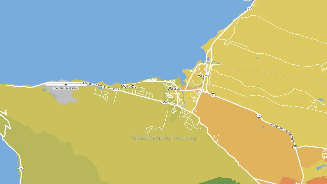
About 55% of adults in Waialua typically vote, below the U.S. average of about 62%. Among adults in Waialua, ~33% vote Democratic, ~22% Republican, and ~45% don't vote. The map below shows estimated turnout by block group.
How Waialua compares
Among cities within 25 miles, Waialua leans more Democratic than 24 of 28 neighbors.
Politically, Waialua sits close to the rest of Hawaii.
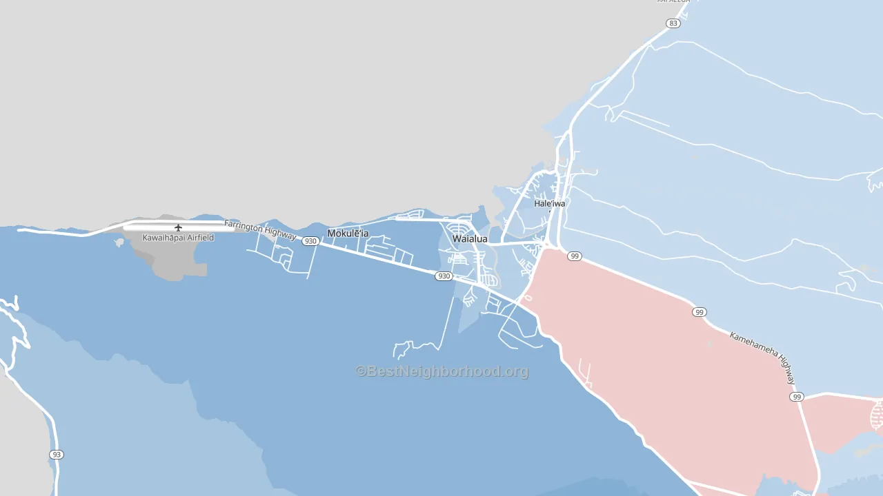
Politics vary noticeably by neighborhood within Waialua. The southwest side is the most Democratic-leaning (D+26) and the southeast side is the least Democratic-leaning (D+15), a spread of about 11 points.
Why Waialua leans the way it does
This analysis examined 14,881 data points per city to find what predicts political lean and turnout. The items below are a few correlations that stood out for Waialua, not a ranked or complete list of what matters most.
Areas with high college attainment vote Democratic. About 35% of adults in Waialua hold a bachelor's degree, about 7 points above the U.S. average of 28%. A high never-married share predicts Democratic voting, and about 33% of adults in Waialua have never been married, above 84% of cities.
Population density and Democratic lean
Places with high population density tend to lean Democratic; Waialua, HI sits in the top tenth nationally on this measure.
Why turnout in Waialua looks the way it does
Renters vote less often than owners. About 42% of households in Waialua rent, about 17 points above the U.S. average of 25%. Crowded housing lines up with lower turnout, and about 9% of homes in Waialua have more than one occupant per room, above 95% of cities. Learn more about the findings and methodology on the political spectrum map.
Nearby Cities
- Haleiwa, HI D+7
- Makaha, HI D+18
- Schofield Barracks, HI D+6
- Wahiawa, HI D+11
- Kunia, HI R+3
- Waianae, HI D+6
- Whitmore Village, HI D+14
- Mililani, HI D+14
- Kawela Bay, HI Even
- Nanakuli, HI D+5
Cities with Similar Populations
- East Moriches, NY R+24
- Clinton, NJ D+5
- Rochester, IL R+27
- Millers Creek, NC R+65
- Elkview, WV R+50
- Norwood, PA R+5
- North Fort Lewis, WA R+5
- Coxs Creek, KY R+51
- Solon, IA Even
- Wendell, ID R+53
Sources and methodology
Precinct-level voting records used to fit the model come from Hawaii Office of Elections, distributed by the Voting and Election Science Team. Demographic inputs come from the U.S. Census Bureau (ACS 5-year estimates and the 2020 Decennial Census). Health and environmental inputs come from the CDC (PLACES and the Environmental Justice Index). Land cover comes from the USGS and EPA. Election-day and lead-up weather come from PRISM 4km daily grids and the NOAA Global Historical Climatology Network. Mail-voting and election-administration patterns come from the MIT Election Lab's Survey of the Performance of American Elections. Block-group crime detail comes from CrimeGrade. Internet data and modeling support provided by ISPreports.org.
Modeling and analysis by the BestNeighborhood data science team. Some land-use inputs for Hawaii, including walkability and the environmental-justice index, are estimated rather than measured, so the figures here carry added uncertainty. Full methodology and findings: political spectrum map.
Methodology reviewed by the BestNeighborhood data team. Last updated May 2026.