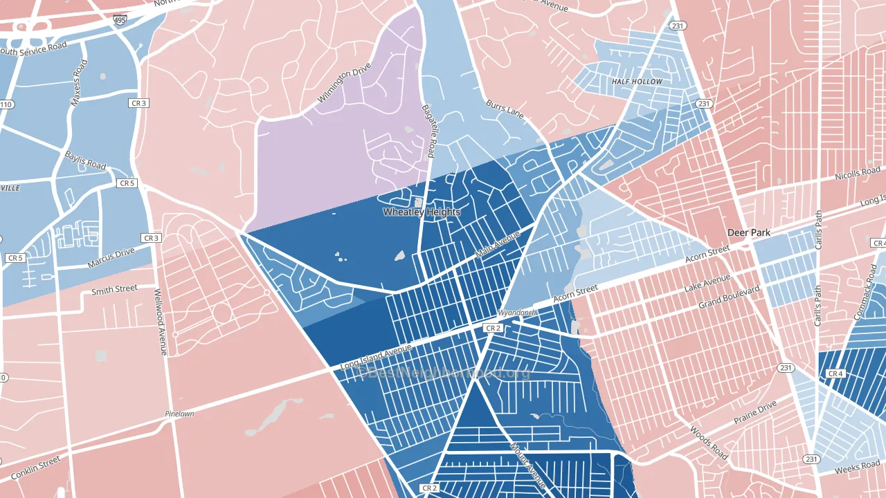
Wheatley Heights is a Democratic stronghold. About 83% of voters here vote Democratic and 17% Republican.
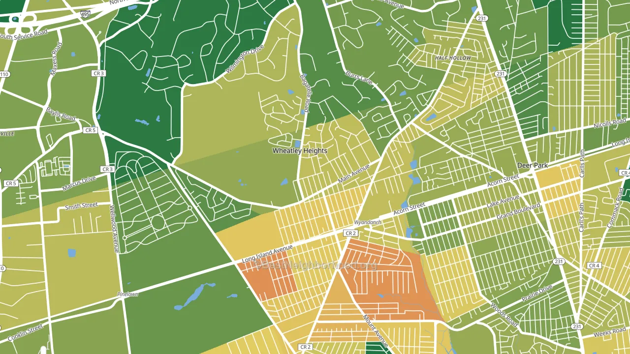
About 59% of adults in Wheatley Heights typically vote, near the U.S. average of about 62%. Among adults in Wheatley Heights, ~49% vote Democratic, ~10% Republican, and ~41% don't vote. The map below shows estimated turnout by block group.
How Wheatley Heights compares
Wheatley Heights runs about 54 points more Democratic than New York as a whole.
Politics vary noticeably by block within Wheatley Heights. The east side is the most Democratic-leaning (D+70) and the southwest side is the least Democratic-leaning (D+48), a spread of about 22 points.
Why Wheatley Heights leans the way it does
This analysis examined 14,881 data points per neighborhood to find what predicts political lean and turnout. The items below are a few correlations that stood out for Wheatley Heights, not a ranked or complete list of what matters most.
Areas with many never-married adults vote Democratic. About 49% of adults in Wheatley Heights have never been married, modestly above similar-sized neighborhoods (around 39%).
Walkability and Republican lean
Places with a low walkability score tend to lean Republican; Wheatley Heights, Wyandanch, NY sits in the bottom quarter nationally on this measure. A walkable street grid does not change how people vote; it mostly reflects how urban a place is.
Why turnout in Wheatley Heights looks the way it does
Crowded housing lines up with lower turnout. About 8% of homes in Wheatley Heights have more than one occupant per room, above 86% of neighborhoods. Learn more about the findings and methodology on the political spectrum map.
Nearby Neighborhoods
- West Hills, Huntington, NY R+4
- Elwood, East Northport, NY R+8
- West Amityville, East Massapequa, NY D+16
- Nassau Shores, East Massapequa, NY R+33
- Biltmore Shores, Massapequa, NY R+44
- Mott Section, Garden City, NY D+4
- Bay Colony, Baldwin Harbor, NY D+43
- Glen Oaks, Queens, NY D+8
- Bellerose, Queens, NY D+7
- Douglaston-Little Neck, Queens, NY D+3
Neighborhoods with Similar Populations
- Mission Ridge, San Antonio, TX R+8
- Glendale, Madison, WI D+57
- Southpoint, Jacksonville, FL R+8
- Colonial Heights, Mobile, AL D+60
- Southgate Triangle, Missoula, MT D+26
- McFerrin Park, Nashville, TN D+71
- Jacoby Creek, Arcata, CA D+59
- Wentworth Estates, Naples, FL R+16
- Heart of the Westside, Springfield, MO R+15
- Croissant Park, Fort Lauderdale, FL D+5
Sources and methodology
Precinct-level voting records used to fit the model come from New York State Board of Elections, distributed by the Voting and Election Science Team. Demographic inputs come from the U.S. Census Bureau (ACS 5-year estimates and the 2020 Decennial Census). Health and environmental inputs come from the CDC (PLACES and the Environmental Justice Index). Land cover comes from the USGS and EPA. Election-day and lead-up weather come from PRISM 4km daily grids and the NOAA Global Historical Climatology Network. Mail-voting and election-administration patterns come from the MIT Election Lab's Survey of the Performance of American Elections. Block-group crime detail comes from CrimeGrade. Internet data and modeling support provided by ISPreports.org.
Modeling and analysis by the BestNeighborhood data science team. Full methodology and findings: political spectrum map.
Methodology reviewed by the BestNeighborhood data team. Last updated May 2026.