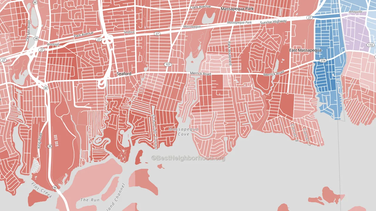
Biltmore Shores leans heavily Republican by roughly 44 points: about 28% of voters vote Democratic and 72% Republican.
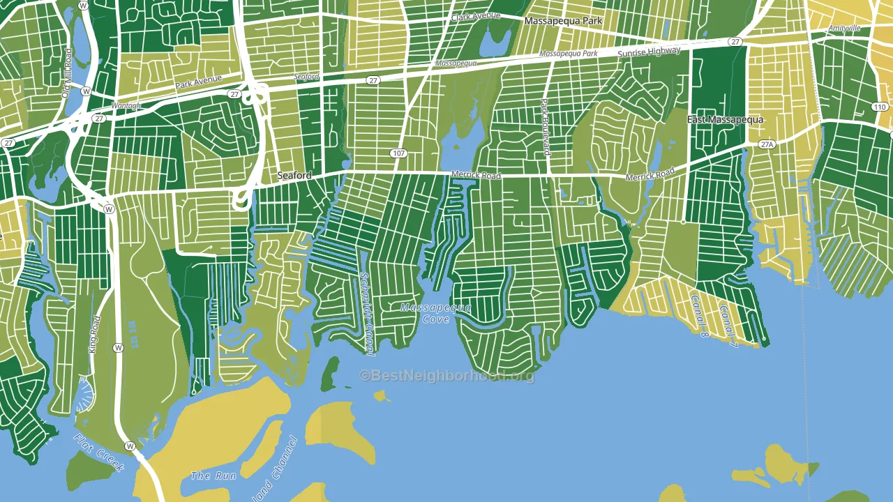
About 93% of adults in Biltmore Shores typically vote, above the U.S. average of about 62%. Among adults in Biltmore Shores, ~26% vote Democratic, ~67% Republican, and ~7% don't vote. The map below shows estimated turnout by block group.
How Biltmore Shores compares
Biltmore Shores sits in a sparsely populated area with few comparable neighborhoods nearby.
Biltmore Shores runs about 56 points more Republican than New York as a whole. New York leans Democratic overall, while Biltmore Shores is one of the few Republican-leaning pockets.
Politics vary noticeably by block within Biltmore Shores. The southwest side is the most Republican-leaning (R+50) and the northeast side is the least Republican-leaning (R+40), a spread of about 10 points.
Why Biltmore Shores leans the way it does
This analysis examined 14,881 data points per neighborhood to find what predicts political lean and turnout. The items below are a few correlations that stood out for Biltmore Shores, not a ranked or complete list of what matters most.
Biltmore Shores votes against the grain of New York. New York leans Democratic overall, while Biltmore Shores runs about 56 points more Republican. A high family-household share predicts Republican voting, and about 78% of households in Biltmore Shores are family households, above 82% of neighborhoods.
Preventive-care access and voter turnout
Places with strong routine preventive-care access tend to turn out at a higher rate; Biltmore Shores, Massapequa, NY sits in the top tenth nationally on this measure. Dental visits do not drive turnout; the rate reflects income, insurance, and healthcare access, which line up with who votes.
Why turnout in Biltmore Shores looks the way it does
Areas with strong routine healthcare access turn out at higher rates. Biltmore Shores is in the top quarter nationally for routine-care measures such as insurance coverage, preventive screenings, and dental visits. The dental-visit rate here is about 74%, about 14 points above the U.S. average of 60%. Homeowners vote more often than renters, and about 98% of households in Biltmore Shores own their home, compared to around 82% in nearby neighborhoods. High high-school completion lines up with higher turnout, and about 99% of adults in Biltmore Shores have completed high school, above 89% of neighborhoods. Learn more about the findings and methodology on the political spectrum map.
Nearby Neighborhoods
- Nassau Shores, East Massapequa, NY R+33
- West Amityville, East Massapequa, NY D+16
- Bay Colony, Baldwin Harbor, NY D+43
- Wheatley Heights, Wyandanch, NY D+67
- Mott Section, Garden City, NY D+4
- West Hills, Huntington, NY R+4
- Rosedale, Queens, NY D+77
- Glen Oaks, Queens, NY D+8
- Cambria Heights, Queens, NY D+84
- Bellerose, Queens, NY D+7
Neighborhoods with Similar Populations
- Staumbaugh Heller, Redwood City, CA D+51
- Riverchase Country Club, Hoover, AL R+31
- Arlington South, Riverside, CA R+2
- Lansdowne, Charlotte, NC D+29
- East Downtown Dearborn, Dearborn, MI R+20
- Natomas Crossing, Sacramento, CA D+41
- The Islands, Gilbert, AZ R+5
- Martindale-Brightwood, Indianapolis, IN D+66
- Oxford, Fort Wayne, IN D+67
- Midtown Phillips, Minneapolis, MN D+67
Sources and methodology
Precinct-level voting records used to fit the model come from New York State Board of Elections, distributed by the Voting and Election Science Team. Demographic inputs come from the U.S. Census Bureau (ACS 5-year estimates and the 2020 Decennial Census). Health and environmental inputs come from the CDC (PLACES and the Environmental Justice Index). Land cover comes from the USGS and EPA. Election-day and lead-up weather come from PRISM 4km daily grids and the NOAA Global Historical Climatology Network. Mail-voting and election-administration patterns come from the MIT Election Lab's Survey of the Performance of American Elections. Block-group crime detail comes from CrimeGrade. Internet data and modeling support provided by ISPreports.org.
Modeling and analysis by the BestNeighborhood data science team. Full methodology and findings: political spectrum map.
Methodology reviewed by the BestNeighborhood data team. Last updated May 2026.