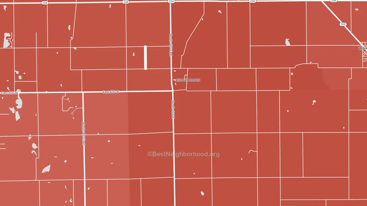
Willow Branch is a Republican stronghold. About 21% of voters here vote Democratic and 79% Republican.
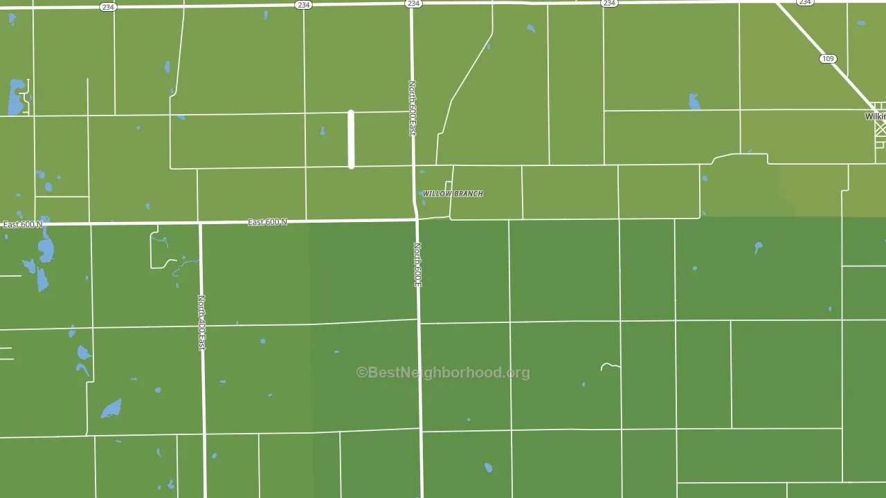
About 79% of adults in Willow Branch typically vote, above the U.S. average of about 62%. Among adults in Willow Branch, ~17% vote Democratic, ~62% Republican, and ~21% don't vote. The map below shows estimated turnout by block group.
How Willow Branch compares
Among cities within 25 miles, Willow Branch leans more Republican than 72 of 92 neighbors.
Willow Branch runs about 40 points more Republican than Indiana as a whole.
Politics vary noticeably by neighborhood within Willow Branch. The north side is the most Republican-leaning (R+61) and the west side is the least Republican-leaning (R+49), a spread of about 12 points.
Why Willow Branch leans the way it does
Density, race composition, education, and family structure all sit close to their national averages in Willow Branch. The lean here lands roughly where demographic data alone would predict.
Walkability and Republican lean
Places with a low walkability score tend to lean Republican; Willow Branch, IN sits in the bottom quarter nationally on this measure. A walkable street grid does not change how people vote; it mostly reflects how urban a place is.
Why turnout in Willow Branch looks the way it does
Areas with strong routine healthcare access turn out at higher rates. Willow Branch is in the top quarter nationally for routine-care measures such as insurance coverage, preventive screenings, and dental visits. The dental-visit rate here is about 66%, about 6 points above the U.S. average of 60%. Homeowners vote more often than renters, and about 96% of households in Willow Branch own their home, about 21 points above the U.S. average of 75%. Learn more about the findings and methodology on the political spectrum map.
Nearby Cities
- Wilkinson, IN R+60
- Maxwell, IN R+50
- Milners Corner, IN R+55
- Finly, IN R+48
- Charlottesville, IN R+58
- Cleveland, IN R+58
- Maple Valley, IN R+60
- Shirley, IN R+56
- Greenfield, IN R+38
- Mohawk, IN R+46
Cities with Similar Populations
- Yarmouth, IA R+52
- Godwinsville, GA R+57
- Letitia, NC R+62
- Northcutts Cove, TN R+73
- Talcott, WV R+55
- Small, NC R+28
- Horsegall, SC R+42
- Byer, OH R+61
- Nightmute, AK D+22
- East Schuyler, NY R+37
Sources and methodology
Precinct-level voting records used to fit the model come from Indiana Secretary of State, Elections, distributed by the Voting and Election Science Team. Demographic inputs come from the U.S. Census Bureau (ACS 5-year estimates and the 2020 Decennial Census). Health and environmental inputs come from the CDC (PLACES and the Environmental Justice Index). Land cover comes from the USGS and EPA. Election-day and lead-up weather come from PRISM 4km daily grids and the NOAA Global Historical Climatology Network. Mail-voting and election-administration patterns come from the MIT Election Lab's Survey of the Performance of American Elections. Block-group crime detail comes from CrimeGrade. Internet data and modeling support provided by ISPreports.org.
Modeling and analysis by the BestNeighborhood data science team. Full methodology and findings: political spectrum map.
Methodology reviewed by the BestNeighborhood data team. Last updated May 2026.