Woodlawn leans heavily Democratic by roughly 40 points: about 70% of voters vote Democratic and 30% Republican. These figures are model estimates: Rhode Island did not have precinct-level voting records available for training, so the numbers above come from demographic and health features rather than local ground truth.
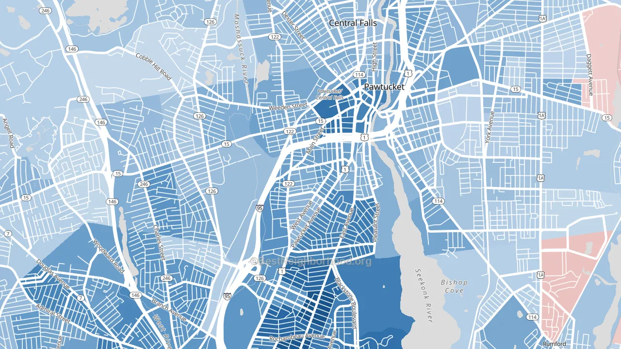
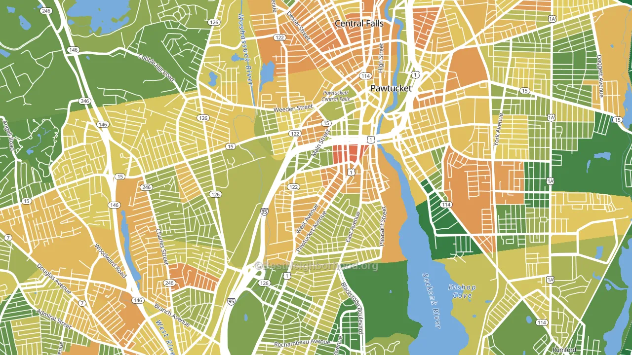
About 44% of adults in Woodlawn typically vote, below the U.S. average of about 62%. Among adults in Woodlawn, ~31% vote Democratic, ~13% Republican, and ~56% don't vote. The map below shows estimated turnout by block group.
How Woodlawn compares
Among neighborhoods within 5 miles, Woodlawn leans more Democratic than 21 of 31 neighbors.
Woodlawn runs about 26 points more Democratic than Rhode Island as a whole.
Politics vary noticeably by block within Woodlawn. The southeast side is the most Democratic-leaning (D+65) and the southwest side is the least Democratic-leaning (D+34), a spread of about 32 points.
Why Woodlawn leans the way it does
Density, race composition, education, and family structure all sit close to their national averages in Woodlawn. None of them point strongly toward either party.
Walkability and Democratic lean
Places with a highly walkable street grid tend to lean Democratic; Woodlawn, Pawtucket, RI sits in the top tenth nationally on this measure. A walkable street grid does not change how people vote; it mostly reflects how urban a place is.
Why turnout in Woodlawn looks the way it does
Renters vote less often than owners. About 65% of households in Woodlawn rent, about 40 points above the U.S. average of 25%. High food insecurity lines up with lower turnout, and about 34% of adults in Woodlawn report food insecurity, above 87% of neighborhoods. Learn more about the findings and methodology on the political spectrum map.
Nearby Neighborhoods
- Fairlawn, Pawtucket, RI D+22
- Hope, Providence, RI D+78
- Charles, Providence, RI D+33
- Marieville, Providence, RI D+12
- Blackstone, Providence, RI D+74
- Mount Hope, Providence, RI D+74
- Darlington, Pawtucket, RI D+22
- Wanskuck, Providence, RI D+40
- Happy Hollow, Valley Falls, RI Even
- Smith Hill, Providence, RI D+47
Neighborhoods with Similar Populations
- Seminary, Oakland, CA D+77
- Harvey Park, Denver, CO D+34
- Adams Park, Atlanta, GA D+86
- River West, Bend, OR D+45
- Surprise Farms, Surprise, AZ R+23
- Fairlington-Shirlington, Arlington, VA D+64
- Bay View, Norfolk, VA D+19
- Harris-Houston, Charlotte, NC D+56
- Lauderdale Lakes West Gate, Lauderdale Lakes, FL D+65
- Schuylerville, Bronx, NY D+11
Sources and methodology
Precinct-level voting records used to fit the model come from Rhode Island Board of Elections, distributed by the Voting and Election Science Team. Demographic inputs come from the U.S. Census Bureau (ACS 5-year estimates and the 2020 Decennial Census). Health and environmental inputs come from the CDC (PLACES and the Environmental Justice Index). Land cover comes from the USGS and EPA. Election-day and lead-up weather come from PRISM 4km daily grids and the NOAA Global Historical Climatology Network. Mail-voting and election-administration patterns come from the MIT Election Lab's Survey of the Performance of American Elections. Block-group crime detail comes from CrimeGrade. Internet data and modeling support provided by ISPreports.org.
Modeling and analysis by the BestNeighborhood data science team. RI did not have precinct-level voting records available for training, so the figures here come from extrapolation across demographic, health, and land-use features rather than local ground truth. Full methodology and findings: political spectrum map.
Methodology reviewed by the BestNeighborhood data team. Last updated May 2026.