Wrigley leans heavily Democratic by roughly 42 points: about 71% of voters vote Democratic and 29% Republican.
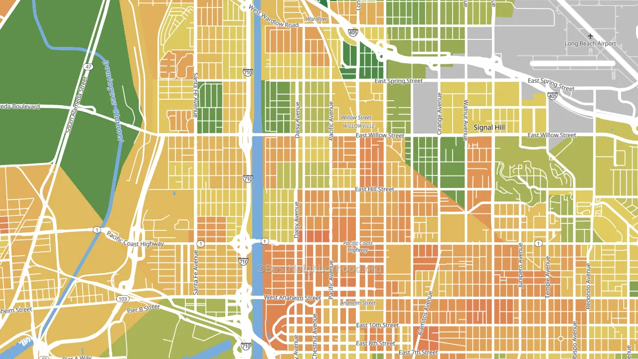
About 39% of adults in Wrigley typically vote, below the U.S. average of about 62%. Among adults in Wrigley, ~28% vote Democratic, ~11% Republican, and ~61% don't vote. The map below shows estimated turnout by block group.
How Wrigley compares
Among neighborhoods within 5 miles, Wrigley leans more Democratic than 11 of 17 neighbors.
Wrigley runs about 22 points more Democratic than California as a whole.
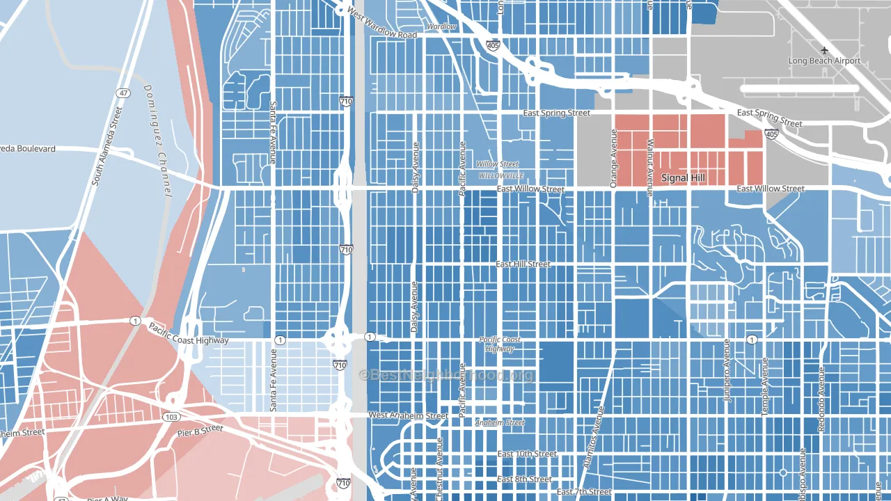
Politics vary noticeably by block within Wrigley. The east side is the most Democratic-leaning (D+49) and the north side is the least Democratic-leaning (D+35), a spread of about 14 points.
Why Wrigley leans the way it does
This analysis examined 14,881 data points per neighborhood to find what predicts political lean and turnout. The items below are a few correlations that stood out for Wrigley, not a ranked or complete list of what matters most.
Areas with many never-married adults vote Democratic. About 51% of adults in Wrigley have never been married, modestly above similar-sized neighborhoods (around 41%).
Population density and Democratic lean
Places with high population density tend to lean Democratic; Wrigley, Long Beach, CA sits in the top tenth nationally on this measure.
Why turnout in Wrigley looks the way it does
Areas with limited routine healthcare access turn out at lower rates. Wrigley is in the bottom quarter nationally for routine-care measures such as insurance coverage, preventive screenings, and dental visits. Renters vote less often than owners, and about 67% of households in Wrigley rent, about 42 points above the U.S. average of 25%. High food insecurity lines up with lower turnout, and about 29% of adults in Wrigley report food insecurity, above 81% of neighborhoods. Learn more about the findings and methodology on the political spectrum map.
Nearby Neighborhoods
- Poly High District, Long Beach, CA D+38
- West Side, Long Beach, CA D+34
- Downtown Long Beach, Long Beach, CA D+52
- Californial Heights, Long Beach, CA D+46
- Los Cerritos, Long Beach, CA D+40
- Bixby Knolls, Long Beach, CA D+46
- Circle Area, Long Beach, CA D+40
- East Side, Long Beach, CA D+52
- Bixby Area, Long Beach, CA D+37
- Belmont Heights, Long Beach, CA D+56
Neighborhoods with Similar Populations
- Downtown Seattle, Seattle, WA D+53
- Excelsior, San Francisco, CA D+39
- Old Brooklyn, Cleveland, OH D+14
- Westgate Hts, Albuquerque, NM D+16
- West End, Tacoma, WA D+33
- Scripps Ranch, San Diego, CA D+20
- Berryessa, San Jose, CA D+22
- Torresdale, Philadelphia, PA R+10
- City Heights East, San Diego, CA D+31
- North Lawndale, Chicago, IL D+78
Sources and methodology
Precinct-level voting records used to fit the model come from California Secretary of State, Elections, distributed by the Voting and Election Science Team. Demographic inputs come from the U.S. Census Bureau (ACS 5-year estimates and the 2020 Decennial Census). Health and environmental inputs come from the CDC (PLACES and the Environmental Justice Index). Land cover comes from the USGS and EPA. Election-day and lead-up weather come from PRISM 4km daily grids and the NOAA Global Historical Climatology Network. Mail-voting and election-administration patterns come from the MIT Election Lab's Survey of the Performance of American Elections. Block-group crime detail comes from CrimeGrade. Internet data and modeling support provided by ISPreports.org.
Modeling and analysis by the BestNeighborhood data science team. Full methodology and findings: political spectrum map.
Methodology reviewed by the BestNeighborhood data team. Last updated May 2026.