Excelsior leans heavily Democratic by roughly 40 points: about 70% of voters vote Democratic and 30% Republican.
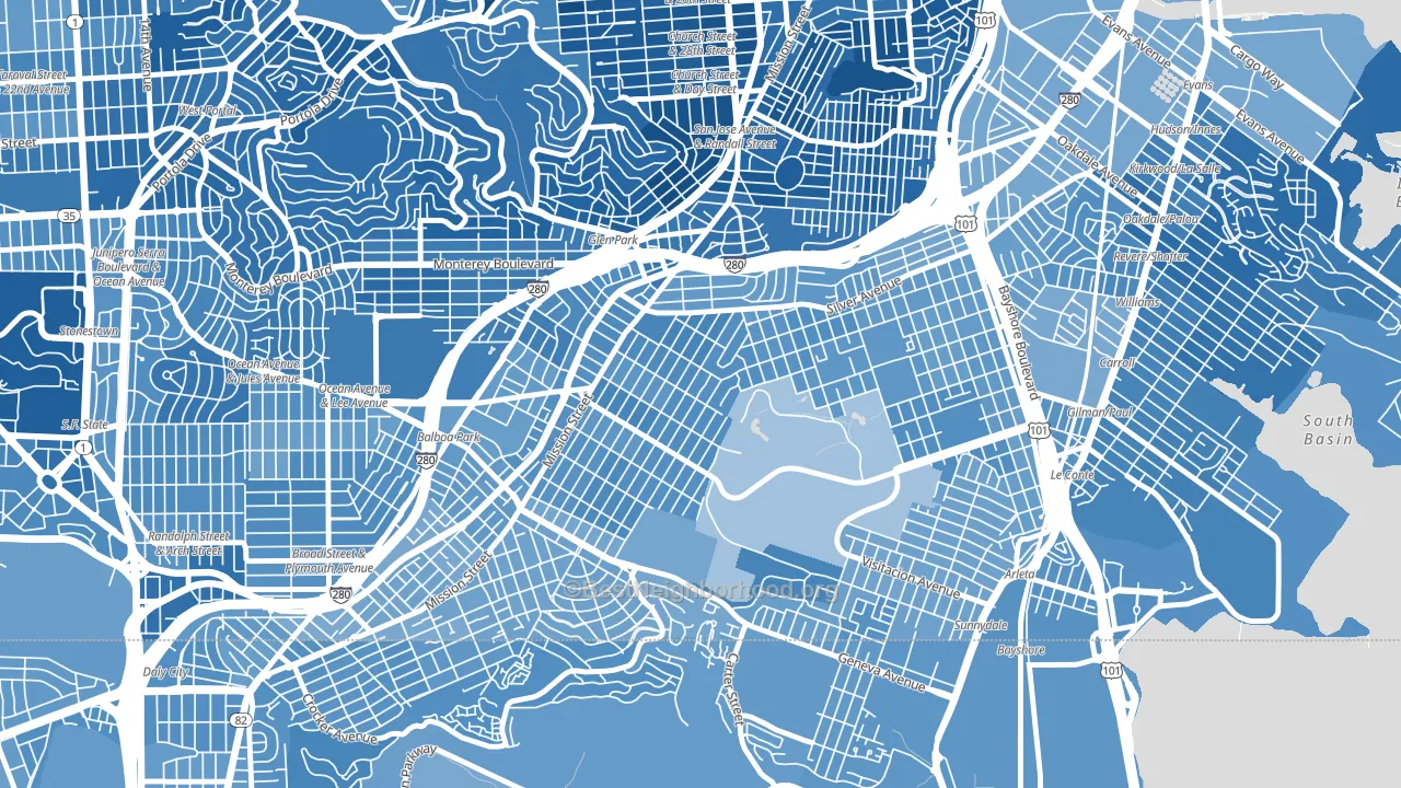
About 51% of adults in Excelsior typically vote, below the U.S. average of about 62%. Among adults in Excelsior, ~36% vote Democratic, ~15% Republican, and ~49% don't vote. The map below shows estimated turnout by block group.
How Excelsior compares
Among neighborhoods within 5 miles, Excelsior leans more Democratic than 7 of 46 neighbors.
Excelsior runs about 19 points more Democratic than California as a whole.
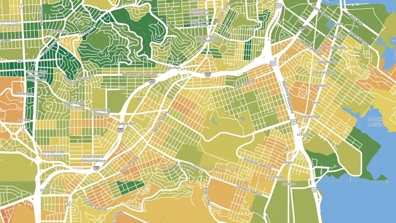
Politics vary noticeably by block within Excelsior. The northwest side is the most Democratic-leaning (D+51) and the northeast side is the least Democratic-leaning (D+31), a spread of about 20 points.
Why Excelsior leans the way it does
This analysis examined 14,881 data points per neighborhood to find what predicts political lean and turnout. The items below are a few correlations that stood out for Excelsior, not a ranked or complete list of what matters most.
Dense areas vote Democratic. More than 99% of residents in Excelsior live in densely developed areas, about 64 points above the U.S. average of 36%.
Paved land cover and Democratic lean
Places with extensive paved surfaces tend to lean Democratic; Excelsior, San Francisco, CA sits in the top tenth nationally on this measure. Paved ground does not change how people vote; it mostly reflects how urban and built-up a place is.
Why turnout in Excelsior looks the way it does
Crowded housing lines up with lower turnout. About 15% of homes in Excelsior have more than one occupant per room, above 96% of neighborhoods. Learn more about the findings and methodology on the political spectrum map.
Nearby Neighborhoods
- St Marys Park, San Francisco, CA D+53
- Glen Park, San Francisco, CA D+79
- Outer Mission, San Francisco, CA D+48
- Crocker Amazon, San Francisco, CA D+34
- Visitacion Valley, San Francisco, CA D+36
- Ingleside, San Francisco, CA D+50
- Bernal Heights, San Francisco, CA D+78
- Silver Terrace, San Francisco, CA D+36
- Diamond Heights, San Francisco, CA D+71
- Crocker, Daly City, CA D+42
Neighborhoods with Similar Populations
- Downtown Seattle, Seattle, WA D+53
- Wrigley, Long Beach, CA D+42
- Westgate Hts, Albuquerque, NM D+16
- Old Brooklyn, Cleveland, OH D+14
- West End, Tacoma, WA D+33
- Scripps Ranch, San Diego, CA D+20
- Berryessa, San Jose, CA D+22
- City Heights East, San Diego, CA D+31
- Torresdale, Philadelphia, PA R+10
- North Lawndale, Chicago, IL D+78
Sources and methodology
Precinct-level voting records used to fit the model come from California Secretary of State, Elections, distributed by the Voting and Election Science Team. Demographic inputs come from the U.S. Census Bureau (ACS 5-year estimates and the 2020 Decennial Census). Health and environmental inputs come from the CDC (PLACES and the Environmental Justice Index). Land cover comes from the USGS and EPA. Election-day and lead-up weather come from PRISM 4km daily grids and the NOAA Global Historical Climatology Network. Mail-voting and election-administration patterns come from the MIT Election Lab's Survey of the Performance of American Elections. Block-group crime detail comes from CrimeGrade. Internet data and modeling support provided by ISPreports.org.
Modeling and analysis by the BestNeighborhood data science team. Full methodology and findings: political spectrum map.
Methodology reviewed by the BestNeighborhood data team. Last updated May 2026.