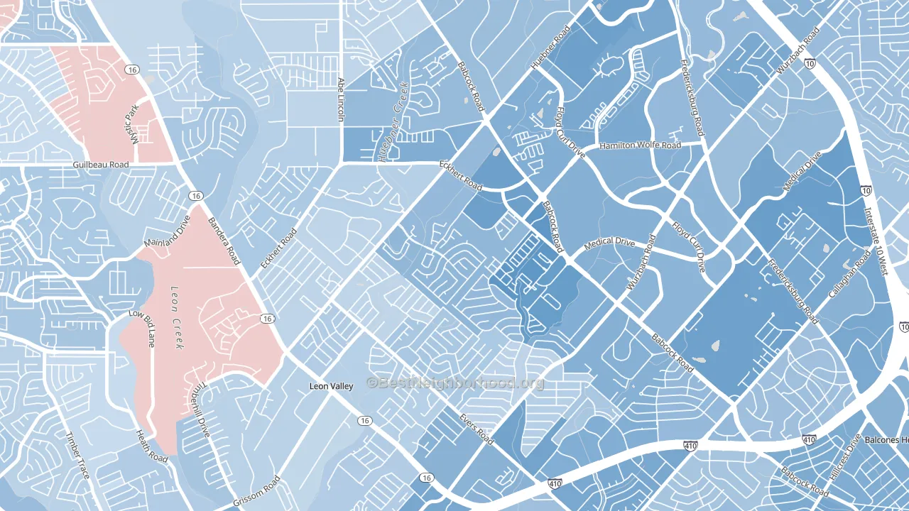
Apple Creek leans Democratic by roughly 26 points: about 63% of voters vote Democratic and 37% Republican.
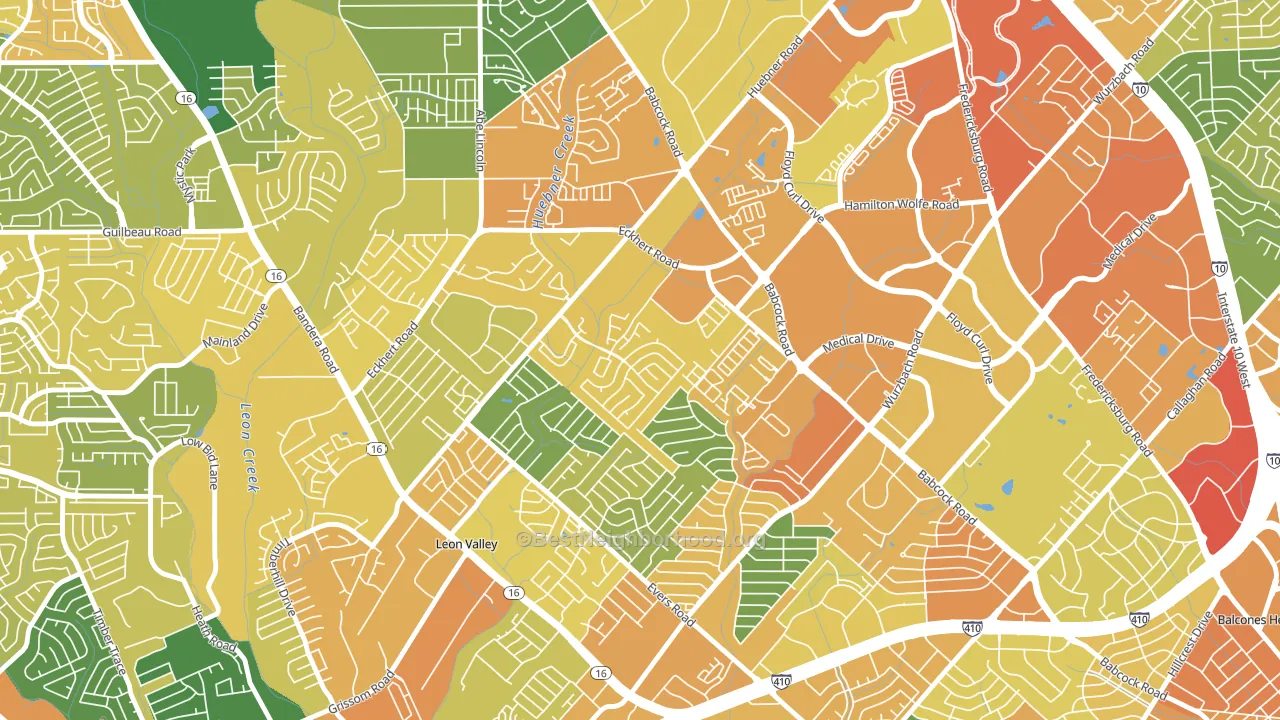
About 48% of adults in Apple Creek typically vote, below the U.S. average of about 62%. Among adults in Apple Creek, ~30% vote Democratic, ~18% Republican, and ~52% don't vote. The map below shows estimated turnout by block group.
How Apple Creek compares
Among neighborhoods within 5 miles, Apple Creek leans more Democratic than 15 of 22 neighbors.
Apple Creek runs about 39 points more Democratic than Texas as a whole. Texas leans Republican overall, while Apple Creek is one of the few Democratic-leaning pockets.
Why Apple Creek leans the way it does
This analysis examined 14,881 data points per neighborhood to find what predicts political lean and turnout. The items below are a few correlations that stood out for Apple Creek, not a ranked or complete list of what matters most.
Dense areas vote Democratic. More than 99% of residents in Apple Creek live in densely developed areas, about 64 points above the U.S. average of 36%. Apple Creek runs against the grain of Texas, a Democratic-leaning pocket in a Republican-leaning state.
Population density and Democratic lean
Places with high population density tend to lean Democratic; Apple Creek, San Antonio, TX sits in the top quarter nationally on this measure.
Why turnout in Apple Creek looks the way it does
Areas with limited routine healthcare access turn out at lower rates. Apple Creek is in the bottom quarter nationally for routine-care measures such as insurance coverage, preventive screenings, and dental visits. Learn more about the findings and methodology on the political spectrum map.
Nearby Neighborhoods
- Alamo Farmsteads-Babcock Road, San Antonio, TX D+13
- Oak Hills, San Antonio, TX D+27
- Thunderbird Hills, San Antonio, TX D+23
- Ingram Hills, San Antonio, TX D+24
- Vance Jackson, San Antonio, TX D+20
- Braun Station West, San Antonio, TX R+4
- Parkwood Maintenance, San Antonio, TX D+11
- Pipers Meadow, San Antonio, TX D+21
- Culebra Park, San Antonio, TX D+27
- Braun's Farm, San Antonio, TX D+8
Neighborhoods with Similar Populations
- Riverside Heights, Tampa, FL D+21
- Germantown, Nashville, TN D+36
- Duveneck-Saint Francis, Palo Alto, CA D+44
- West Mt. Scott, Happy Valley, OR D+23
- Bywater, New Orleans, LA D+63
- Clarksville, Austin, TX D+58
- Brooklands Park, Rochester Hills, MI R+4
- Echo Highlands, Birmingham, AL D+77
- Mount Vernon, San Bernardino, CA D+37
- Millbrooke Ranch, Pinellas Park, FL R+11
Sources and methodology
Precinct-level voting records used to fit the model come from Texas Secretary of State, Elections Division, distributed by the Voting and Election Science Team. Demographic inputs come from the U.S. Census Bureau (ACS 5-year estimates and the 2020 Decennial Census). Health and environmental inputs come from the CDC (PLACES and the Environmental Justice Index). Land cover comes from the USGS and EPA. Election-day and lead-up weather come from PRISM 4km daily grids and the NOAA Global Historical Climatology Network. Mail-voting and election-administration patterns come from the MIT Election Lab's Survey of the Performance of American Elections. Block-group crime detail comes from CrimeGrade. Internet data and modeling support provided by ISPreports.org.
Modeling and analysis by the BestNeighborhood data science team. Full methodology and findings: political spectrum map.
Methodology reviewed by the BestNeighborhood data team. Last updated May 2026.