Barry Harbour leans slightly Democratic by roughly 12 points: about 56% of voters vote Democratic and 44% Republican.
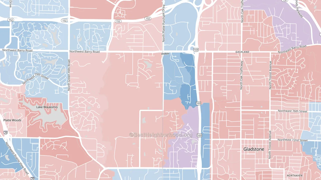
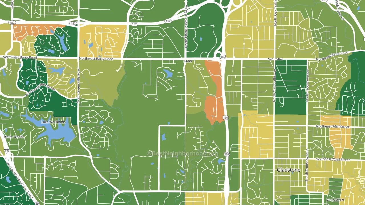
About 66% of adults in Barry Harbour typically vote, near the U.S. average of about 62%. Among adults in Barry Harbour, ~37% vote Democratic, ~29% Republican, and ~34% don't vote. The map below shows estimated turnout by block group.
How Barry Harbour compares
Among neighborhoods within 5 miles, Barry Harbour leans more Democratic than 10 of 12 neighbors.
Barry Harbour runs about 31 points more Democratic than Missouri as a whole. Missouri leans Republican overall, while Barry Harbour is one of the few Democratic-leaning pockets.
Politics vary noticeably by block within Barry Harbour. The northeast side is the most Democratic-leaning (D+21) and the west side is the least Democratic-leaning (D+2), a spread of about 19 points.
Why Barry Harbour leans the way it does
This analysis examined 14,881 data points per neighborhood to find what predicts political lean and turnout. The items below are a few correlations that stood out for Barry Harbour, not a ranked or complete list of what matters most.
Barry Harbour votes against the grain of Missouri. Missouri leans Republican overall, while Barry Harbour runs about 31 points more Democratic.
Paved land cover and Republican lean
Places with little paved surface tend to lean Republican; Barry Harbour, Kansas City, MO sits in the bottom quarter nationally on this measure. Paved ground does not change how people vote; it mostly reflects how urban and built-up a place is.
Why turnout in Barry Harbour looks the way it does
Turnout in Barry Harbour sits close to the national pattern. Routine healthcare access, homeownership, education, and food security all land near their national averages here. Learn more about the findings and methodology on the political spectrum map.
Nearby Neighborhoods
- Platte Brook North, Kansas City, MO D+9
- Clayton, Kansas City, MO D+9
- Coves North, Kansas City, MO D+9
- The Coves, Kansas City, MO D+14
- Breen Hills, Kansas City, MO D+7
- Gashland, Kansas City, MO R+4
- Lakeview Terrace, Kansas City, MO D+14
- Parkdale-Walden, Kansas City, MO D+8
- Meadowbrook Heights, Kansas City, MO R+3
- Park Forest, Kansas City, MO D+12
Neighborhoods with Similar Populations
- Pinewood-West Palm Beach, West Palm Beach, FL D+38
- Roselawn, Brighton, NY D+61
- Dignowity Hill, San Antonio, TX D+42
- Silver Bow Park, Butte, MT Even
- Princess Jeanne, Albuquerque, NM D+17
- Garden District, Baton Rouge, LA D+63
- Norwood Park, Dundalk, MD R+14
- Wrightsboro, Wilmington, NC R+3
- Milneburg, New Orleans, LA D+77
- Forestdale, Hammond, IN D+29
Sources and methodology
Precinct-level voting records used to fit the model come from Missouri Secretary of State, Elections, distributed by the Voting and Election Science Team. Demographic inputs come from the U.S. Census Bureau (ACS 5-year estimates and the 2020 Decennial Census). Health and environmental inputs come from the CDC (PLACES and the Environmental Justice Index). Land cover comes from the USGS and EPA. Election-day and lead-up weather come from PRISM 4km daily grids and the NOAA Global Historical Climatology Network. Mail-voting and election-administration patterns come from the MIT Election Lab's Survey of the Performance of American Elections. Block-group crime detail comes from CrimeGrade. Internet data and modeling support provided by ISPreports.org.
Modeling and analysis by the BestNeighborhood data science team. Full methodology and findings: political spectrum map.
Methodology reviewed by the BestNeighborhood data team. Last updated May 2026.