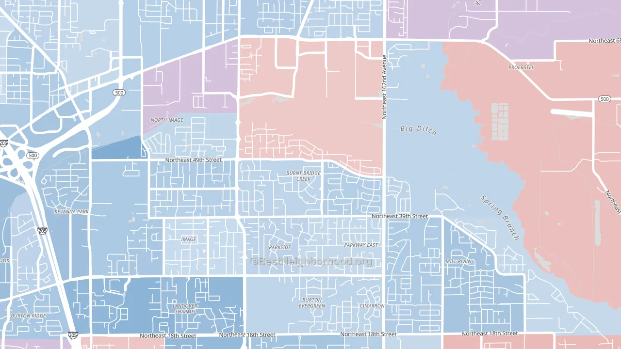
Burnt Bridge Creek is a true toss-up. About 50% of voters here vote Democratic and 50% Republican.
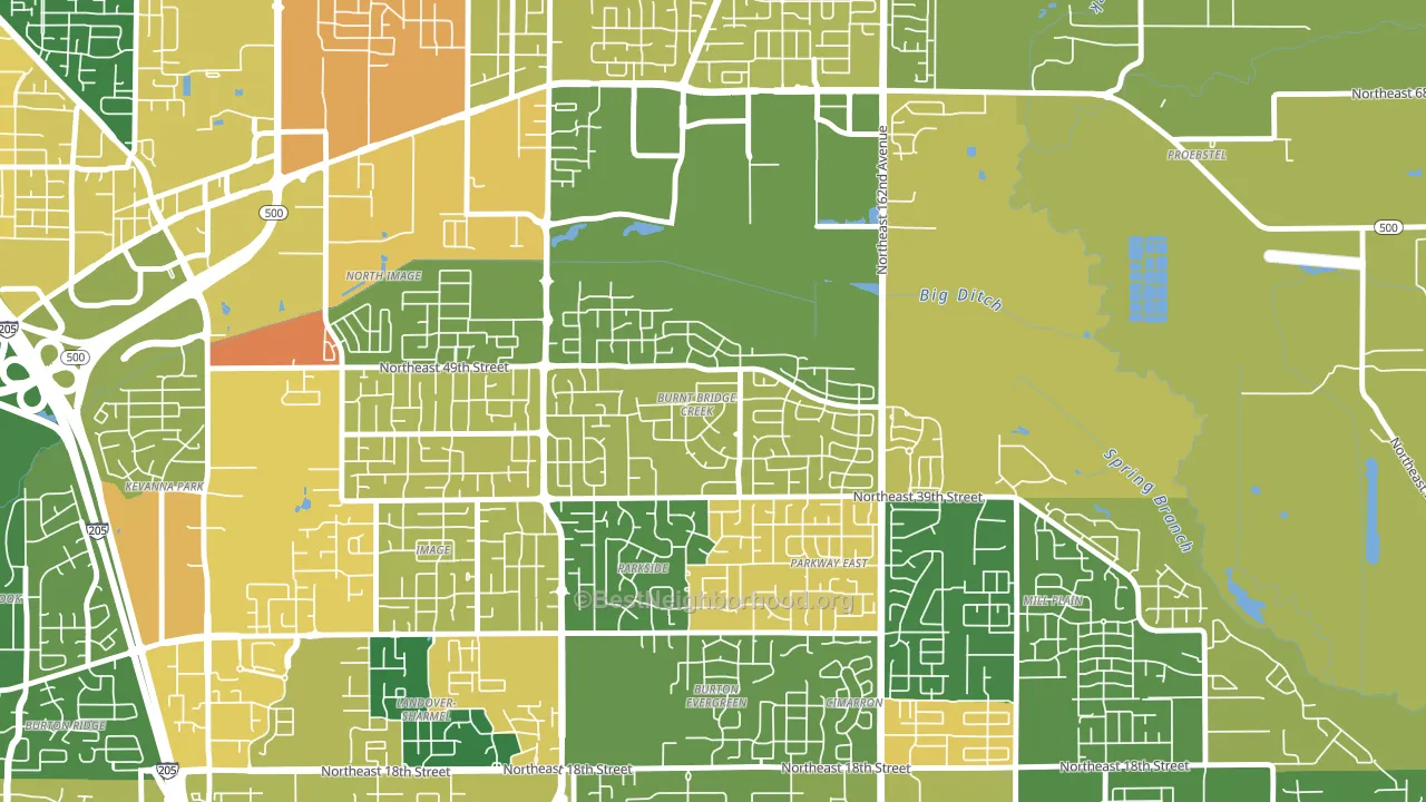
About 72% of adults in Burnt Bridge Creek typically vote, above the U.S. average of about 62%. Among adults in Burnt Bridge Creek, ~36% vote Democratic, ~36% Republican, and ~28% don't vote. The map below shows estimated turnout by block group.
How Burnt Bridge Creek compares
Among neighborhoods within 5 miles, Burnt Bridge Creek sits roughly in the middle of the political spectrum, with 0 neighbors leaning further in the place's direction and 20 leaning the other way.
Burnt Bridge Creek runs about 17 points more Republican than Washington as a whole.
Why Burnt Bridge Creek leans the way it does
Density, race composition, education, and family structure all sit close to their national averages in Burnt Bridge Creek. The lean here lands roughly where demographic data alone would predict.
Population density and Democratic lean
Places with high population density tend to lean Democratic; Burnt Bridge Creek, Vancouver, WA sits above the national average on this measure.
Why turnout in Burnt Bridge Creek looks the way it does
Turnout in Burnt Bridge Creek sits close to the national pattern. Routine healthcare access, homeownership, education, and food security all land near their national averages here. Learn more about the findings and methodology on the political spectrum map.
Nearby Neighborhoods
- North Image, Vancouver, WA D+6
- Image, Vancouver, WA D+4
- Landover-Sharmel, Vancouver, WA D+22
- North Sifton-Orchards Area, Orchards, WA Even
- Countryside Woods, Vancouver, WA D+13
- Kevanna Park, Vancouver, WA D+13
- Orchards Area, Orchards, WA Even
- Fisher-Mill Plain-Fisher's Village, Vancouver, WA D+3
- Fircrest, Vancouver, WA D+21
- Oakbrook, Vancouver, WA D+13
Neighborhoods with Similar Populations
- South Akron, Akron, OH D+39
- Eastwood Hills, Kansas City, MO D+54
- Arlington Heights, Arlington, MA D+63
- Happy Valley, Anderson, CA R+43
- Sunwood Central, Santa Ana, CA D+24
- Rio Grande, Albuquerque, NM D+40
- Meredith, Des Moines, IA D+17
- Fourth Ward, Charlotte, NC D+44
- Walnut Hills-Dayton, Dayton, OH D+9
- Bystrom, Modesto, CA D+15
Sources and methodology
Precinct-level voting records used to fit the model come from Washington Secretary of State, Elections, distributed by the Voting and Election Science Team. Demographic inputs come from the U.S. Census Bureau (ACS 5-year estimates and the 2020 Decennial Census). Health and environmental inputs come from the CDC (PLACES and the Environmental Justice Index). Land cover comes from the USGS and EPA. Election-day and lead-up weather come from PRISM 4km daily grids and the NOAA Global Historical Climatology Network. Mail-voting and election-administration patterns come from the MIT Election Lab's Survey of the Performance of American Elections. Block-group crime detail comes from CrimeGrade. Internet data and modeling support provided by ISPreports.org.
Modeling and analysis by the BestNeighborhood data science team. Full methodology and findings: political spectrum map.
Methodology reviewed by the BestNeighborhood data team. Last updated May 2026.