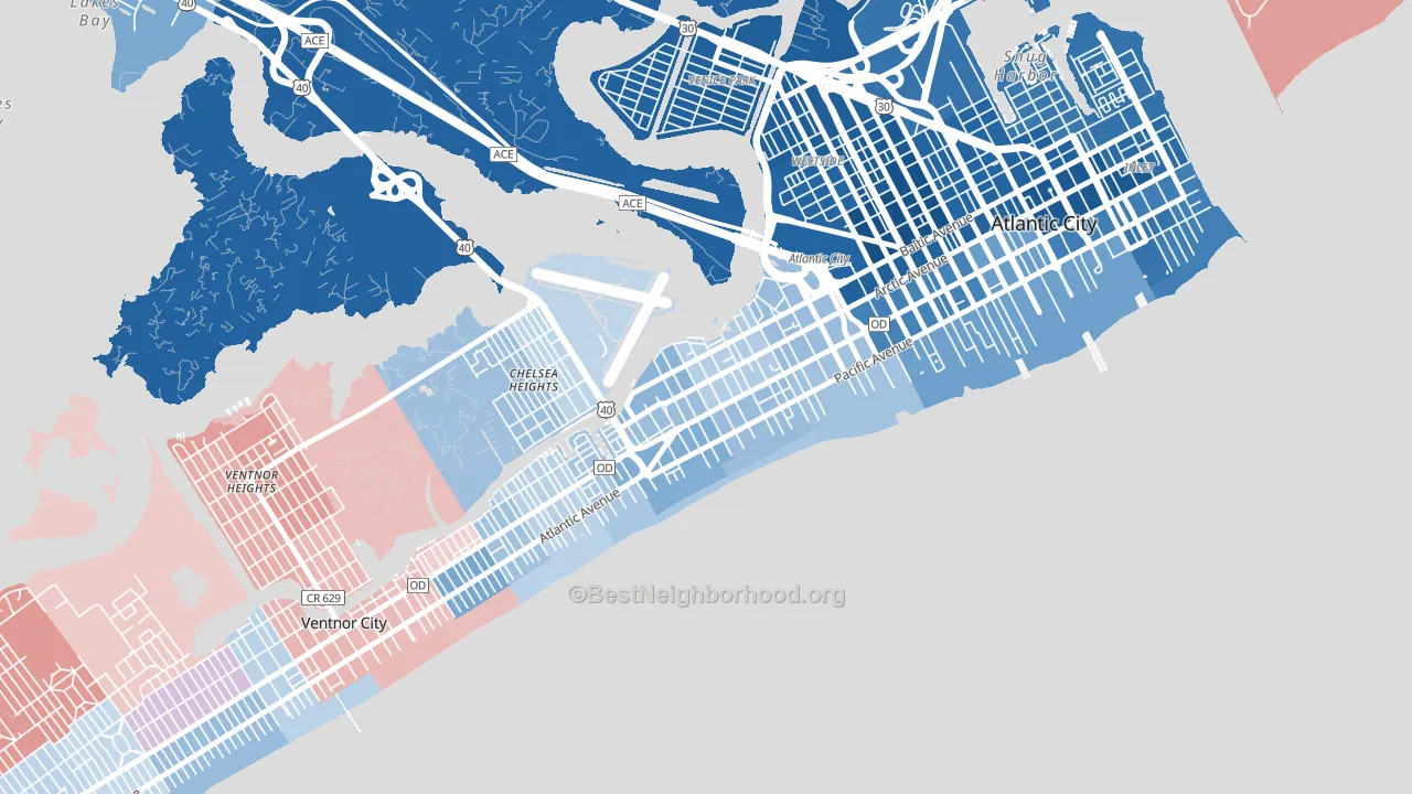
Chelsea leans slightly Democratic by roughly 12 points: about 56% of voters vote Democratic and 44% Republican.
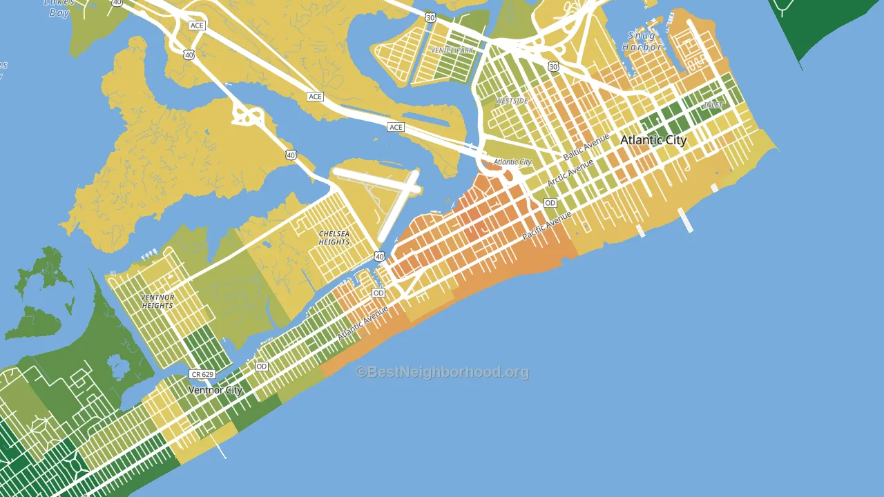
About 33% of adults in Chelsea typically vote, below the U.S. average of about 62%. Among adults in Chelsea, ~18% vote Democratic, ~14% Republican, and ~68% don't vote. The map below shows estimated turnout by block group.
How Chelsea compares
Among neighborhoods within 5 miles, Chelsea is the least Democratic-leaning.
Chelsea runs about 6 points more Democratic than New Jersey as a whole.
Why Chelsea leans the way it does
This analysis examined 14,881 data points per neighborhood to find what predicts political lean and turnout. The items below are a few correlations that stood out for Chelsea, not a ranked or complete list of what matters most.
Areas with many never-married adults vote Democratic. About 49% of adults in Chelsea have never been married, about 20 points above the U.S. average of 29%.
Population density and Democratic lean
Places with high population density tend to lean Democratic; Chelsea, Atlantic City, NJ sits in the top tenth nationally on this measure.
Why turnout in Chelsea looks the way it does
Areas with limited routine healthcare access turn out at lower rates. Chelsea is in the bottom quarter nationally for routine-care measures such as insurance coverage, preventive screenings, and dental visits. The dental-visit rate here is about 47%, about 21 points below the New Jersey average of 67%. Renters vote less often than owners, and about 66% of households in Chelsea rent, compared to around 45% in nearby neighborhoods. High food insecurity lines up with lower turnout, and about 32% of adults in Chelsea report food insecurity, above 85% of neighborhoods. Learn more about the findings and methodology on the political spectrum map.
Nearby Neighborhoods
- Lower Chelsea, Atlantic City, NJ D+15
- Westside, Atlantic City, NJ D+68
- Atlantic City Inlet, Atlantic City, NJ D+57
- The Gardens, Ocean City, NJ R+6
- Barnegat Pines, Forked River, NJ R+42
- Dover Heights, Toms River, NJ R+27
- West Osbornsville, Brick, NJ R+32
- Fairview, Camden, NJ D+55
- Morgan Village, Camden, NJ D+68
- Whitman Park, Camden, NJ D+78
Neighborhoods with Similar Populations
- Bella Vista, Philadelphia, PA D+76
- Barton Hills, Austin, TX D+48
- Old San Leandro, San Leandro, CA D+50
- Wedgewood, Charlotte, NC D+66
- Mount Washington, Los Angeles, CA D+57
- Berwick, Columbus, OH D+62
- Kempsville Gardens, Virginia Beach, VA D+20
- Southwest Detroit, Detroit, MI D+28
- University City North, Charlotte, NC D+56
- Ysleta Mission Valley, El Paso, TX D+24
Sources and methodology
Precinct-level voting records used to fit the model come from New Jersey Division of Elections, distributed by the Voting and Election Science Team. Demographic inputs come from the U.S. Census Bureau (ACS 5-year estimates and the 2020 Decennial Census). Health and environmental inputs come from the CDC (PLACES and the Environmental Justice Index). Land cover comes from the USGS and EPA. Election-day and lead-up weather come from PRISM 4km daily grids and the NOAA Global Historical Climatology Network. Mail-voting and election-administration patterns come from the MIT Election Lab's Survey of the Performance of American Elections. Block-group crime detail comes from CrimeGrade. Internet data and modeling support provided by ISPreports.org.
Modeling and analysis by the BestNeighborhood data science team. Full methodology and findings: political spectrum map.
Methodology reviewed by the BestNeighborhood data team. Last updated May 2026.