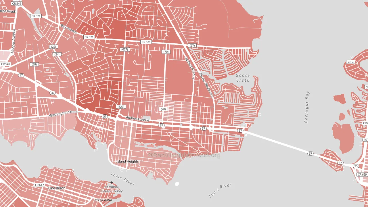
Dover Heights leans Republican by roughly 26 points: about 37% of voters vote Democratic and 63% Republican.
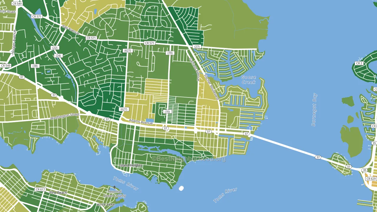
About 72% of adults in Dover Heights typically vote, above the U.S. average of about 62%. Among adults in Dover Heights, ~27% vote Democratic, ~45% Republican, and ~28% don't vote. The map below shows estimated turnout by block group.
How Dover Heights compares
Dover Heights runs about 33 points more Republican than New Jersey as a whole. New Jersey leans Democratic overall, while Dover Heights is one of the few Republican-leaning pockets.
Politics vary noticeably by block within Dover Heights. The east side is the most Republican-leaning (R+35) and the west side is the least Republican-leaning (R+22), a spread of about 13 points.
Why Dover Heights leans the way it does
This analysis examined 14,881 data points per neighborhood to find what predicts political lean and turnout. The items below are a few correlations that stood out for Dover Heights, not a ranked or complete list of what matters most.
Dover Heights votes against the grain of New Jersey. New Jersey leans Democratic overall, while Dover Heights runs about 33 points more Republican.
Preventive-care access and voter turnout
Places with strong routine preventive-care access tend to turn out at a higher rate; Dover Heights, Toms River, NJ sits above the national average on this measure. Dental visits do not drive turnout; the rate reflects income, insurance, and healthcare access, which line up with who votes.
Why turnout in Dover Heights looks the way it does
Homeowners vote more often than renters. About 87% of households in Dover Heights own their home, about 13 points above the New Jersey average of 74%. Learn more about the findings and methodology on the political spectrum map.
Nearby Neighborhoods
- West Osbornsville, Brick, NJ R+32
- Arrowhead Park, Brick, NJ R+33
- Barnegat Pines, Forked River, NJ R+42
- Point Pleasant Manor, Brick, NJ R+31
- Downtown Neptune City, Neptune City, NJ D+8
- Berkley Estates, Neptune, NJ D+46
- Creighton Village, Old Bridge, NJ R+24
- Ravine Gardens, Matawan, NJ R+4
- Southwood, Old Bridge, NJ R+22
- North Middletown, Middletown, NJ R+22
Neighborhoods with Similar Populations
- Cody, Mobile, AL D+71
- Spencer View Terrace, Deer Park, TX R+22
- Isle of Palms, Jacksonville Beach, FL R+39
- Kabrich Crescent, Blacksburg, VA D+37
- Clifton Heights, St. Louis, MO D+36
- Bellalago, Kissimmee, FL D+9
- The Boulevards, Canton, OH D+21
- Essex, Chicago, IL D+82
- Buckingham Park, Willingboro, NJ D+78
- Everroad Park, Columbus, IN R+22
Sources and methodology
Precinct-level voting records used to fit the model come from New Jersey Division of Elections, distributed by the Voting and Election Science Team. Demographic inputs come from the U.S. Census Bureau (ACS 5-year estimates and the 2020 Decennial Census). Health and environmental inputs come from the CDC (PLACES and the Environmental Justice Index). Land cover comes from the USGS and EPA. Election-day and lead-up weather come from PRISM 4km daily grids and the NOAA Global Historical Climatology Network. Mail-voting and election-administration patterns come from the MIT Election Lab's Survey of the Performance of American Elections. Block-group crime detail comes from CrimeGrade. Internet data and modeling support provided by ISPreports.org.
Modeling and analysis by the BestNeighborhood data science team. Full methodology and findings: political spectrum map.
Methodology reviewed by the BestNeighborhood data team. Last updated May 2026.