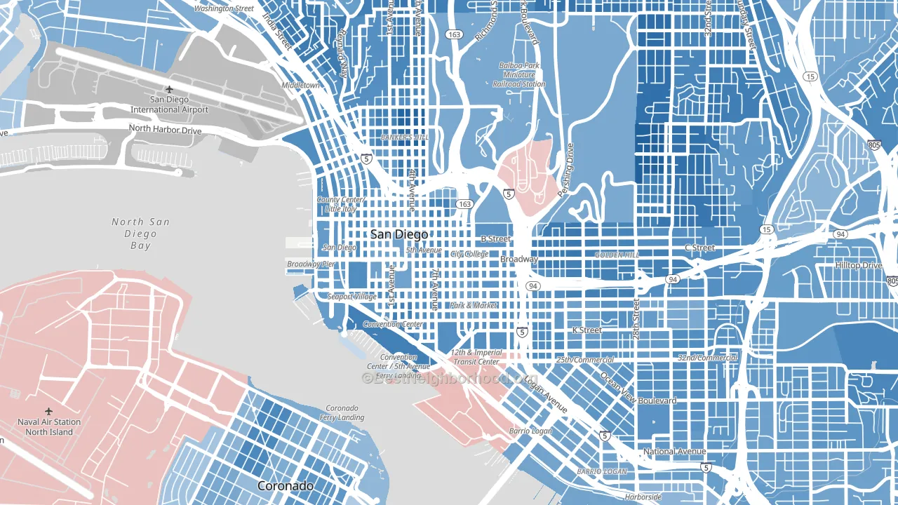
Core leans heavily Democratic by roughly 42 points: about 71% of voters vote Democratic and 29% Republican.
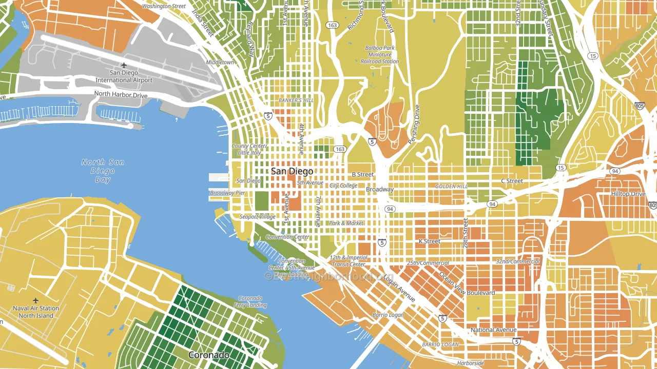
About 42% of adults in Core typically vote, below the U.S. average of about 62%. Among adults in Core, ~30% vote Democratic, ~12% Republican, and ~58% don't vote. The map below shows estimated turnout by block group.
How Core compares
Among neighborhoods within 5 miles, Core leans more Democratic than 19 of 35 neighbors.
Core runs about 23 points more Democratic than California as a whole.
Politics vary noticeably by block within Core. The south side is the most Democratic-leaning (D+48) and the southwest side is the least Democratic-leaning (D+36), a spread of about 11 points.
Why Core leans the way it does
This analysis examined 14,881 data points per neighborhood to find what predicts political lean and turnout. The items below are a few correlations that stood out for Core, not a ranked or complete list of what matters most.
Dense areas vote Democratic. More than 99% of residents in Core live in densely developed areas, about 64 points above the U.S. average of 36%. A high never-married share predicts Democratic voting, and about 59% of adults in Core have never been married, above 92% of neighborhoods.
Population density and Democratic lean
Places with high population density tend to lean Democratic; Core, San Diego, CA sits in the top tenth nationally on this measure.
Why turnout in Core looks the way it does
Renters vote less often than owners. About 92% of households in Core rent, about 67 points above the U.S. average of 25%. High-crime urban areas turn out at lower rates, and Core sits in the top 15% on a violent-crime measure. Learn more about the findings and methodology on the political spectrum map.
Nearby Neighborhoods
- East Village, San Diego, CA D+44
- Cortez Hill, San Diego, CA D+50
- Marina, San Diego, CA D+45
- Columbia San Diego, San Diego, CA D+37
- Little Italy, San Diego, CA D+40
- Sherman Heights, San Diego, CA D+45
- Park West, San Diego, CA D+54
- Balboa Park, San Diego, CA D+58
- Grant Hill, San Diego, CA D+42
- Middletown, San Diego, CA D+47
Neighborhoods with Similar Populations
- North End Manchester, Manchester, NH D+29
- Lake Balboa, Van Nuys, CA D+32
- The Woods at Mill Valley, Marysville, OH R+23
- Hamilton, Worcester, MA D+21
- Diamond Hill-Jarvis, Fort Worth, TX D+20
- Beverly Woods, Charlotte, NC D+7
- White Bridge, Nashville, TN D+20
- Denbigh, Newport News, VA D+55
- Carpenter, Ann Arbor, MI D+50
- East Durham, Durham, NC D+74
Sources and methodology
Precinct-level voting records used to fit the model come from California Secretary of State, Elections, distributed by the Voting and Election Science Team. Demographic inputs come from the U.S. Census Bureau (ACS 5-year estimates and the 2020 Decennial Census). Health and environmental inputs come from the CDC (PLACES and the Environmental Justice Index). Land cover comes from the USGS and EPA. Election-day and lead-up weather come from PRISM 4km daily grids and the NOAA Global Historical Climatology Network. Mail-voting and election-administration patterns come from the MIT Election Lab's Survey of the Performance of American Elections. Block-group crime detail comes from CrimeGrade. Internet data and modeling support provided by ISPreports.org.
Modeling and analysis by the BestNeighborhood data science team. Full methodology and findings: political spectrum map.
Methodology reviewed by the BestNeighborhood data team. Last updated May 2026.