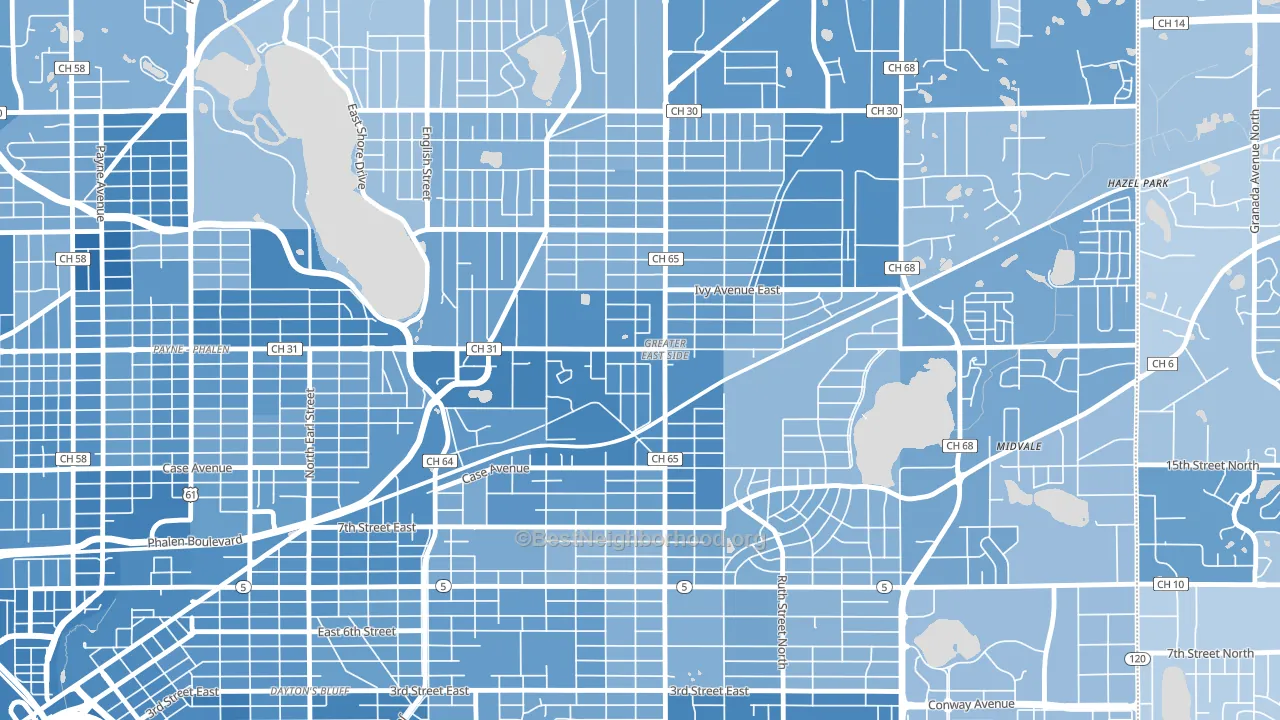
Greater Eastside leans heavily Democratic by roughly 32 points: about 66% of voters vote Democratic and 34% Republican.
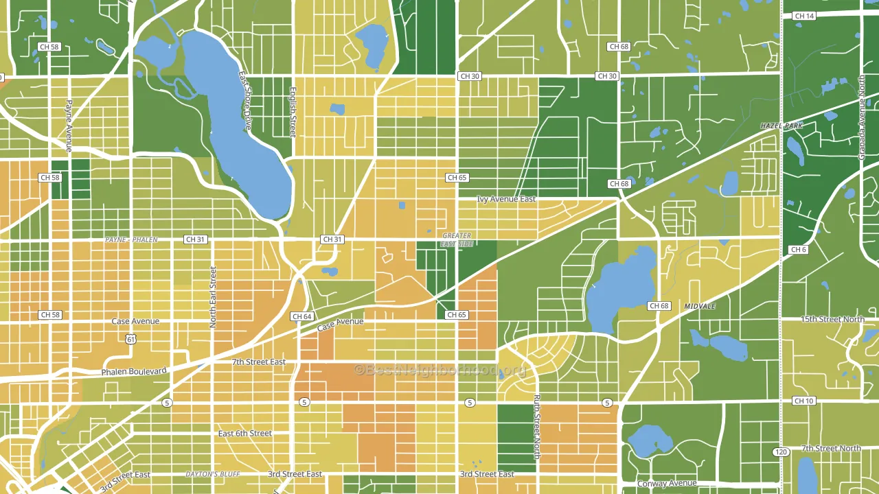
About 56% of adults in Greater Eastside typically vote, below the U.S. average of about 62%. Among adults in Greater Eastside, ~37% vote Democratic, ~19% Republican, and ~44% don't vote. The map below shows estimated turnout by block group.
How Greater Eastside compares
Among neighborhoods within 5 miles, Greater Eastside is the least Democratic-leaning.
Greater Eastside runs about 28 points more Democratic than Minnesota as a whole.
Politics vary noticeably by block within Greater Eastside. The west side is the most Democratic-leaning (D+42) and the northwest side is the least Democratic-leaning (D+22), a spread of about 20 points.
Why Greater Eastside leans the way it does
Density, race composition, education, and family structure all sit close to their national averages in Greater Eastside. The lean here lands roughly where demographic data alone would predict.
Preventive-care access and voter turnout
Places with limited routine preventive-care access tend to turn out at a lower rate; Greater Eastside, St. Paul, MN sits below the national average on this measure. Dental visits do not drive turnout; the rate reflects income, insurance, and healthcare access, which line up with who votes.
Why turnout in Greater Eastside looks the way it does
Crowded housing lines up with lower turnout. About 9% of homes in Greater Eastside have more than one occupant per room, above 90% of neighborhoods. Low high-school completion lines up with lower turnout, and about 82% of adults in Greater Eastside have completed high school, below 82% of neighborhoods. Learn more about the findings and methodology on the political spectrum map.
Nearby Neighborhoods
- Dayton's Bluff, St. Paul, MN D+46
- Payne Phallen, St. Paul, MN D+40
- Battle Creek, St. Paul, MN D+39
- Downtown Minneapolis, St. Paul, MN D+64
- North End, St. Paul, MN D+45
- West Side, St. Paul, MN D+46
- Thomas-Dale, St. Paul, MN D+53
- Summit-University, St. Paul, MN D+72
- West 7th, St. Paul, MN D+59
- Como, St. Paul, MN D+61
Neighborhoods with Similar Populations
- Oak Forest-Garden Oaks, Houston, TX D+13
- Rancho Charleston, Las Vegas, NV D+23
- Alexandria Wrest, Alexandria, VA D+51
- South Central Omaha, Omaha, NE D+15
- Bellevue, Nashville, TN D+8
- Wissanoning, Philadelphia, PA D+30
- Pottage Park, Chicago, IL D+26
- West Bloomington, Bloomington, MN D+33
- Stapleton, Denver, CO D+56
- Pacific Beach, San Diego, CA D+35
Sources and methodology
Precinct-level voting records used to fit the model come from Minnesota Secretary of State, Elections, distributed by the Voting and Election Science Team. Demographic inputs come from the U.S. Census Bureau (ACS 5-year estimates and the 2020 Decennial Census). Health and environmental inputs come from the CDC (PLACES and the Environmental Justice Index). Land cover comes from the USGS and EPA. Election-day and lead-up weather come from PRISM 4km daily grids and the NOAA Global Historical Climatology Network. Mail-voting and election-administration patterns come from the MIT Election Lab's Survey of the Performance of American Elections. Block-group crime detail comes from CrimeGrade. Internet data and modeling support provided by ISPreports.org.
Modeling and analysis by the BestNeighborhood data science team. Full methodology and findings: political spectrum map.
Methodology reviewed by the BestNeighborhood data team. Last updated May 2026.