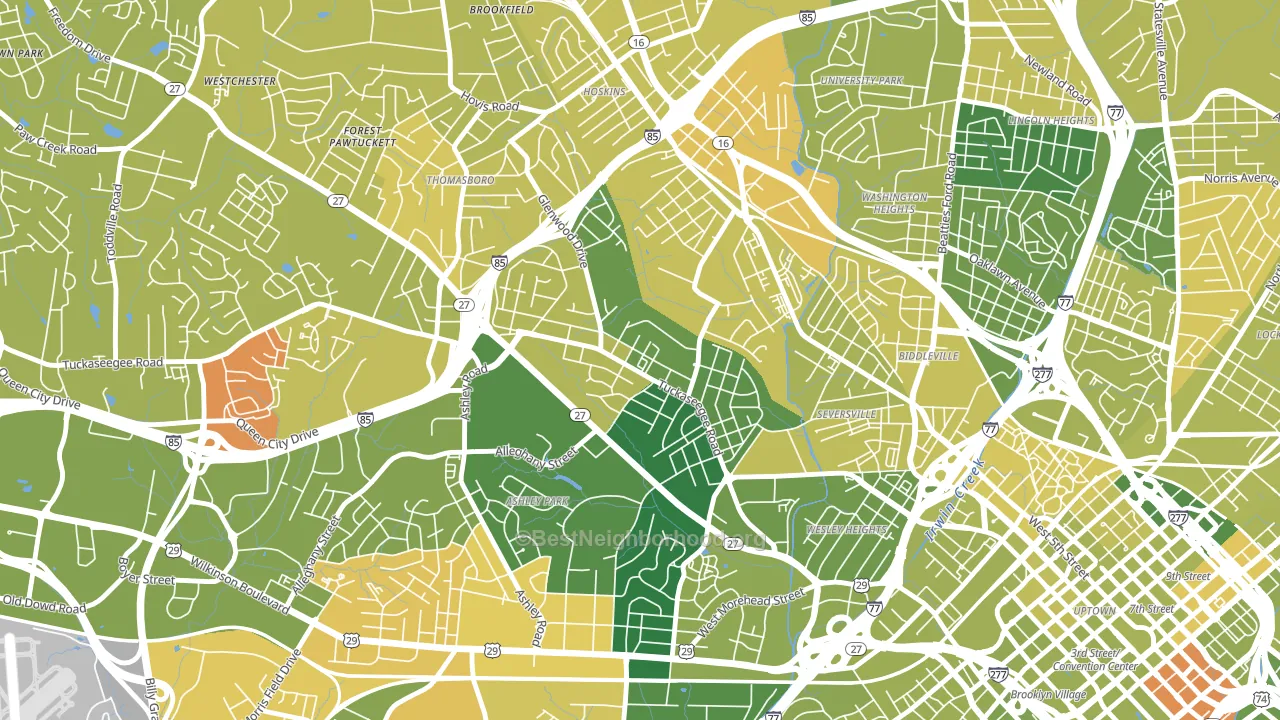
Enderly Park is a Democratic stronghold. About 90% of voters here vote Democratic and 10% Republican.
[sc name="abovemapcta"]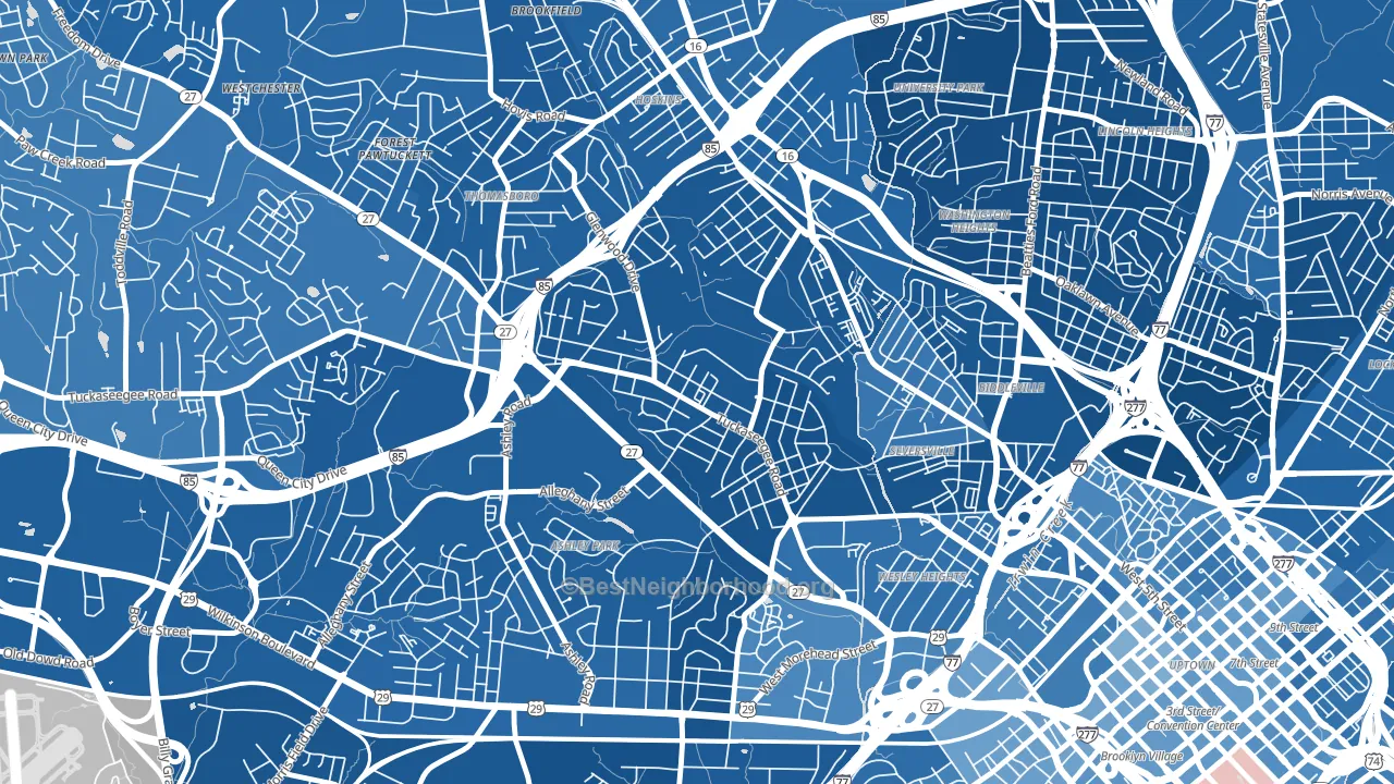 [bestneighborhood_map_controls]
About 81% of adults in Enderly Park typically vote, above the U.S. average of about 62%. Among adults in Enderly Park, ~73% vote Democratic, ~8% Republican, and ~19% don't vote. The map below shows estimated turnout by block group.
 [bestneighborhood_map_controls]
How Enderly Park compares
Among neighborhoods within 5 miles, Enderly Park leans more Democratic than 22 of 23 neighbors.
Enderly Park runs about 83 points more Democratic than North Carolina as a whole. North Carolina leans Republican overall, while Enderly Park is one of the few Democratic-leaning pockets.
Why Enderly Park leans the way it does
This analysis examined 14,881 data points per neighborhood to find what predicts political lean and turnout. The items below are a few correlations that stood out for Enderly Park, not a ranked or complete list of what matters most.
Enderly Park votes against the grain of North Carolina. North Carolina leans Republican overall, while Enderly Park runs about 83 points more Democratic. A high never-married share predicts Democratic voting, and about 48% of adults in Enderly Park have never been married, above 78% of neighborhoods.
Park access and Democratic lean
Places with heavy park coverage tend to lean Democratic; Enderly Park, Charlotte, NC sits in the top quarter nationally on this measure. Park access does not change how people vote; it tends to track denser, higher-income areas.
Why turnout in Enderly Park looks the way it does
Turnout in Enderly Park sits close to the national pattern. Routine healthcare access, homeownership, education, and food security all land near their national averages here. Learn more about the findings and methodology on the political spectrum map.
[one_half]Nearby Neighborhoods
- Ashley Park, Charlotte, NC D+66
- Thomasboro-Hoskins, Charlotte, NC D+75
- Third Ward, Charlotte, NC D+47
- Toddville Road, Charlotte, NC D+64
- Westchester, Charlotte, NC D+72
- Downtown Charlotte, Charlotte, NC D+32
- Fourth Ward, Charlotte, NC D+44
- Firestone-Garden Park, Charlotte, NC D+78
- Dilworth, Charlotte, NC D+34
- Clanton Park-Roseland, Charlotte, NC D+83
Neighborhoods with Similar Populations
- Old Redford, Detroit, MI D+83
- Downtown Geneva, Geneva, OH R+23
- Central Business District-Rochester, Rochester, NY D+64
- 1st Ward, Portsmouth, OH R+12
- Lincoln, San Rafael, CA D+51
- Feasterville, Feasterville-Trevose, PA R+13
- North River Shores, Stuart, FL R+25
- Stockdale Greens, Bakersfield, CA R+15
- Tara Hills, San Pablo, CA D+35
- Silver Swan, Milwaukee, WI D+74
Sources and methodology
Precinct-level voting records used to fit the model come from North Carolina State Board of Elections, distributed by the Voting and Election Science Team. Demographic inputs come from the U.S. Census Bureau (ACS 5-year estimates and the 2020 Decennial Census). Health and environmental inputs come from the CDC (PLACES and the Environmental Justice Index). Land cover comes from the USGS and EPA. Election-day and lead-up weather come from PRISM 4km daily grids and the NOAA Global Historical Climatology Network. Mail-voting and election-administration patterns come from the MIT Election Lab's Survey of the Performance of American Elections. Block-group crime detail comes from CrimeGrade. Internet data and modeling support provided by ISPreports.org.
Modeling and analysis by the BestNeighborhood data science team. Full methodology and findings: political spectrum map.
Methodology reviewed by the BestNeighborhood data team. Last updated May 2026.