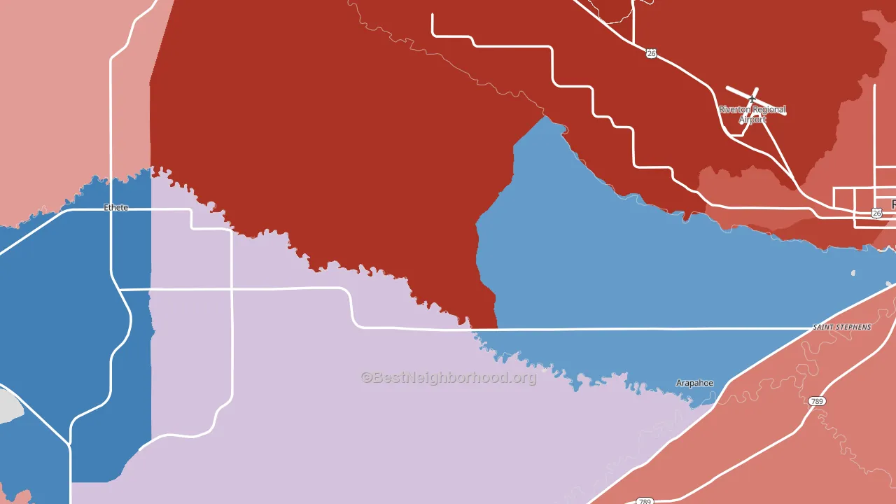
Fremont County leans heavily Republican by roughly 32 points: about 34% of voters vote Democratic and 66% Republican.
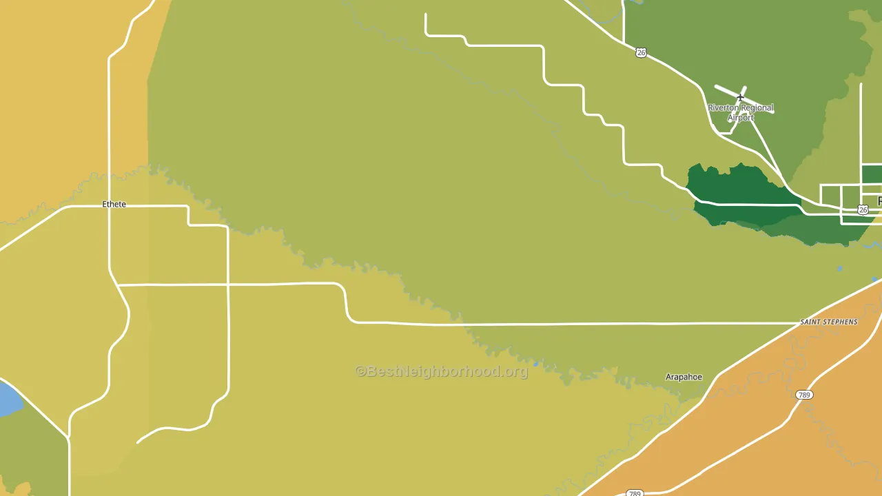
About 70% of adults in Fremont County typically vote, above the U.S. average of about 62%. Among adults in Fremont County, ~24% vote Democratic, ~46% Republican, and ~30% don't vote. The map below shows estimated turnout by block group.
How Fremont County compares
Fremont County runs about 13 points more Democratic than Wyoming as a whole.
Politics vary noticeably by city within Fremont County. The west side runs the most Democratic (D+3) and the north side runs the most Republican (R+75), a spread of about 78 points.
Why Fremont County leans the way it does
Density, race composition, education, and family structure all sit close to their national averages in Fremont County. The lean here lands roughly where demographic data alone would predict.
High-school completion and voter turnout
Places with high-school-completion-heavy adults tend to turn out at a higher rate; Fremont County, WY sits in the top quarter nationally on this measure.
Why turnout in Fremont County looks the way it does
Areas with high high-school completion turn out at higher rates. About 94% of adults in Fremont County have completed high school, above 80% of counties. Learn more about the findings and methodology on the political spectrum map.
Nearby Counties
- Hot Springs County, WY R+57
- Sublette County, WY R+58
- Washakie County, WY R+64
- Sweetwater County, WY R+53
- Park County, WY R+51
- Big Horn County, WY R+73
- Teton County, WY D+16
- Natrona County, WY R+41
- Lincoln County, WY R+66
- Carbon County, WY R+57
Counties with Similar Populations
- Campbell County, TN R+65
- Sequoyah County, OK R+58
- Person County, NC R+24
- Webster County, MO R+64
- Union County, AR R+20
- Mayes County, OK R+56
- Douglas County, MN R+36
- Wayne County, WV R+55
- Crawford County, KS R+28
- Oconto County, WI R+40
Sources and methodology
Precinct-level voting records used to fit the model come from Wyoming Secretary of State, Elections, distributed by the Voting and Election Science Team. Demographic inputs come from the U.S. Census Bureau (ACS 5-year estimates and the 2020 Decennial Census). Health and environmental inputs come from the CDC (PLACES and the Environmental Justice Index). Land cover comes from the USGS and EPA. Election-day and lead-up weather come from PRISM 4km daily grids and the NOAA Global Historical Climatology Network. Mail-voting and election-administration patterns come from the MIT Election Lab's Survey of the Performance of American Elections. Block-group crime detail comes from CrimeGrade. Internet data and modeling support provided by ISPreports.org.
Modeling and analysis by the BestNeighborhood data science team. Full methodology and findings: political spectrum map.
Methodology reviewed by the BestNeighborhood data team. Last updated May 2026.