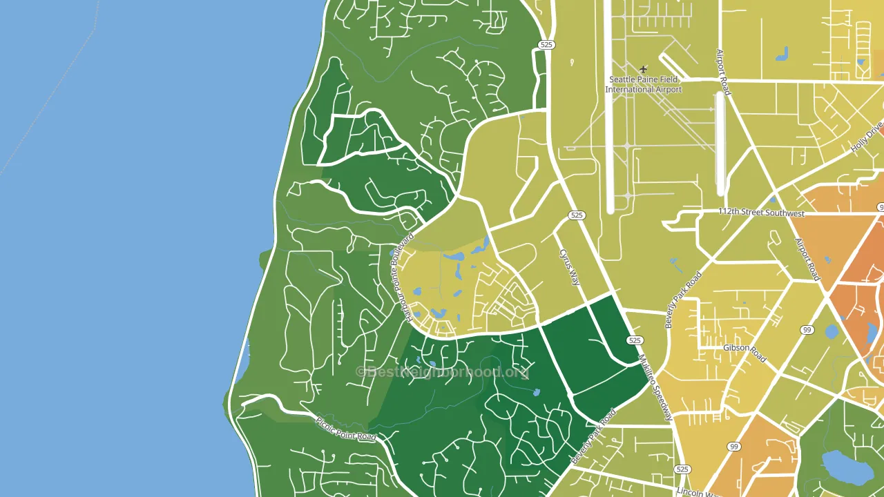
Harbour Pointe leans Democratic by roughly 22 points: about 61% of voters vote Democratic and 39% Republican.
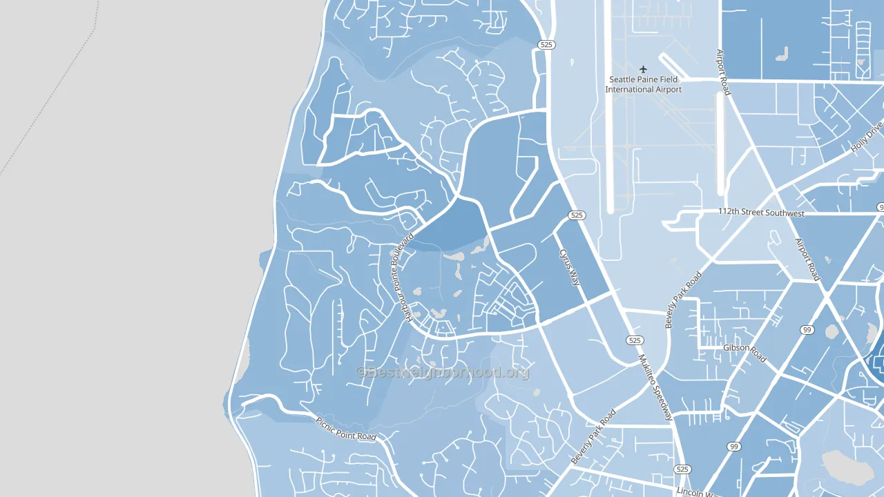
About 78% of adults in Harbour Pointe typically vote, above the U.S. average of about 62%. Among adults in Harbour Pointe, ~47% vote Democratic, ~30% Republican, and ~23% don't vote. The map below shows estimated turnout by block group.
How Harbour Pointe compares
Among neighborhoods within 5 miles, Harbour Pointe leans more Democratic than 8 of 12 neighbors.
Politically, Harbour Pointe sits close to the rest of Washington.
Why Harbour Pointe leans the way it does
This analysis examined 14,881 data points per neighborhood to find what predicts political lean and turnout. The items below are a few correlations that stood out for Harbour Pointe, not a ranked or complete list of what matters most.
Areas with high college attainment vote Democratic. About 62% of adults in Harbour Pointe hold a bachelor's degree, about 33 points above the U.S. average of 28%.
Preventive-care access and voter turnout
Places with strong routine preventive-care access tend to turn out at a higher rate; Harbour Pointe, Mukilteo, WA sits in the top quarter nationally on this measure. Dental visits do not drive turnout; the rate reflects income, insurance, and healthcare access, which line up with who votes.
Why turnout in Harbour Pointe looks the way it does
Areas with high high-school completion turn out at higher rates. About 99% of adults in Harbour Pointe have completed high school, about 7 points above the Washington average of 91%. Learn more about the findings and methodology on the political spectrum map.
Nearby Neighborhoods
Neighborhoods with Similar Populations
- Coulwood West, Charlotte, NC D+42
- Pine Point, Springfield, MA D+41
- Turtle Rock, Irvine, CA D+11
- Bridgeland, Cypress, TX R+24
- Harris-Houston, Charlotte, NC D+56
- Southeastern Hills, Lexington, KY D+24
- Surprise Farms, Surprise, AZ R+23
- Leimert Park, Los Angeles, CA D+78
- Cypress Station, Houston, TX D+59
- Lynn-Highland Park, Oakland, CA D+62
Sources and methodology
Precinct-level voting records used to fit the model come from Washington Secretary of State, Elections, distributed by the Voting and Election Science Team. Demographic inputs come from the U.S. Census Bureau (ACS 5-year estimates and the 2020 Decennial Census). Health and environmental inputs come from the CDC (PLACES and the Environmental Justice Index). Land cover comes from the USGS and EPA. Election-day and lead-up weather come from PRISM 4km daily grids and the NOAA Global Historical Climatology Network. Mail-voting and election-administration patterns come from the MIT Election Lab's Survey of the Performance of American Elections. Block-group crime detail comes from CrimeGrade. Internet data and modeling support provided by ISPreports.org.
Modeling and analysis by the BestNeighborhood data science team. Full methodology and findings: political spectrum map.
Methodology reviewed by the BestNeighborhood data team. Last updated May 2026.