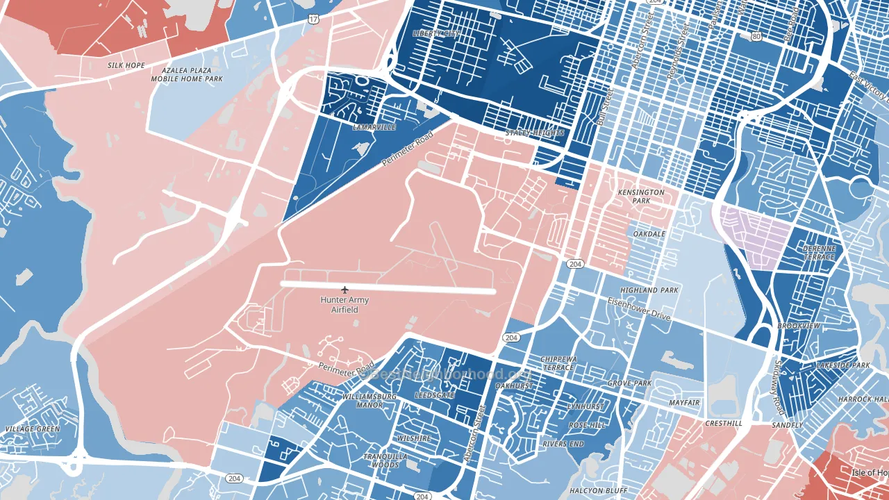
Hunter Army Airfield is a true toss-up. About 52% of voters here vote Democratic and 48% Republican.
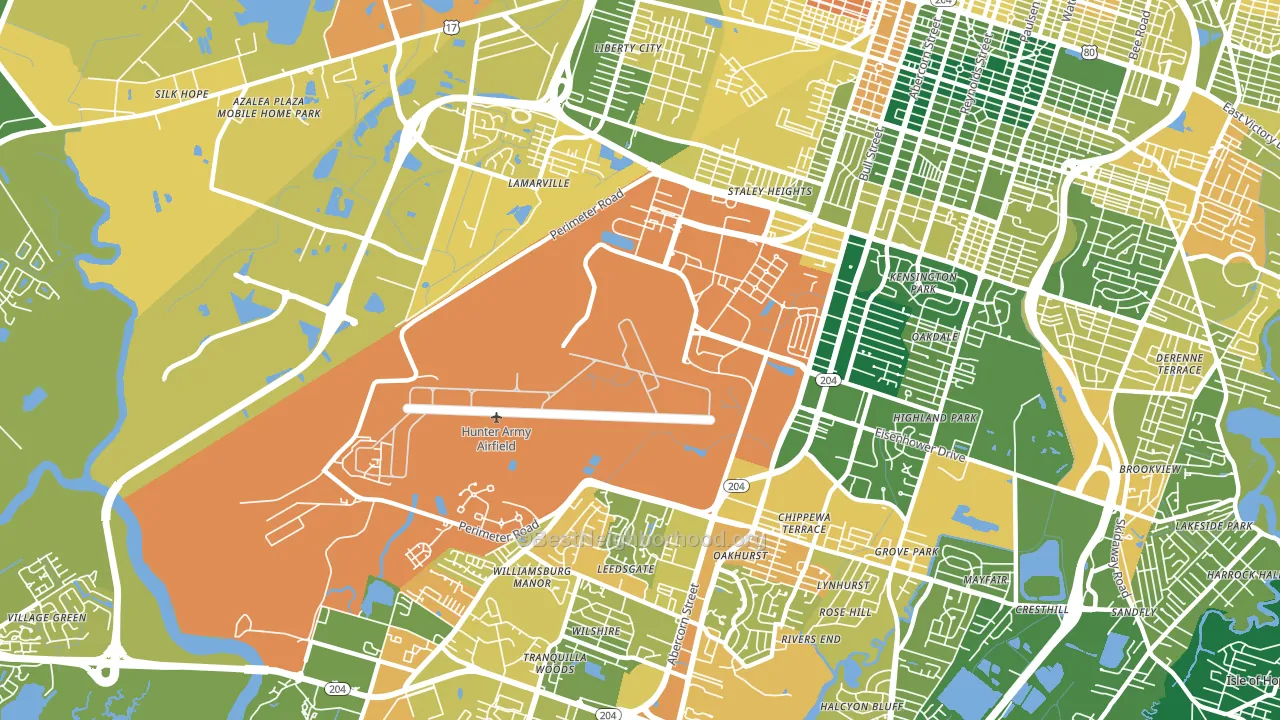
About 35% of adults in Hunter Army Airfield typically vote, below the U.S. average of about 62%. Among adults in Hunter Army Airfield, ~18% vote Democratic, ~17% Republican, and ~65% don't vote. The map below shows estimated turnout by block group.
How Hunter Army Airfield compares
Among neighborhoods within 5 miles, Hunter Army Airfield is the least Democratic-leaning.
Hunter Army Airfield runs about 6 points more Democratic than Georgia as a whole.
Politics vary noticeably by block within Hunter Army Airfield. The northeast side runs the most Democratic (D+86) and the west side runs the most Republican (R+9), a spread of about 95 points.
Why Hunter Army Airfield leans the way it does
Density, race composition, education, and family structure all sit close to their national averages in Hunter Army Airfield. The lean here lands roughly where demographic data alone would predict.
Homeownership and voter turnout
Places with renter-heavy households tend to turn out at a lower rate; Hunter Army Airfield, Savannah, GA sits in the bottom tenth nationally on this measure.
Why turnout in Hunter Army Airfield looks the way it does
Areas with limited routine healthcare access turn out at lower rates. Hunter Army Airfield is in the bottom quarter nationally for routine-care measures such as insurance coverage, preventive screenings, and dental visits. The dental-visit rate here is about 49%, about 7 points below the Georgia average of 56%. Renters vote less often than owners, and about 83% of households in Hunter Army Airfield rent, compared to around 46% in nearby neighborhoods. High-crime urban areas turn out at lower rates, and Hunter Army Airfield sits in the top 15% on a violent-crime measure. Learn more about the findings and methodology on the political spectrum map.
Nearby Neighborhoods
- Wilshire Estates-Savannah Mall, Savannah, GA D+43
- Paradise Park, Savannah, GA D+29
- Windsor Forest, Savannah, GA D+24
- Ardmore-Gould Estates-Olin Heights, Savannah, GA D+36
- Chatham Parkway, Savannah, GA D+42
- Midtown Savannah, Savannah, GA D+71
- Georgetown, Savannah, GA D+16
- Boltons Landing, Charleston, SC D+7
- White Gables, Summerville, SC R+27
- Charleston Historic District, Charleston, SC D+12
Neighborhoods with Similar Populations
- Holualoa, Kailua-Kona, HI D+21
- Vinton Street, Omaha, NE D+28
- Golden Valley, Milwaukee, WI D+41
- East Old Golden Road, West Pleasant View, CO D+21
- Indian Spring, Boynton Beach, FL D+18
- Centerville, Brownsville, PA R+34
- Marietta, Jacksonville, FL R+43
- Pinnacle Club, Grove City, OH R+9
- Pelican Marsh, Naples, FL R+21
- East Campus, Lincoln, NE D+45
Sources and methodology
Precinct-level voting records used to fit the model come from Georgia Elections Division, distributed by the Voting and Election Science Team. Demographic inputs come from the U.S. Census Bureau (ACS 5-year estimates and the 2020 Decennial Census). Health and environmental inputs come from the CDC (PLACES and the Environmental Justice Index). Land cover comes from the USGS and EPA. Election-day and lead-up weather come from PRISM 4km daily grids and the NOAA Global Historical Climatology Network. Mail-voting and election-administration patterns come from the MIT Election Lab's Survey of the Performance of American Elections. Block-group crime detail comes from CrimeGrade. Internet data and modeling support provided by ISPreports.org.
Modeling and analysis by the BestNeighborhood data science team. Full methodology and findings: political spectrum map.
Methodology reviewed by the BestNeighborhood data team. Last updated May 2026.