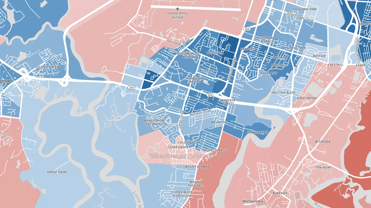
Windsor Forest leans Democratic by roughly 24 points: about 62% of voters vote Democratic and 38% Republican.
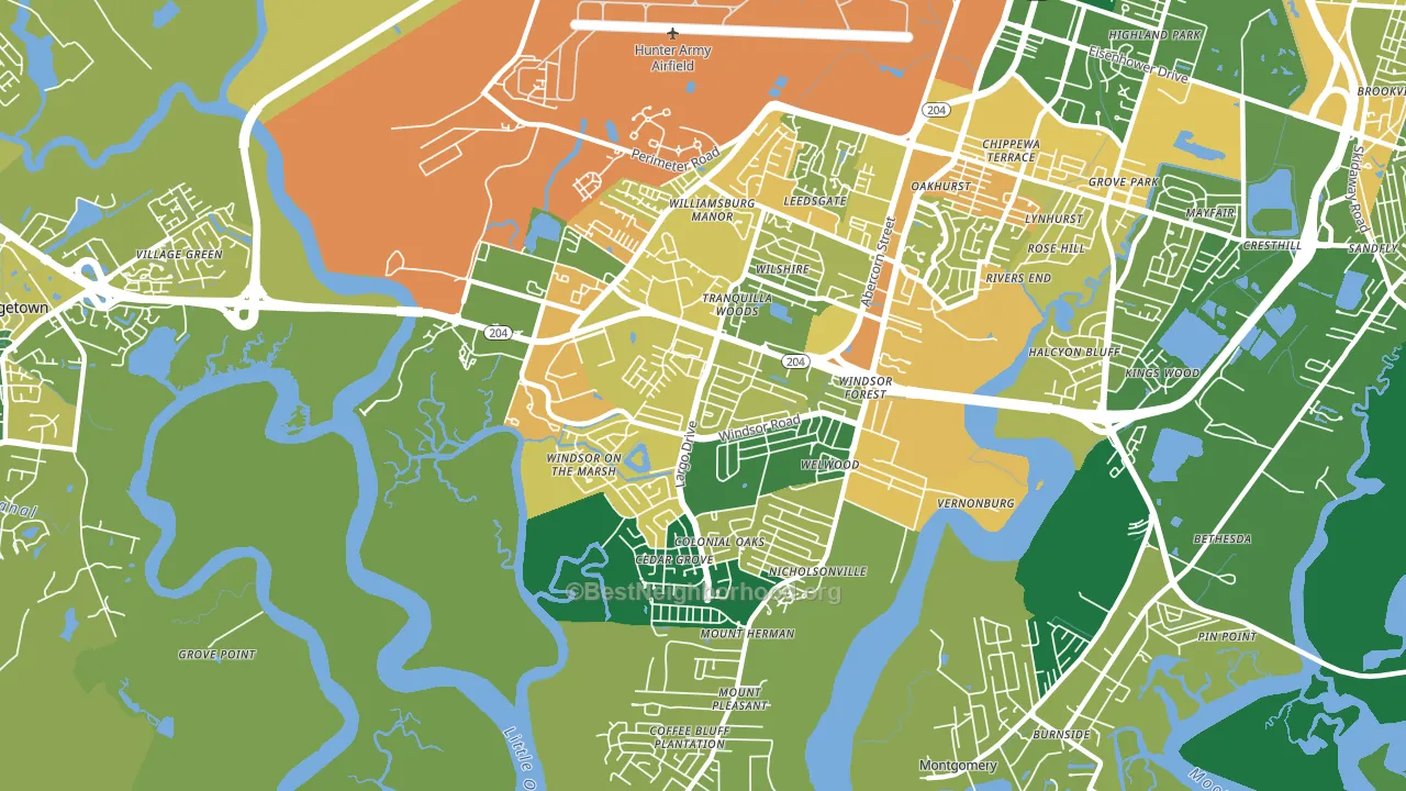
About 60% of adults in Windsor Forest typically vote, near the U.S. average of about 62%. Among adults in Windsor Forest, ~37% vote Democratic, ~23% Republican, and ~40% don't vote. The map below shows estimated turnout by block group.
How Windsor Forest compares
Among neighborhoods within 5 miles, Windsor Forest leans more Democratic than 2 of 4 neighbors.
Windsor Forest runs about 27 points more Democratic than Georgia as a whole. Georgia is roughly evenly split, and Windsor Forest sits clearly on the Democratic side.
Politics vary noticeably by block within Windsor Forest. The northeast side is the most Democratic-leaning (D+52) and the southeast side is the least Democratic-leaning (D+4), a spread of about 48 points.
Why Windsor Forest leans the way it does
This analysis examined 14,881 data points per neighborhood to find what predicts political lean and turnout. The items below are a few correlations that stood out for Windsor Forest, not a ranked or complete list of what matters most.
Windsor Forest votes against the grain of Georgia. Georgia is roughly evenly split, while Windsor Forest runs about 27 points more Democratic.
Cancer-screening access and voter turnout
Places with high colon-cancer-screening access tend to turn out at a higher rate; Windsor Forest, Savannah, GA sits in the top quarter nationally on this measure. Cancer screening does not drive turnout; it reflects income, insurance, and healthcare access.
Why turnout in Windsor Forest looks the way it does
Turnout in Windsor Forest sits close to the national pattern. Routine healthcare access, homeownership, education, and food security all land near their national averages here. Learn more about the findings and methodology on the political spectrum map.
Nearby Neighborhoods
- Wilshire Estates-Savannah Mall, Savannah, GA D+43
- Paradise Park, Savannah, GA D+29
- Hunter Army Airfield, Savannah, GA D+4
- Georgetown, Savannah, GA D+16
- Ardmore-Gould Estates-Olin Heights, Savannah, GA D+36
- Chatham Parkway, Savannah, GA D+42
- Midtown Savannah, Savannah, GA D+71
- Boltons Landing, Charleston, SC D+7
- White Gables, Summerville, SC R+27
- Charleston Historic District, Charleston, SC D+12
Neighborhoods with Similar Populations
- University Square, Tampa, FL D+36
- Bayshore Beautiful, Tampa, FL R+5
- South Park, Buffalo, NY D+7
- Venable, Charlottesville, VA D+59
- Five Mile Prairie, Spokane, WA R+13
- Hamilton Main Street Historic District, Hamilton, OH R+14
- Seward, Minneapolis, MN D+78
- South Bay, Eureka, CA D+14
- East Elmhurst, Queens, NY R+11
- Greenwood, Newport News, VA D+38
Sources and methodology
Precinct-level voting records used to fit the model come from Georgia Elections Division, distributed by the Voting and Election Science Team. Demographic inputs come from the U.S. Census Bureau (ACS 5-year estimates and the 2020 Decennial Census). Health and environmental inputs come from the CDC (PLACES and the Environmental Justice Index). Land cover comes from the USGS and EPA. Election-day and lead-up weather come from PRISM 4km daily grids and the NOAA Global Historical Climatology Network. Mail-voting and election-administration patterns come from the MIT Election Lab's Survey of the Performance of American Elections. Block-group crime detail comes from CrimeGrade. Internet data and modeling support provided by ISPreports.org.
Modeling and analysis by the BestNeighborhood data science team. Full methodology and findings: political spectrum map.
Methodology reviewed by the BestNeighborhood data team. Last updated May 2026.