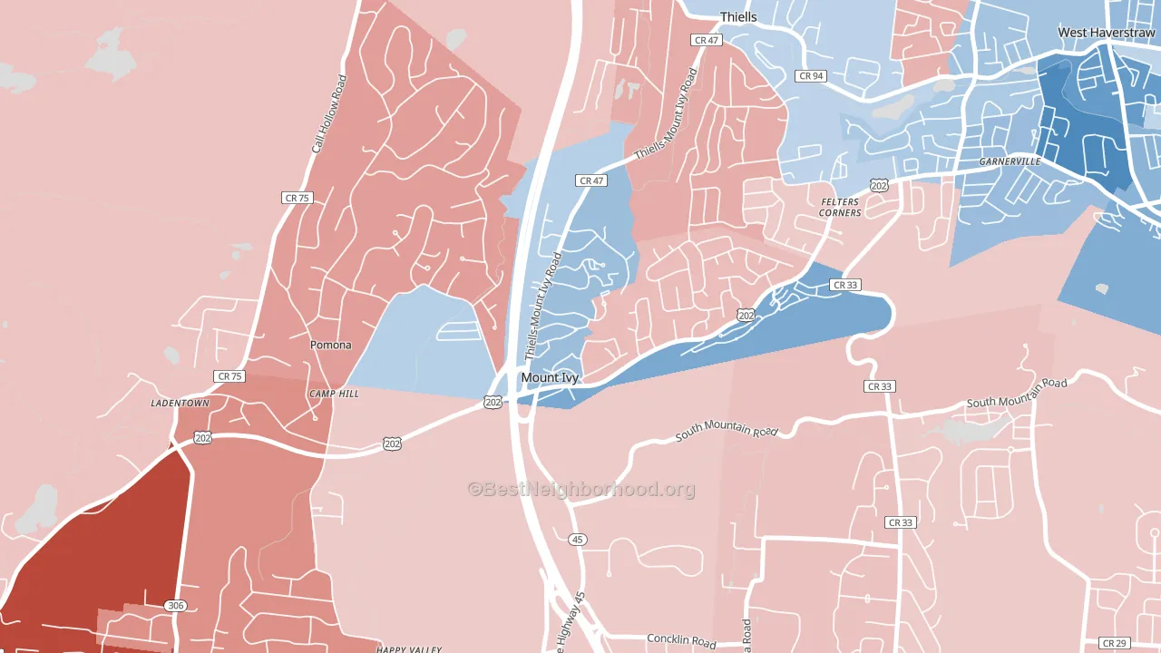
Mt Ivy is a true toss-up. About 50% of voters here vote Democratic and 50% Republican.
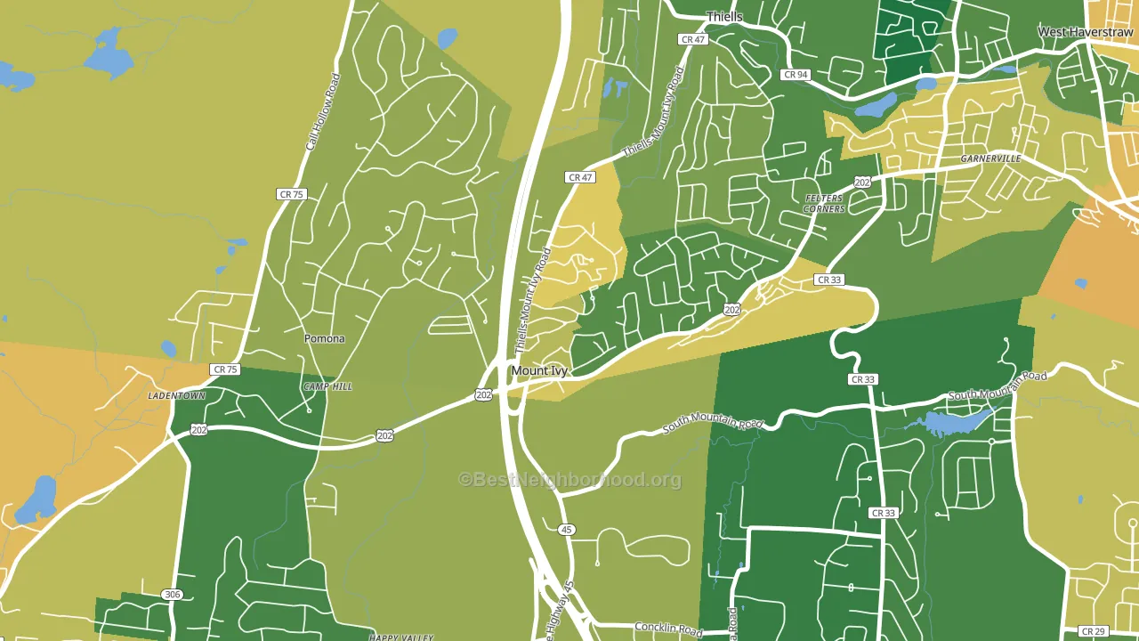
About 74% of adults in Mt Ivy typically vote, above the U.S. average of about 62%. Among adults in Mt Ivy, ~37% vote Democratic, ~37% Republican, and ~26% don't vote. The map below shows estimated turnout by block group.
How Mt Ivy compares
Mt Ivy runs about 14 points more Republican than New York as a whole. New York leans Democratic overall, while Mt Ivy sits closer to the political middle.
Politics vary noticeably by block within Mt Ivy. The south side runs the most Democratic (D+11) and the southeast side runs the most Republican (R+17), a spread of about 28 points.
Why Mt Ivy leans the way it does
This analysis examined 14,881 data points per neighborhood to find what predicts political lean and turnout. The items below are a few correlations that stood out for Mt Ivy, not a ranked or complete list of what matters most.
Mt Ivy votes against the grain of New York. New York leans Democratic overall, while Mt Ivy runs about 14 points more Republican.
Non-English at home and voter turnout
Places with a low non-English-at-home share tend to turn out at a higher rate; Mt Ivy, Pomona, NY sits in the bottom quarter nationally on this measure.
Why turnout in Mt Ivy looks the way it does
Turnout in Mt Ivy sits close to the national pattern. Routine healthcare access, homeownership, education, and food security all land near their national averages here. Learn more about the findings and methodology on the political spectrum map.
Nearby Neighborhoods
- Hillcrest, Spring Valley, NY R+10
- Viola, Monsey, NY R+70
- Bardonia, West Nyack, NY R+7
- Masonicus, Mahwah, NJ D+3
- Northwest Ridgewood, Ridgewood, NJ D+29
- Wortendyke, Midland Park, NJ R+2
- Downtown Ridgewood, Ridgewood, NJ D+30
- Southeast Ridgewood, Ridgewood, NJ D+25
- Ridgewood Junction, Glen Rock, NJ D+21
- Greenville, Scarsdale, NY D+27
Neighborhoods with Similar Populations
- Woodside Village, Largo, FL R+8
- Lower East, Santa Barbara, CA D+57
- North University, Tucson, AZ D+56
- Western Hills, Beaumont, TX D+21
- Alban Hills, Albuquerque, NM D+10
- Questa, Mountain House, CA D+10
- Lewelling, Milwaukie, OR D+39
- Nodine Hill, Yonkers, NY D+34
- Greenwood and Hamilton, Trenton, NJ D+64
- Arctic, West Warwick, RI D+8
Sources and methodology
Precinct-level voting records used to fit the model come from New York State Board of Elections, distributed by the Voting and Election Science Team. Demographic inputs come from the U.S. Census Bureau (ACS 5-year estimates and the 2020 Decennial Census). Health and environmental inputs come from the CDC (PLACES and the Environmental Justice Index). Land cover comes from the USGS and EPA. Election-day and lead-up weather come from PRISM 4km daily grids and the NOAA Global Historical Climatology Network. Mail-voting and election-administration patterns come from the MIT Election Lab's Survey of the Performance of American Elections. Block-group crime detail comes from CrimeGrade. Internet data and modeling support provided by ISPreports.org.
Modeling and analysis by the BestNeighborhood data science team. Full methodology and findings: political spectrum map.
Methodology reviewed by the BestNeighborhood data team. Last updated May 2026.