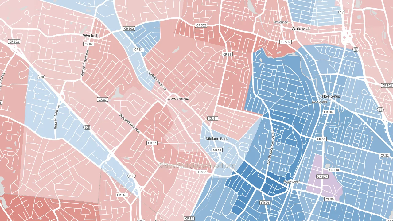
Wortendyke is a true toss-up. About 49% of voters here vote Democratic and 51% Republican.
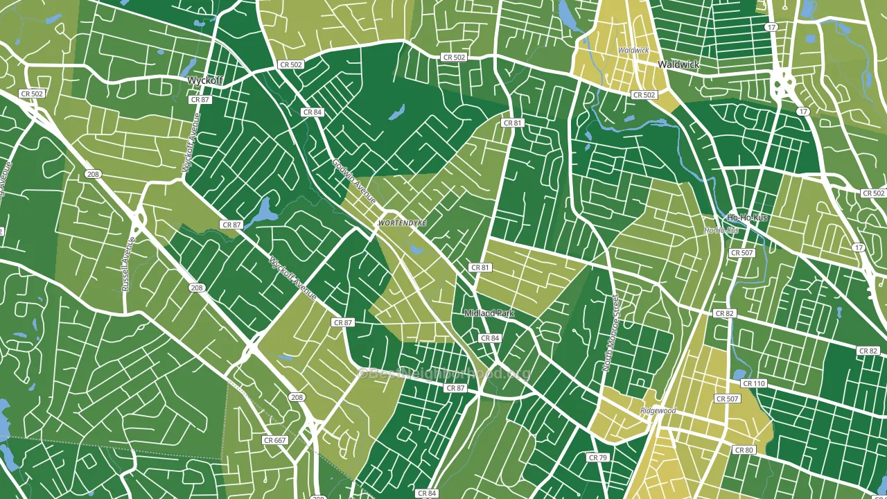
About 79% of adults in Wortendyke typically vote, above the U.S. average of about 62%. Among adults in Wortendyke, ~39% vote Democratic, ~40% Republican, and ~21% don't vote. The map below shows estimated turnout by block group.
How Wortendyke compares
Among neighborhoods within 5 miles, Wortendyke sits roughly in the middle of the political spectrum, with 5 neighbors leaning further in the place's direction and 0 leaning the other way.
Wortendyke runs about 8 points more Republican than New Jersey as a whole.
Politics vary noticeably by block within Wortendyke. The southeast side runs the most Democratic (D+5) and the northeast side runs the most Republican (R+9), a spread of about 14 points.
Why Wortendyke leans the way it does
This analysis examined 14,881 data points per neighborhood to find what predicts political lean and turnout. The items below are a few correlations that stood out for Wortendyke, not a ranked or complete list of what matters most.
Density pulls a place toward Democrats and a high white share pulls it toward Republicans. In Wortendyke the two roughly cancel.
Food insecurity and voter turnout
Places with low food insecurity tend to turn out at a higher rate; Wortendyke, Midland Park, NJ sits in the bottom quarter nationally on this measure. Food insecurity does not directly drive turnout; it reflects economic hardship, which lines up with lower voting.
Why turnout in Wortendyke looks the way it does
Areas with strong routine healthcare access turn out at higher rates. Wortendyke is in the top quarter nationally for routine-care measures such as insurance coverage, preventive screenings, and dental visits. The dental-visit rate here is about 75%, about 15 points above the U.S. average of 60%. Learn more about the findings and methodology on the political spectrum map.
Nearby Neighborhoods
- Northwest Ridgewood, Ridgewood, NJ D+29
- Downtown Ridgewood, Ridgewood, NJ D+30
- Ridgewood Junction, Glen Rock, NJ D+21
- Southeast Ridgewood, Ridgewood, NJ D+25
- Radburn, Fair Lawn, NJ D+8
- Warren Point, Fair Lawn, NJ Even
- Downtown Paterson, Paterson, NJ D+32
- Masonicus, Mahwah, NJ D+3
- Passaic Junction, Saddle Brook, NJ R+18
- Lake View, Paterson, NJ D+5
Neighborhoods with Similar Populations
- Crooked River Ranch, Terrebonne, OR R+43
- Landon Branch, Waco, TX R+16
- College View, Starkville, MS D+4
- Eden Isle, Horizon West, FL R+6
- Glacier View, Everett, WA D+16
- Johnson Ranch, Roseville, CA R+2
- Grand Park, Jacksonville, FL D+84
- Prairie Hills, Madison, WI D+64
- El Paso Lower Valley, El Paso, TX D+26
- Medical District, Memphis, TN D+71
Sources and methodology
Precinct-level voting records used to fit the model come from New Jersey Division of Elections, distributed by the Voting and Election Science Team. Demographic inputs come from the U.S. Census Bureau (ACS 5-year estimates and the 2020 Decennial Census). Health and environmental inputs come from the CDC (PLACES and the Environmental Justice Index). Land cover comes from the USGS and EPA. Election-day and lead-up weather come from PRISM 4km daily grids and the NOAA Global Historical Climatology Network. Mail-voting and election-administration patterns come from the MIT Election Lab's Survey of the Performance of American Elections. Block-group crime detail comes from CrimeGrade. Internet data and modeling support provided by ISPreports.org.
Modeling and analysis by the BestNeighborhood data science team. Full methodology and findings: political spectrum map.
Methodology reviewed by the BestNeighborhood data team. Last updated May 2026.