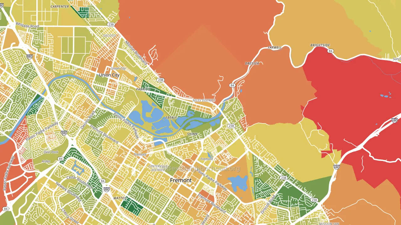
Niles Junction leans heavily Democratic by roughly 32 points: about 66% of voters vote Democratic and 34% Republican.
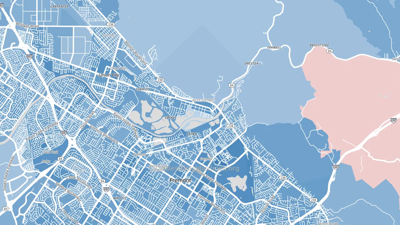
About 58% of adults in Niles Junction typically vote, near the U.S. average of about 62%. Among adults in Niles Junction, ~38% vote Democratic, ~20% Republican, and ~42% don't vote. The map below shows estimated turnout by block group.
How Niles Junction compares
Among neighborhoods within 5 miles, Niles Junction is the least Democratic-leaning.
Niles Junction runs about 11 points more Democratic than California as a whole.
Politics vary noticeably by block within Niles Junction. The northwest side is the most Democratic-leaning (D+37) and the southwest side is the least Democratic-leaning (D+21), a spread of about 16 points.
Why Niles Junction leans the way it does
Density, race composition, education, and family structure all sit close to their national averages in Niles Junction. The lean here lands roughly where demographic data alone would predict.
Population density and Democratic lean
Places with high population density tend to lean Democratic; Niles Junction, Fremont, CA sits in the top quarter nationally on this measure.
Why turnout in Niles Junction looks the way it does
Crowded housing lines up with lower turnout. About 6% of homes in Niles Junction have more than one occupant per room, above 81% of neighborhoods. Strong routine healthcare access lines up with higher turnout, and Niles Junction sits in the top quarter on routine-care measures. Learn more about the findings and methodology on the political spectrum map.
Nearby Neighborhoods
- Parkmont, Fremont, CA D+36
- Downtown Fremont, Fremont, CA D+37
- Sundale, Fremont, CA D+34
- Ardenwood, Fremont, CA D+36
- Fairway Park, Hayward, CA D+36
- Contempo, Union City, CA D+30
- Mission-Garin, Hayward, CA D+43
- Tennyson-Alquire, Hayward, CA D+35
- Hayward Highland, Hayward, CA D+41
- Whitman-Mocine, Hayward, CA D+33
Neighborhoods with Similar Populations
- Murphy Creek, Aurora, CO D+5
- Clarkdale, Culver City, CA D+38
- Imperial Oaks, Spring, TX R+32
- Colonial Village, Teaneck, NJ D+29
- Cannon Heights, Dalton, GA D+4
- Fremont Park, Glendale, CA D+12
- Winnona Park, Decatur, GA D+69
- Austin Estates, Barberton, OH R+6
- Toluca Lake, North Hollywood, CA D+37
- Tiger Hole-Secret Woods, Jacksonville, FL R+17
Sources and methodology
Precinct-level voting records used to fit the model come from California Secretary of State, Elections, distributed by the Voting and Election Science Team. Demographic inputs come from the U.S. Census Bureau (ACS 5-year estimates and the 2020 Decennial Census). Health and environmental inputs come from the CDC (PLACES and the Environmental Justice Index). Land cover comes from the USGS and EPA. Election-day and lead-up weather come from PRISM 4km daily grids and the NOAA Global Historical Climatology Network. Mail-voting and election-administration patterns come from the MIT Election Lab's Survey of the Performance of American Elections. Block-group crime detail comes from CrimeGrade. Internet data and modeling support provided by ISPreports.org.
Modeling and analysis by the BestNeighborhood data science team. Full methodology and findings: political spectrum map.
Methodology reviewed by the BestNeighborhood data team. Last updated May 2026.