Perry County is a Republican stronghold. About 24% of voters here vote Democratic and 76% Republican.
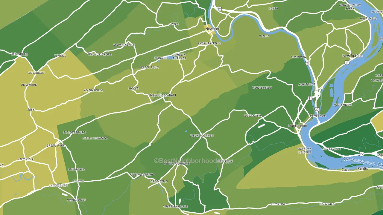
About 75% of adults in Perry County typically vote, above the U.S. average of about 62%. Among adults in Perry County, ~18% vote Democratic, ~57% Republican, and ~25% don't vote. The map below shows estimated turnout by block group.
How Perry County compares
Among counties within 50 miles, Perry County leans more Republican than 12 of 14 neighbors.
Perry County runs about 51 points more Republican than Pennsylvania as a whole.
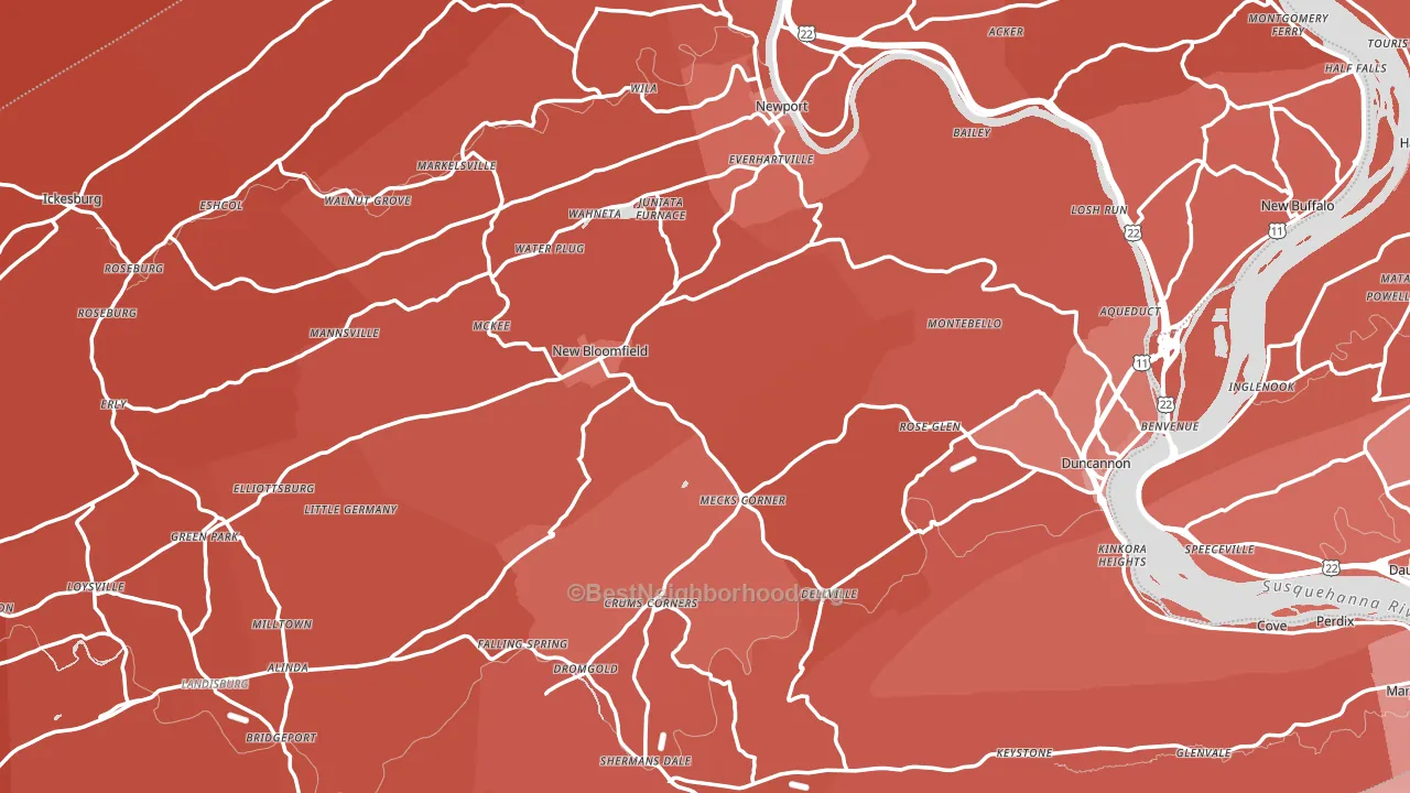
Politics vary noticeably by city within Perry County. The southwest side is the most Republican-leaning (R+63) and the southeast side is the least Republican-leaning (R+40), a spread of about 23 points.
Why Perry County leans the way it does
This analysis examined 14,881 data points per county to find what predicts political lean and turnout. The items below are a few correlations that stood out for Perry County, not a ranked or complete list of what matters most.
Areas with many family households vote Republican. About 70% of households in Perry County are family households, above 79% of counties.
Preventive-care access and voter turnout
Places with strong routine preventive-care access tend to turn out at a higher rate; Perry County, PA sits above the national average on this measure. Dental visits do not drive turnout; the rate reflects income, insurance, and healthcare access, which line up with who votes.
Why turnout in Perry County looks the way it does
Homeowners vote more often than renters. About 82% of households in Perry County own their home, about 7 points above the U.S. average of 75%. Learn more about the findings and methodology on the political spectrum map.
Nearby Counties
- Juniata County, PA R+62
- Cumberland County, PA R+9
- Dauphin County, PA D+12
- Snyder County, PA R+50
- Mifflin County, PA R+58
- Lebanon County, PA R+31
- Adams County, PA R+35
- York County, PA R+21
- Union County, PA R+26
- Northumberland County, PA R+39
Counties with Similar Populations
- Osage County, OK R+39
- Caldwell County, TX R+17
- Thomas County, GA R+18
- Colquitt County, GA R+36
- Windham County, VT D+28
- Hillsdale County, MI R+43
- Greene County, AR R+58
- Habersham County, GA R+55
- Hancock County, MS R+53
- Bryan County, OK R+54
Sources and methodology
Precinct-level voting records used to fit the model come from Pennsylvania Department of State, Bureau of Elections, distributed by the Voting and Election Science Team. Demographic inputs come from the U.S. Census Bureau (ACS 5-year estimates and the 2020 Decennial Census). Health and environmental inputs come from the CDC (PLACES and the Environmental Justice Index). Land cover comes from the USGS and EPA. Election-day and lead-up weather come from PRISM 4km daily grids and the NOAA Global Historical Climatology Network. Mail-voting and election-administration patterns come from the MIT Election Lab's Survey of the Performance of American Elections. Block-group crime detail comes from CrimeGrade. Internet data and modeling support provided by ISPreports.org.
Modeling and analysis by the BestNeighborhood data science team. Full methodology and findings: political spectrum map.
Methodology reviewed by the BestNeighborhood data team. Last updated May 2026.