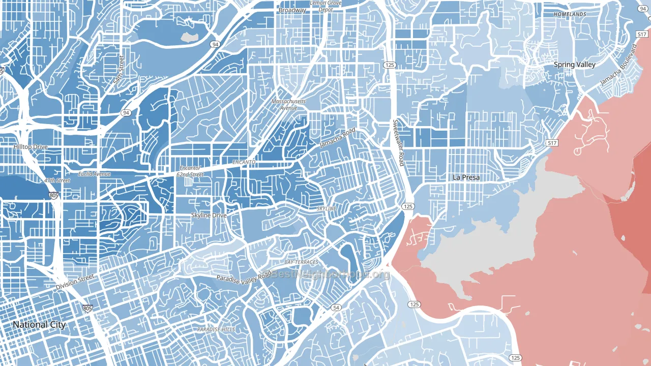
Sky Line leans heavily Democratic by roughly 34 points: about 67% of voters vote Democratic and 33% Republican.
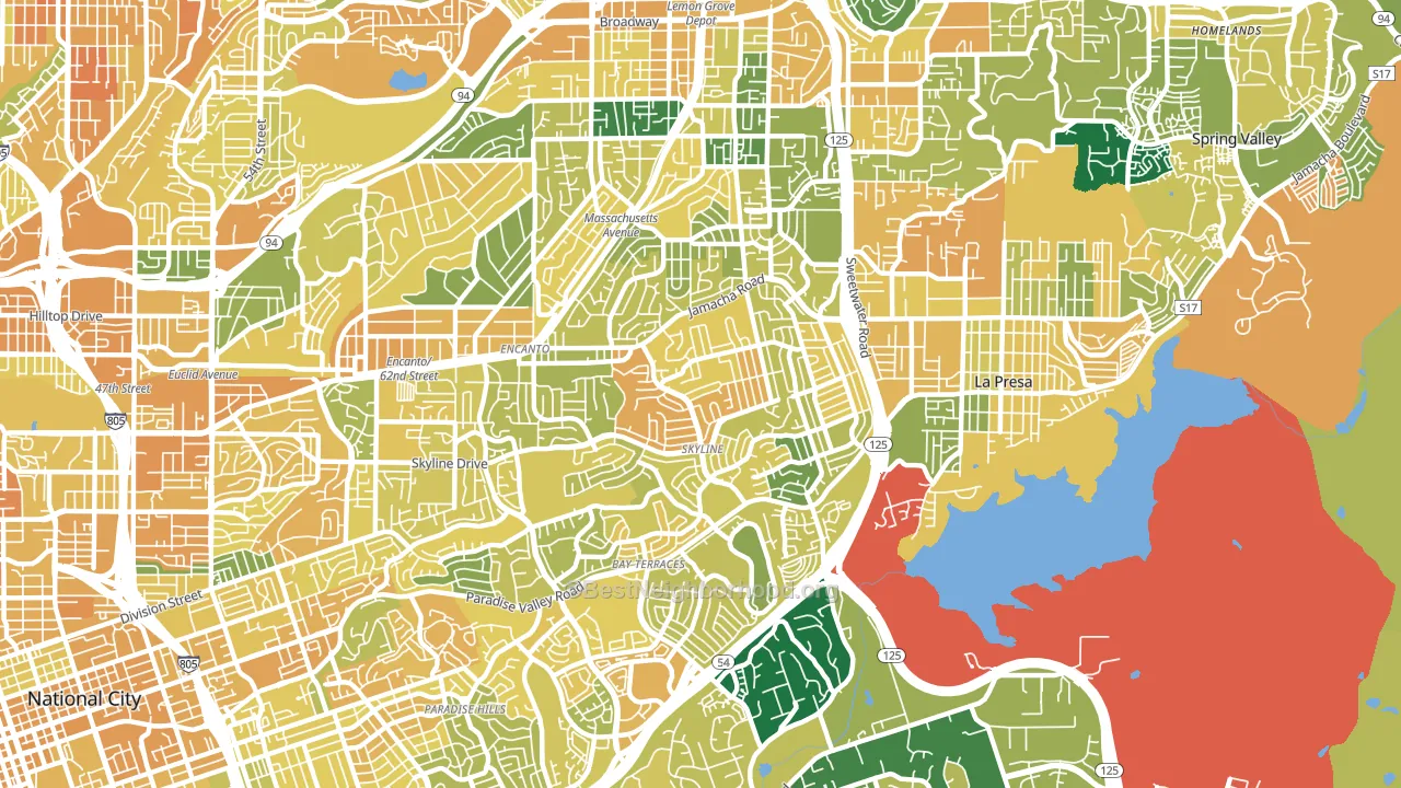
About 56% of adults in Sky Line typically vote, below the U.S. average of about 62%. Among adults in Sky Line, ~38% vote Democratic, ~18% Republican, and ~44% don't vote. The map below shows estimated turnout by block group.
How Sky Line compares
Among neighborhoods within 5 miles, Sky Line leans more Democratic than 15 of 25 neighbors.
Sky Line runs about 13 points more Democratic than California as a whole.
Politics vary noticeably by block within Sky Line. The southwest side is the most Democratic-leaning (D+47) and the northeast side is the least Democratic-leaning (D+18), a spread of about 30 points.
Why Sky Line leans the way it does
Density, race composition, education, and family structure all sit close to their national averages in Sky Line. The lean here lands roughly where demographic data alone would predict.
Preventive-care access and voter turnout
Places with limited routine preventive-care access tend to turn out at a lower rate; Sky Line, San Diego, CA sits below the national average on this measure. Dental visits do not drive turnout; the rate reflects income, insurance, and healthcare access, which line up with who votes.
Why turnout in Sky Line looks the way it does
Crowded housing lines up with lower turnout. About 7% of homes in Sky Line have more than one occupant per room, above 85% of neighborhoods. Learn more about the findings and methodology on the political spectrum map.
Nearby Neighborhoods
- Jomacha-Lomita, San Diego, CA D+29
- Bay Terraces, San Diego, CA D+20
- Encanto, San Diego, CA D+29
- Alta Vista, San Diego, CA D+20
- Valencia Park, San Diego, CA D+45
- Emerald Hills, San Diego, CA D+45
- Paradise Hills, San Diego, CA D+21
- Oak Park, San Diego, CA D+30
- Darnall, San Diego, CA D+31
- Lincoln Park, San Diego, CA D+40
Neighborhoods with Similar Populations
- Jenkins-Pinecroft, Shreveport, LA D+33
- River Mountain, Little Rock, AR D+9
- Glenville, Cleveland, OH D+87
- Egger Highlands, San Diego, CA D+16
- St. Francis, Daly City, CA D+35
- Vista East, Orlando, FL D+4
- Washington Park, Chicago, IL D+81
- Myers Park, Charlotte, NC D+9
- Baldwin Park, Orlando, FL D+10
- Southside, Toledo, OH D+34
Sources and methodology
Precinct-level voting records used to fit the model come from California Secretary of State, Elections, distributed by the Voting and Election Science Team. Demographic inputs come from the U.S. Census Bureau (ACS 5-year estimates and the 2020 Decennial Census). Health and environmental inputs come from the CDC (PLACES and the Environmental Justice Index). Land cover comes from the USGS and EPA. Election-day and lead-up weather come from PRISM 4km daily grids and the NOAA Global Historical Climatology Network. Mail-voting and election-administration patterns come from the MIT Election Lab's Survey of the Performance of American Elections. Block-group crime detail comes from CrimeGrade. Internet data and modeling support provided by ISPreports.org.
Modeling and analysis by the BestNeighborhood data science team. Full methodology and findings: political spectrum map.
Methodology reviewed by the BestNeighborhood data team. Last updated May 2026.