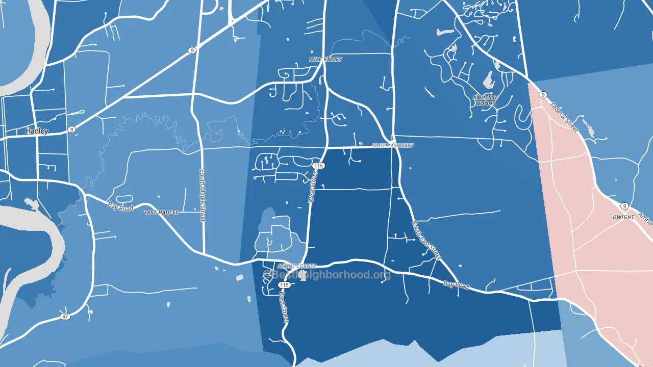
South Amherst is a Democratic stronghold. About 85% of voters here vote Democratic and 15% Republican.
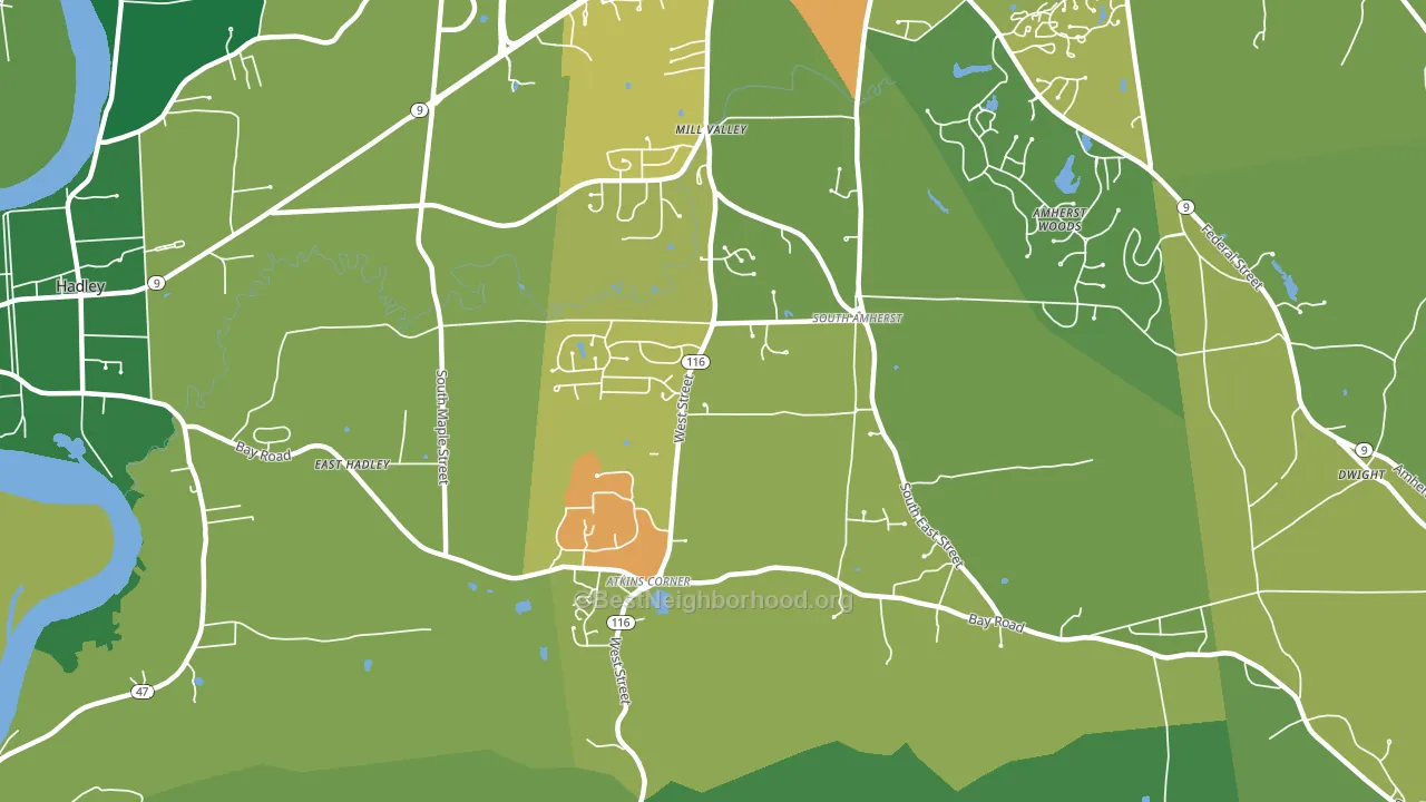
About 71% of adults in South Amherst typically vote, above the U.S. average of about 62%. Among adults in South Amherst, ~60% vote Democratic, ~11% Republican, and ~29% don't vote. The map below shows estimated turnout by block group.
How South Amherst compares
South Amherst runs about 46 points more Democratic than Massachusetts as a whole.
Politics vary noticeably by block within South Amherst. The south side is the most Democratic-leaning (D+78) and the southwest side is the least Democratic-leaning (D+66), a spread of about 12 points.
Why South Amherst leans the way it does
This analysis examined 14,881 data points per neighborhood to find what predicts political lean and turnout. The items below are a few correlations that stood out for South Amherst, not a ranked or complete list of what matters most.
Areas with high college attainment vote Democratic. About 67% of adults in South Amherst hold a bachelor's degree, about 39 points above the U.S. average of 28%. A high never-married share predicts Democratic voting, and about 47% of adults in South Amherst have never been married, above 76% of neighborhoods.
High-school completion, developed land, and voter turnout
Places that combine high-school-completion-heavy adults and a rural land-use pattern tend to turn out at a higher rate, as South Amherst, Amherst, MA does.
Why turnout in South Amherst looks the way it does
Areas with strong routine healthcare access turn out at higher rates. South Amherst is in the top quarter nationally for routine-care measures such as insurance coverage, preventive screenings, and dental visits. The dental-visit rate here is about 77%, about 17 points above the U.S. average of 60%. Learn more about the findings and methodology on the political spectrum map.
Nearby Neighborhoods
- East Village, Amherst, MA D+74
- North Amherst, Amherst, MA D+75
- East Springfield, Springfield, MA D+19
- Boston Road, Springfield, MA D+24
- Pine Point, Springfield, MA D+41
- Liberty Heights, Springfield, MA D+34
- Bay, Springfield, MA D+56
- McKnight, Springfield, MA D+55
- Sixteen Acres, Springfield, MA D+20
- Upper Hill, Springfield, MA D+65
Neighborhoods with Similar Populations
- Marriott's Griffin Gate Golf Culb, Lexington, KY D+57
- Springfield, Jacksonville, FL D+51
- Fair Oaks, North Fair Oaks, CA D+54
- Augusta Street Area, Greenville, SC R+4
- Stephens, Little Rock, AR D+71
- Belmont-Charlottesville, Charlottesville, VA D+61
- Plymouth Village, Redlands, CA D+8
- Huguenot, Richmond, VA D+21
- Las Vistas, Tucson, AZ D+44
- Nassau Shores, East Massapequa, NY R+33
Sources and methodology
Precinct-level voting records used to fit the model come from Massachusetts Secretary of the Commonwealth, Elections, distributed by the Voting and Election Science Team. Demographic inputs come from the U.S. Census Bureau (ACS 5-year estimates and the 2020 Decennial Census). Health and environmental inputs come from the CDC (PLACES and the Environmental Justice Index). Land cover comes from the USGS and EPA. Election-day and lead-up weather come from PRISM 4km daily grids and the NOAA Global Historical Climatology Network. Mail-voting and election-administration patterns come from the MIT Election Lab's Survey of the Performance of American Elections. Block-group crime detail comes from CrimeGrade. Internet data and modeling support provided by ISPreports.org.
Modeling and analysis by the BestNeighborhood data science team. Full methodology and findings: political spectrum map.
Methodology reviewed by the BestNeighborhood data team. Last updated May 2026.