South Side leans Democratic by roughly 20 points: about 60% of voters vote Democratic and 40% Republican.
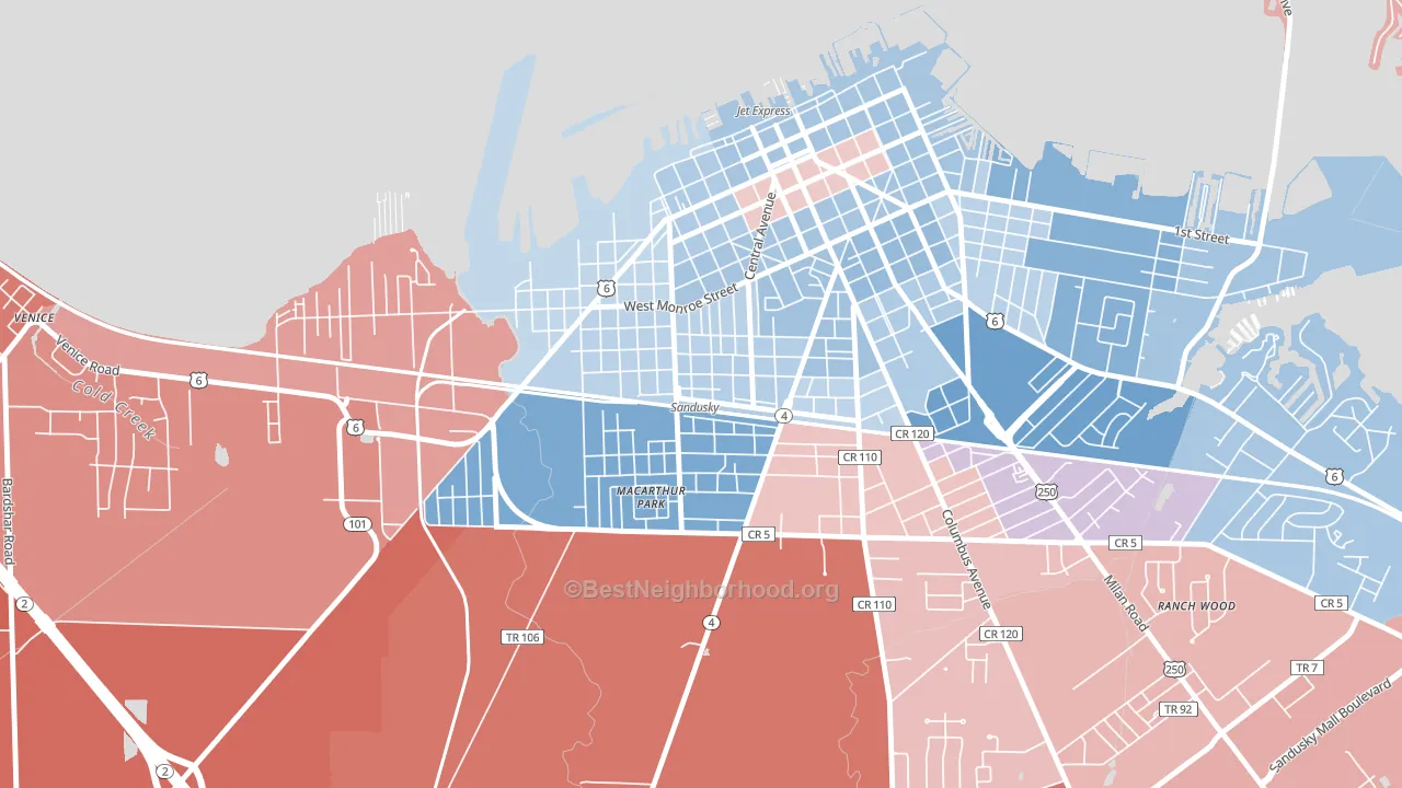
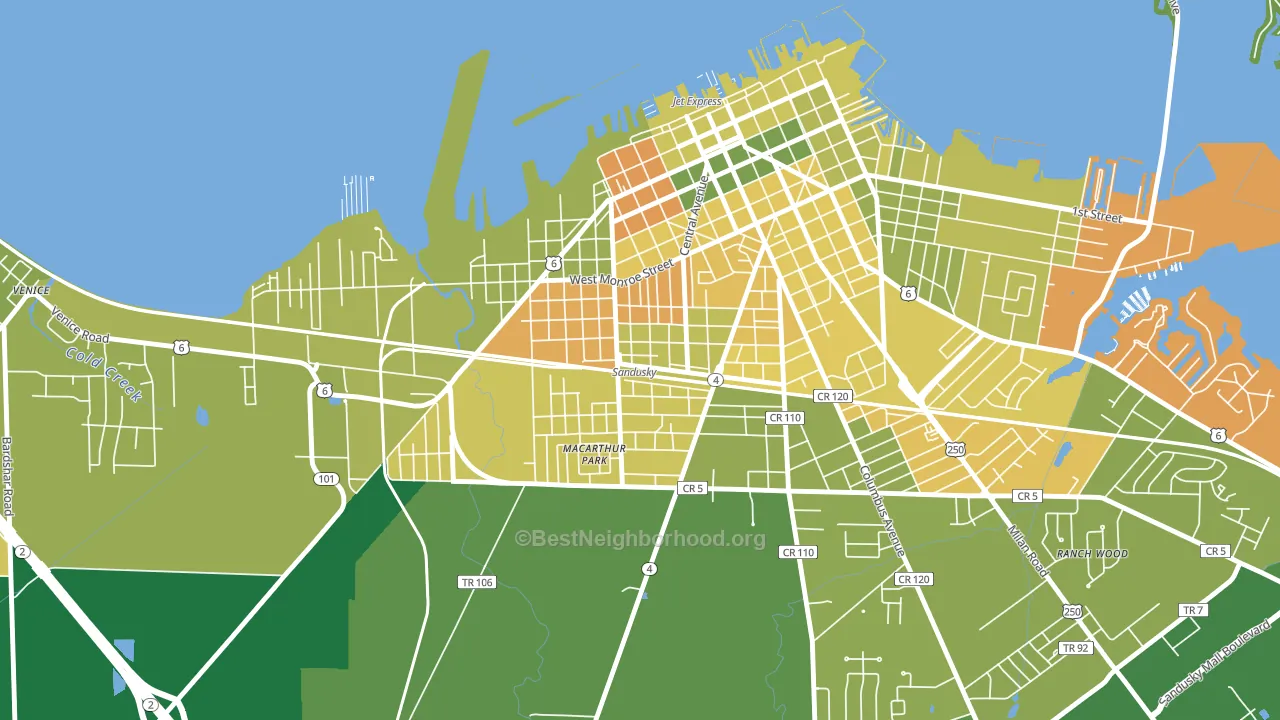
About 52% of adults in South Side typically vote, below the U.S. average of about 62%. Among adults in South Side, ~31% vote Democratic, ~21% Republican, and ~48% don't vote. The map below shows estimated turnout by block group.
How South Side compares
South Side runs about 31 points more Democratic than Ohio as a whole. Ohio leans Republican overall, while South Side is one of the few Democratic-leaning pockets.
Politics vary noticeably by block within South Side. The south side is the most Democratic-leaning (D+30) and the northwest side is the least Democratic-leaning (D+13), a spread of about 17 points.
Why South Side leans the way it does
This analysis examined 14,881 data points per neighborhood to find what predicts political lean and turnout. The items below are a few correlations that stood out for South Side, not a ranked or complete list of what matters most.
South Side votes against the grain of Ohio. Ohio leans Republican overall, while South Side runs about 31 points more Democratic. A high never-married share predicts Democratic voting, and about 51% of adults in South Side have never been married, above 83% of neighborhoods.
Preventive-care access and voter turnout
Places with limited routine preventive-care access tend to turn out at a lower rate; South Side, Sandusky, OH sits in the bottom quarter nationally on this measure. Dental visits do not drive turnout; the rate reflects income, insurance, and healthcare access, which line up with who votes.
Why turnout in South Side looks the way it does
Turnout in South Side sits close to the national pattern. Routine healthcare access, homeownership, education, and food security all land near their national averages here. Learn more about the findings and methodology on the political spectrum map.
Nearby Neighborhoods
- Garden District, Sandusky, OH D+14
- West Main Street Historic District, Norwalk, OH R+28
- Downtown Fremont Historic District, Fremont, OH R+4
- Downtown Lorain, Lorain, OH D+15
- South Lorain, Lorain, OH D+21
- Downtown Elyria, Elyria, OH D+15
- Shelby Center Historic District, Shelby, OH R+43
- Downtown Fostoria, Fostoria, OH R+15
- Birmingham, Toledo, OH D+12
- East Toledo, Toledo, OH D+15
Neighborhoods with Similar Populations
- Arena District, San Antonio, TX D+44
- West Downtown Dearborn, Dearborn, MI D+8
- West del Paso Heights, Sacramento, CA D+31
- Marlborough Heights-Marlborough Pride, Kansas City, MO D+67
- Pearl-Meigs-Monroe, Rochester, NY D+61
- Overbrook, Pittsburgh, PA D+4
- Overlook Park, Allentown, PA D+26
- Dahlman, Omaha, NE D+38
- Mills Estates, Burlingame, CA D+43
- Parkmont, Fremont, CA D+36
Sources and methodology
Precinct-level voting records used to fit the model come from Ohio Secretary of State, Elections, distributed by the Voting and Election Science Team. Demographic inputs come from the U.S. Census Bureau (ACS 5-year estimates and the 2020 Decennial Census). Health and environmental inputs come from the CDC (PLACES and the Environmental Justice Index). Land cover comes from the USGS and EPA. Election-day and lead-up weather come from PRISM 4km daily grids and the NOAA Global Historical Climatology Network. Mail-voting and election-administration patterns come from the MIT Election Lab's Survey of the Performance of American Elections. Block-group crime detail comes from CrimeGrade. Internet data and modeling support provided by ISPreports.org.
Modeling and analysis by the BestNeighborhood data science team. Full methodology and findings: political spectrum map.
Methodology reviewed by the BestNeighborhood data team. Last updated May 2026.