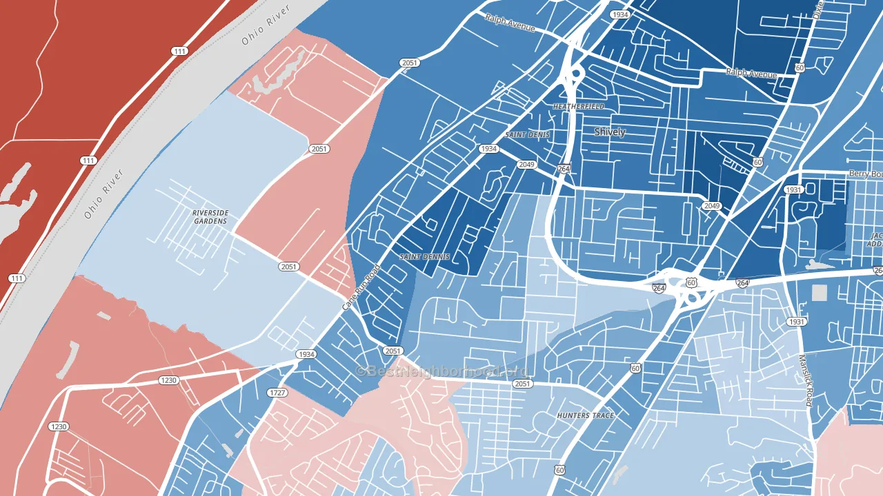
St. Dennis leans heavily Democratic by roughly 38 points: about 69% of voters vote Democratic and 31% Republican.
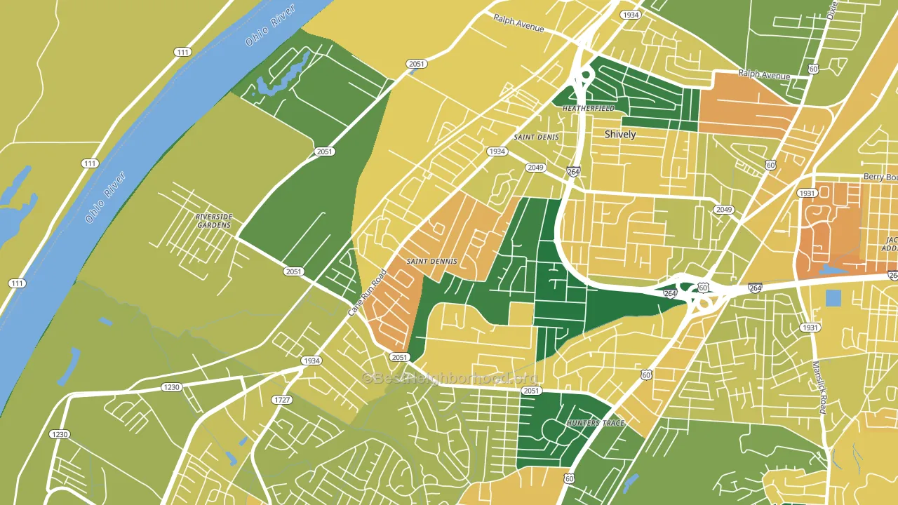
About 61% of adults in St. Dennis typically vote, near the U.S. average of about 62%. Among adults in St. Dennis, ~42% vote Democratic, ~19% Republican, and ~39% don't vote. The map below shows estimated turnout by block group.
How St. Dennis compares
Among neighborhoods within 5 miles, St. Dennis leans more Democratic than 6 of 15 neighbors.
St. Dennis runs about 69 points more Democratic than Kentucky as a whole. Kentucky leans Republican overall, while St. Dennis is one of the few Democratic-leaning pockets.
Politics vary noticeably by block within St. Dennis. The northeast side is the most Democratic-leaning (D+60) and the southeast side is the least Democratic-leaning (D+9), a spread of about 51 points.
Why St. Dennis leans the way it does
This analysis examined 14,881 data points per neighborhood to find what predicts political lean and turnout. The items below are a few correlations that stood out for St. Dennis, not a ranked or complete list of what matters most.
St. Dennis votes against the grain of Kentucky. Kentucky leans Republican overall, while St. Dennis runs about 69 points more Democratic.
Adult tooth loss and voter turnout
Places with a high adult tooth-loss rate tend to turn out at a lower rate; St. Dennis, Louisville, KY sits in the top tenth nationally on this measure. Tooth loss does not drive turnout; it reflects age, income, and healthcare access.
Why turnout in St. Dennis looks the way it does
Areas with low high-school completion turn out at lower rates. About 83% of adults in St. Dennis have completed high school, about 7 points below the U.S. average of 90%. Learn more about the findings and methodology on the political spectrum map.
Nearby Neighborhoods
- Cloverleaf, Louisville, KY D+10
- Jacobs, Louisville, KY D+53
- Pleasure Ridge Park, Louisville, KY R+2
- Park Duvalle, Louisville, KY D+88
- Taylor Berry, Louisville, KY D+43
- Iroquois, Louisville, KY D+23
- Wyandotte, Louisville, KY D+23
- Beechmont, Louisville, KY D+24
- Chickasaw, Louisville, KY D+89
- Parkland, Louisville, KY D+90
Neighborhoods with Similar Populations
- Wynken Blynken anchor Nod, Hialeah, FL R+43
- North Broadway, Escondido, CA Even
- Carmel Mountain, San Diego, CA D+26
- West End, Fontana, CA D+13
- Downtown High Point, High Point, NC D+51
- Franklin To The Fort, Missoula, MT D+29
- East San Gabriel, San Gabriel, CA D+20
- Temple Crest, Tampa, FL D+48
- oakwood, Dayton, OH D+33
- Nubian Square, Boston, MA D+65
Sources and methodology
Precinct-level voting records used to fit the model come from Kentucky State Board of Elections, distributed by the Voting and Election Science Team. Demographic inputs come from the U.S. Census Bureau (ACS 5-year estimates and the 2020 Decennial Census). Health and environmental inputs come from the CDC (PLACES and the Environmental Justice Index). Land cover comes from the USGS and EPA. Election-day and lead-up weather come from PRISM 4km daily grids and the NOAA Global Historical Climatology Network. Mail-voting and election-administration patterns come from the MIT Election Lab's Survey of the Performance of American Elections. Block-group crime detail comes from CrimeGrade. Internet data and modeling support provided by ISPreports.org.
Modeling and analysis by the BestNeighborhood data science team. Full methodology and findings: political spectrum map.
Methodology reviewed by the BestNeighborhood data team. Last updated May 2026.