Cloverleaf leans slightly Democratic by roughly 10 points: about 55% of voters vote Democratic and 45% Republican.
[sc name="abovemapcta"]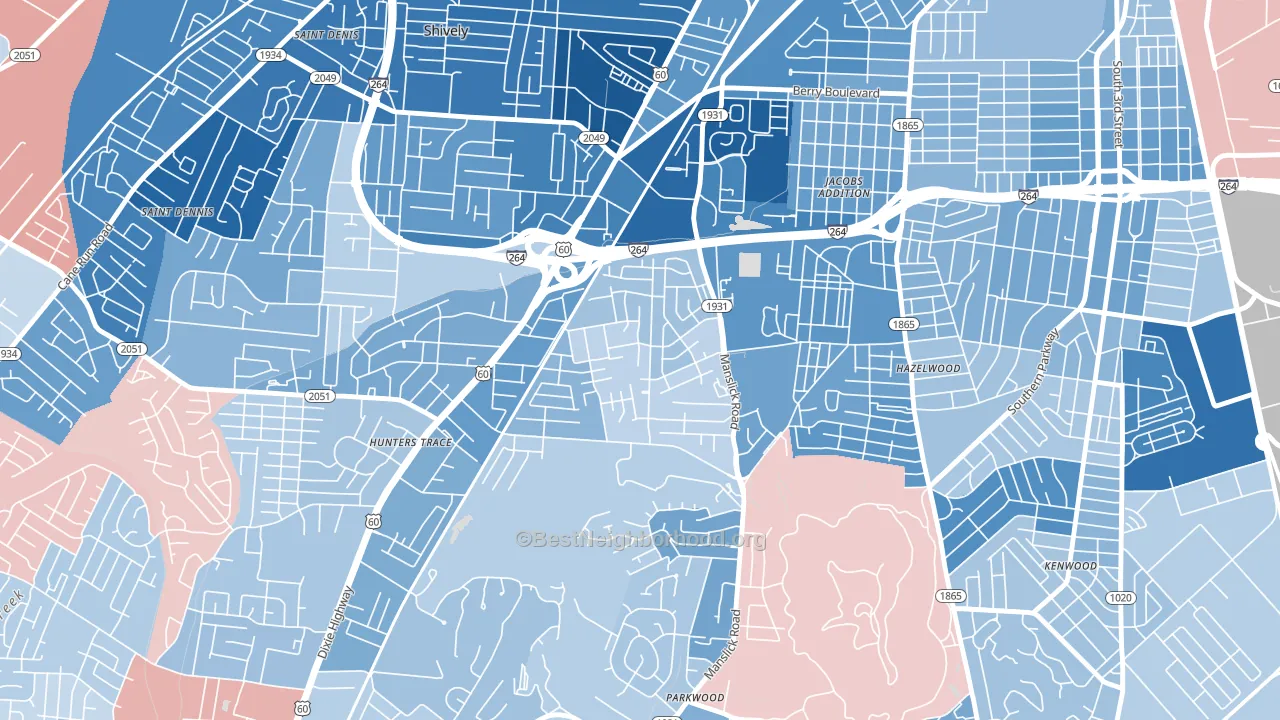 [bestneighborhood_map_controls]
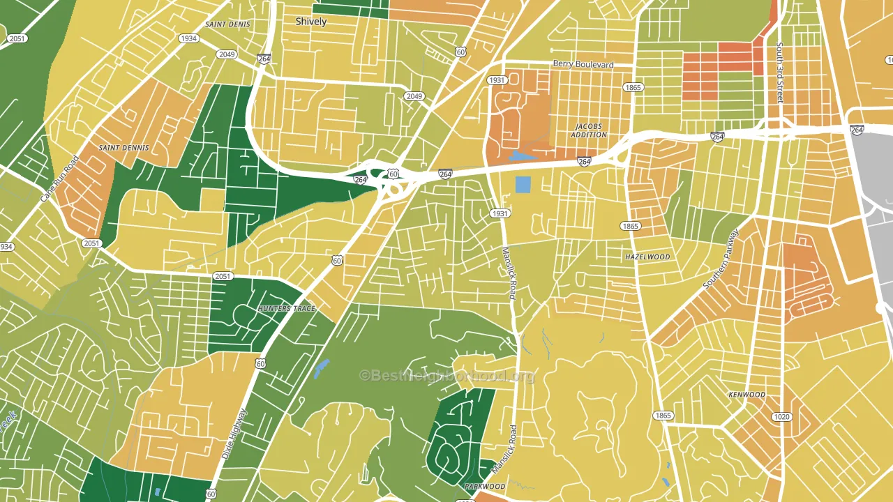
About 60% of adults in Cloverleaf typically vote, near the U.S. average of about 62%. Among adults in Cloverleaf, ~33% vote Democratic, ~27% Republican, and ~40% don't vote. The map below shows estimated turnout by block group.
 [bestneighborhood_map_controls]
How Cloverleaf compares
Among neighborhoods within 5 miles, Cloverleaf leans more Democratic than 1 of 19 neighbors.
Cloverleaf runs about 40 points more Democratic than Kentucky as a whole. Kentucky leans Republican overall, while Cloverleaf is one of the few Democratic-leaning pockets.
Politics vary noticeably by block within Cloverleaf. The southwest side is the most Democratic-leaning (D+15) and the southeast side is the least Democratic-leaning (D+4), a spread of about 11 points.
Why Cloverleaf leans the way it does
This analysis examined 14,881 data points per neighborhood to find what predicts political lean and turnout. The items below are a few correlations that stood out for Cloverleaf, not a ranked or complete list of what matters most.
Dense areas vote Democratic. More than 99% of residents in Cloverleaf live in densely developed areas, about 64 points above the U.S. average of 36%. Cloverleaf runs against the grain of Kentucky, a Democratic-leaning pocket in a Republican-leaning state.
Population density and Democratic lean
Places with high population density tend to lean Democratic; Cloverleaf, Louisville, KY sits above the national average on this measure.
Why turnout in Cloverleaf looks the way it does
Turnout in Cloverleaf sits close to the national pattern. Routine healthcare access, homeownership, education, and food security all land near their national averages here. Learn more about the findings and methodology on the political spectrum map.
[one_half]Nearby Neighborhoods
- Jacobs, Louisville, KY D+53
- Iroquois, Louisville, KY D+23
- Beechmont, Louisville, KY D+24
- Wyandotte, Louisville, KY D+23
- St. Dennis, Louisville, KY D+39
- Southside, Louisville, KY D+31
- Taylor Berry, Louisville, KY D+43
- South Louisville, Louisville, KY D+40
- Pleasure Ridge Park, Louisville, KY R+2
- Algonquin, Louisville, KY D+72
Neighborhoods with Similar Populations
- Turtle Run, Coral Springs, FL D+24
- Old Palo Alto, Palo Alto, CA D+69
- Park Central, Orlando, FL D+37
- Larkinville, Buffalo, NY D+63
- San Pedro, Robstown, TX D+19
- Noralto, Sacramento, CA D+34
- Hewitt Area, Greensboro, NC D+60
- Downtown Waterford, Waterford, CA R+23
- Nasons Corner, Portland, ME D+37
- Midtown, Reno, NV D+36
Sources and methodology
Precinct-level voting records used to fit the model come from Kentucky State Board of Elections, distributed by the Voting and Election Science Team. Demographic inputs come from the U.S. Census Bureau (ACS 5-year estimates and the 2020 Decennial Census). Health and environmental inputs come from the CDC (PLACES and the Environmental Justice Index). Land cover comes from the USGS and EPA. Election-day and lead-up weather come from PRISM 4km daily grids and the NOAA Global Historical Climatology Network. Mail-voting and election-administration patterns come from the MIT Election Lab's Survey of the Performance of American Elections. Block-group crime detail comes from CrimeGrade. Internet data and modeling support provided by ISPreports.org.
Modeling and analysis by the BestNeighborhood data science team. Full methodology and findings: political spectrum map.
Methodology reviewed by the BestNeighborhood data team. Last updated May 2026.