Tall Grass leans Democratic by roughly 20 points: about 60% of voters vote Democratic and 40% Republican.
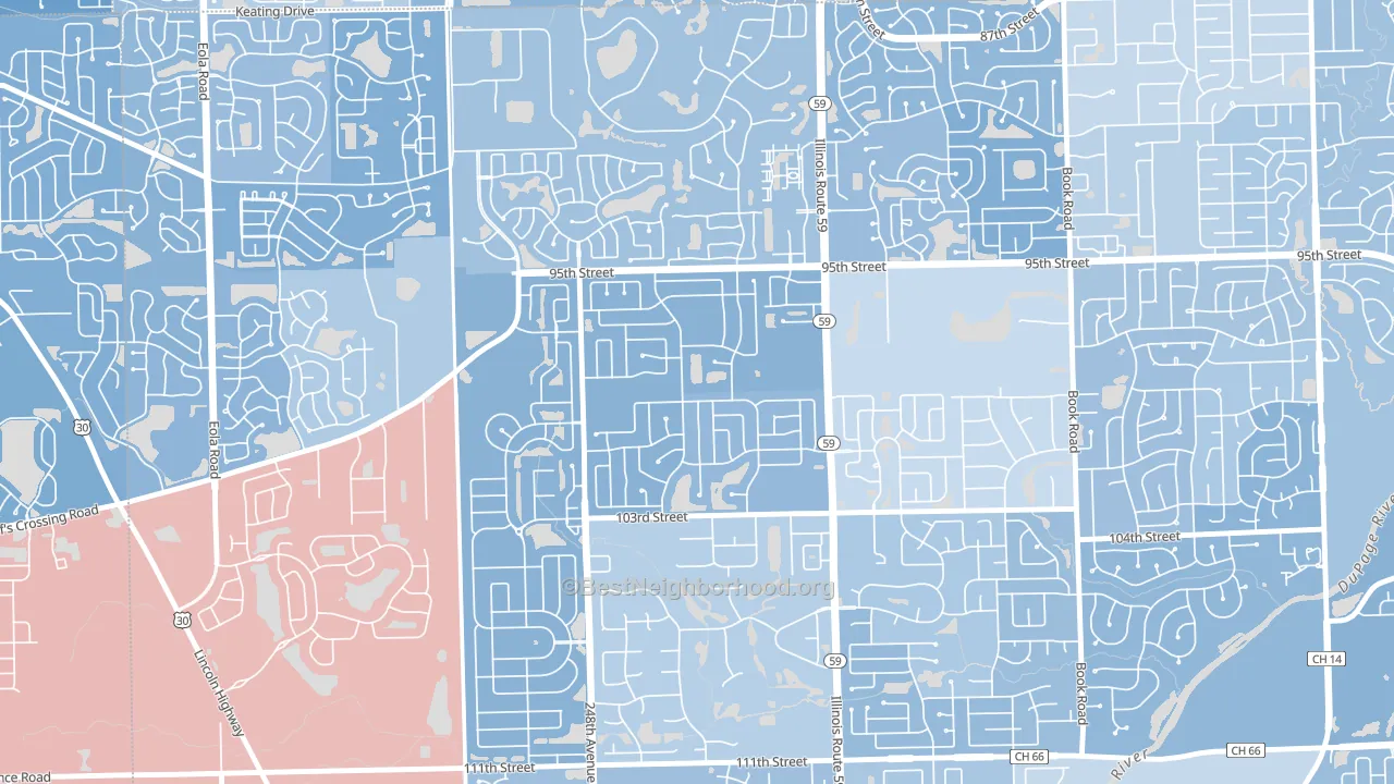
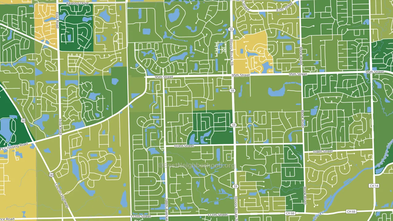
About 79% of adults in Tall Grass typically vote, above the U.S. average of about 62%. Among adults in Tall Grass, ~47% vote Democratic, ~32% Republican, and ~21% don't vote. The map below shows estimated turnout by block group.
How Tall Grass compares
Tall Grass runs about 8 points more Democratic than Illinois as a whole.
Why Tall Grass leans the way it does
This analysis examined 14,881 data points per neighborhood to find what predicts political lean and turnout. The items below are a few correlations that stood out for Tall Grass, not a ranked or complete list of what matters most.
Areas with high college attainment vote Democratic. About 81% of adults in Tall Grass hold a bachelor's degree, about 53 points above the U.S. average of 28%.
Homeownership and voter turnout
Places with homeowner-heavy households tend to turn out at a higher rate; Tall Grass, Naperville, IL sits in the top tenth nationally on this measure.
Why turnout in Tall Grass looks the way it does
Areas with strong routine healthcare access turn out at higher rates. Tall Grass is in the top quarter nationally for routine-care measures such as insurance coverage, preventive screenings, and dental visits. The dental-visit rate here is about 75%, about 15 points above the U.S. average of 60%. Homeowners vote more often than renters, and about 97% of households in Tall Grass own their home, compared to around 75% in nearby neighborhoods. High high-school completion lines up with higher turnout, and about 99% of adults in Tall Grass have completed high school, above 91% of neighborhoods. Learn more about the findings and methodology on the political spectrum map.
Nearby Neighborhoods
- Frontenac, Aurora, IL D+26
- Randall Hills, North Aurora, IL D+13
- Belmont, Downers Grove, IL D+19
- Valley View, Glen Ellyn, IL D+5
- Lace, Darien, IL D+6
- Lakewood Springs, Plano, IL Even
- Yorkfield, Elmhurst, IL D+16
- Thornwood, South Elgin, IL R+4
- Elgin Historic District, Elgin, IL D+38
- Maple Manor, Elgin, IL D+24
Neighborhoods with Similar Populations
- Fry Springs, Charlottesville, VA D+68
- Sierra Oaks, Sacramento, CA D+42
- Alessandro Heights, Riverside, CA R+18
- Highlands Park, Smyrna, GA D+44
- Doylestown Historic District, Doylestown, PA D+26
- Central West, Trenton, NJ D+79
- Palm Club Village, West Palm Beach, FL D+24
- Loma Linda, San Jose, CA D+30
- Midtown-Grand Rapids, Grand Rapids, MI D+62
- Gorgas, Mobile, AL D+90
Sources and methodology
Precinct-level voting records used to fit the model come from Illinois State Board of Elections, distributed by the Voting and Election Science Team. Demographic inputs come from the U.S. Census Bureau (ACS 5-year estimates and the 2020 Decennial Census). Health and environmental inputs come from the CDC (PLACES and the Environmental Justice Index). Land cover comes from the USGS and EPA. Election-day and lead-up weather come from PRISM 4km daily grids and the NOAA Global Historical Climatology Network. Mail-voting and election-administration patterns come from the MIT Election Lab's Survey of the Performance of American Elections. Block-group crime detail comes from CrimeGrade. Internet data and modeling support provided by ISPreports.org.
Modeling and analysis by the BestNeighborhood data science team. Full methodology and findings: political spectrum map.
Methodology reviewed by the BestNeighborhood data team. Last updated May 2026.