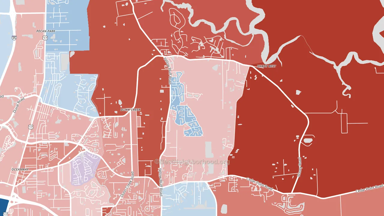
The Cape leans slightly Republican by roughly 8 points: about 46% of voters vote Democratic and 54% Republican.
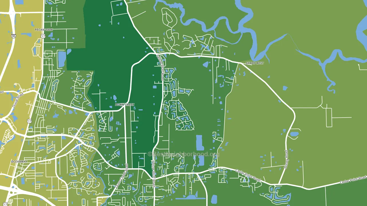
About 86% of adults in The Cape typically vote, above the U.S. average of about 62%. Among adults in The Cape, ~40% vote Democratic, ~46% Republican, and ~14% don't vote. The map below shows estimated turnout by block group.
How The Cape compares
Among neighborhoods within 5 miles, The Cape leans more Republican than 2 of 3 neighbors.
The Cape runs about 4 points more Democratic than Florida as a whole.
Politics vary noticeably by block within The Cape. The west side runs the most Democratic (D+13) and the northwest side runs the most Republican (R+49), a spread of about 62 points.
Why The Cape leans the way it does
This analysis examined 14,881 data points per neighborhood to find what predicts political lean and turnout. The items below are a few correlations that stood out for The Cape, not a ranked or complete list of what matters most.
Areas with many family households vote Republican. About 75% of households in The Cape are family households, about 8 points above the U.S. average of 67%.
Walkability and Republican lean
Places with a low walkability score tend to lean Republican; The Cape, Jacksonville, FL sits in the bottom tenth nationally on this measure. A walkable street grid does not change how people vote; it mostly reflects how urban a place is.
Why turnout in The Cape looks the way it does
Turnout in The Cape sits close to the national pattern. Routine healthcare access, homeownership, education, and food security all land near their national averages here. Learn more about the findings and methodology on the political spectrum map.
Nearby Neighborhoods
- Oceanway, Jacksonville, FL R+7
- Duval, Jacksonville, FL R+21
- Pecan Park, Jacksonville, FL D+9
- Turtle Creek, Jacksonville, FL D+75
- Biscayne, Jacksonville, FL D+59
- Highlands, Jacksonville, FL D+47
- Charter Point, Jacksonville, FL D+28
- Beacon Hills and Harbour, Jacksonville, FL R+27
- Woodmere, Jacksonville, FL R+6
- University Park-Jacksonville, Jacksonville, FL D+26
Neighborhoods with Similar Populations
Sources and methodology
Precinct-level voting records used to fit the model come from Florida Division of Elections, distributed by the Voting and Election Science Team. Demographic inputs come from the U.S. Census Bureau (ACS 5-year estimates and the 2020 Decennial Census). Health and environmental inputs come from the CDC (PLACES and the Environmental Justice Index). Land cover comes from the USGS and EPA. Election-day and lead-up weather come from PRISM 4km daily grids and the NOAA Global Historical Climatology Network. Mail-voting and election-administration patterns come from the MIT Election Lab's Survey of the Performance of American Elections. Block-group crime detail comes from CrimeGrade. Internet data and modeling support provided by ISPreports.org.
Modeling and analysis by the BestNeighborhood data science team. Full methodology and findings: political spectrum map.
Methodology reviewed by the BestNeighborhood data team. Last updated May 2026.