Turtle Run leans Democratic by roughly 24 points: about 62% of voters vote Democratic and 38% Republican.
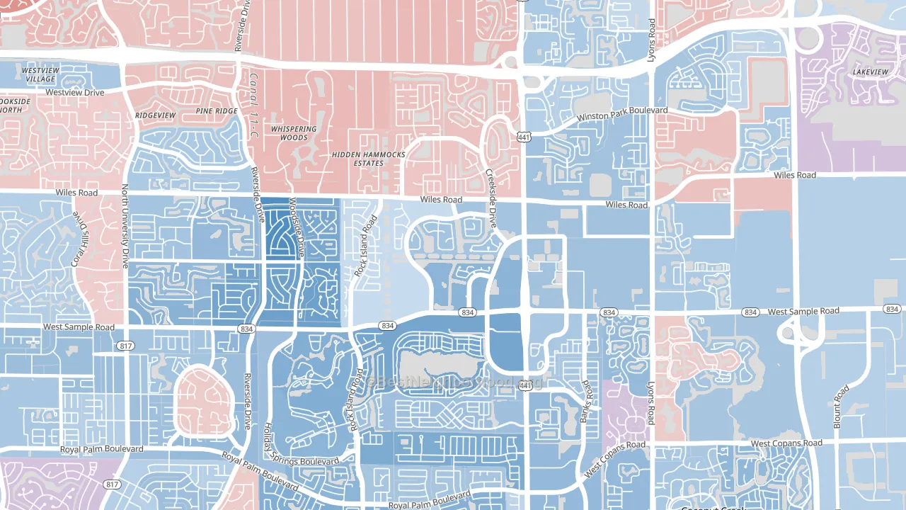
About 67% of adults in Turtle Run typically vote, near the U.S. average of about 62%. Among adults in Turtle Run, ~41% vote Democratic, ~25% Republican, and ~34% don't vote. The map below shows estimated turnout by block group.
How Turtle Run compares
Among neighborhoods within 5 miles, Turtle Run leans more Democratic than 10 of 14 neighbors.
Turtle Run runs about 37 points more Democratic than Florida as a whole. Florida leans Republican overall, while Turtle Run is one of the few Democratic-leaning pockets.
Politics vary noticeably by block within Turtle Run. The west side is the most Democratic-leaning (D+29) and the northwest side is the least Democratic-leaning (D+6), a spread of about 23 points.
Why Turtle Run leans the way it does
This analysis examined 14,881 data points per neighborhood to find what predicts political lean and turnout. The items below are a few correlations that stood out for Turtle Run, not a ranked or complete list of what matters most.
Turtle Run votes against the grain of Florida. Florida leans Republican overall, while Turtle Run runs about 37 points more Democratic.
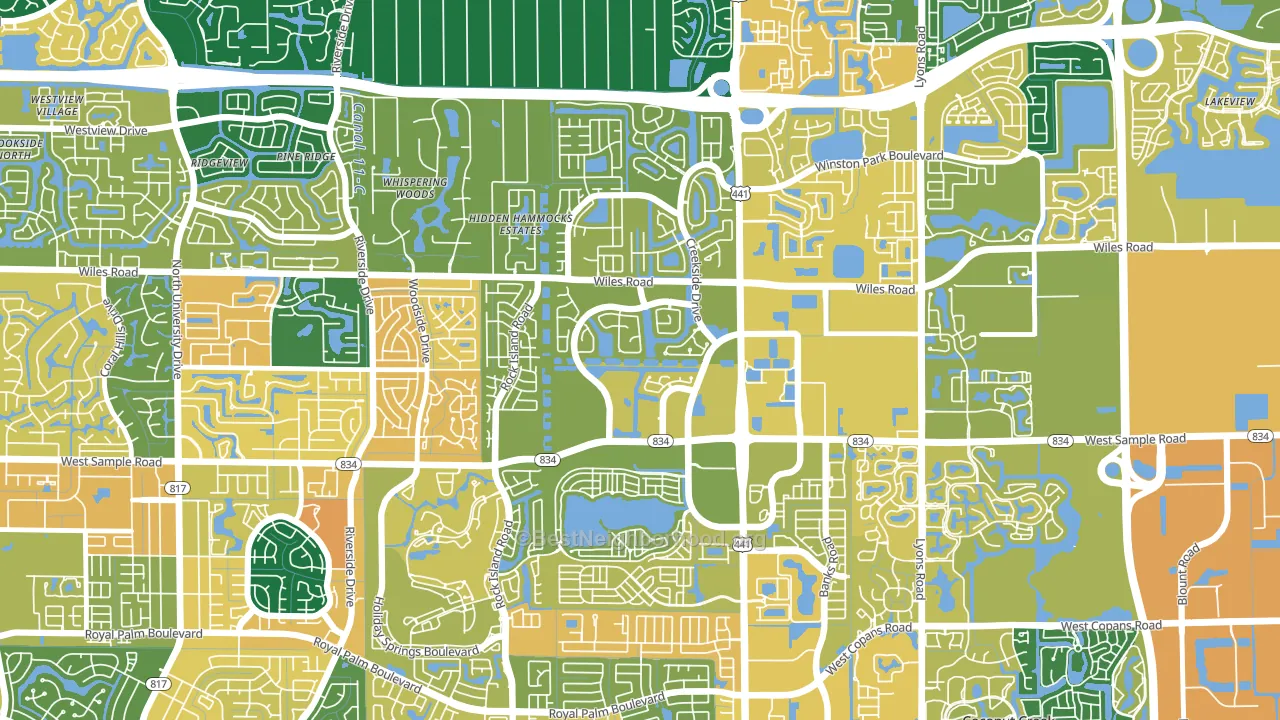
Park access and Democratic lean
Places with heavy park coverage tend to lean Democratic; Turtle Run, Coral Springs, FL sits in the top quarter nationally on this measure. Park access does not change how people vote; it tends to track denser, higher-income areas.
Why turnout in Turtle Run looks the way it does
Turnout in Turtle Run sits close to the national pattern. Routine healthcare access, homeownership, education, and food security all land near their national averages here. Learn more about the findings and methodology on the political spectrum map.
Nearby Neighborhoods
- Forest Hills-Miami, Coral Springs, FL D+19
- Royal Land, Coral Springs, FL D+22
- Lyons Tradewinds Park, Coconut Creek, FL D+6
- Pine Ridge, Coral Springs, FL D+7
- Oriole Margate Golf Course, Margate, FL D+18
- University Drive, Coral Springs, FL D+15
- Kensington, Coral Springs, FL D+16
- Shadow Wood, Coral Springs, FL D+26
- Sandalfoot Cove, Boca Raton, FL Even
- Lauderdale North Park, North Lauderdale, FL D+57
Neighborhoods with Similar Populations
- Cloverleaf, Louisville, KY D+10
- Larkinville, Buffalo, NY D+63
- Park Central, Orlando, FL D+37
- Old Palo Alto, Palo Alto, CA D+69
- San Pedro, Robstown, TX D+19
- Downtown Waterford, Waterford, CA R+23
- Noralto, Sacramento, CA D+34
- Hewitt Area, Greensboro, NC D+60
- Nasons Corner, Portland, ME D+37
- Ridgeview Estates, Bakersfield, CA R+12
Sources and methodology
Precinct-level voting records used to fit the model come from Florida Division of Elections, distributed by the Voting and Election Science Team. Demographic inputs come from the U.S. Census Bureau (ACS 5-year estimates and the 2020 Decennial Census). Health and environmental inputs come from the CDC (PLACES and the Environmental Justice Index). Land cover comes from the USGS and EPA. Election-day and lead-up weather come from PRISM 4km daily grids and the NOAA Global Historical Climatology Network. Mail-voting and election-administration patterns come from the MIT Election Lab's Survey of the Performance of American Elections. Block-group crime detail comes from CrimeGrade. Internet data and modeling support provided by ISPreports.org.
Modeling and analysis by the BestNeighborhood data science team. Full methodology and findings: political spectrum map.
Methodology reviewed by the BestNeighborhood data team. Last updated May 2026.