Walnut Creek leans Democratic by roughly 18 points: about 59% of voters vote Democratic and 41% Republican.
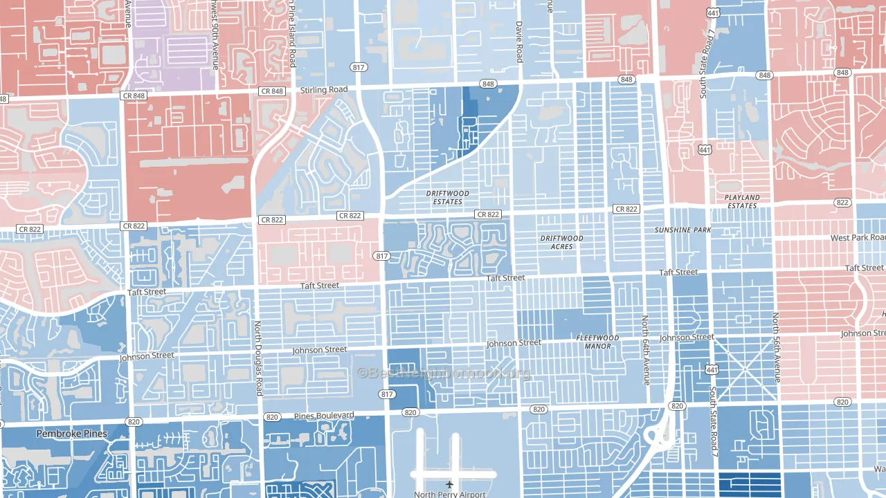
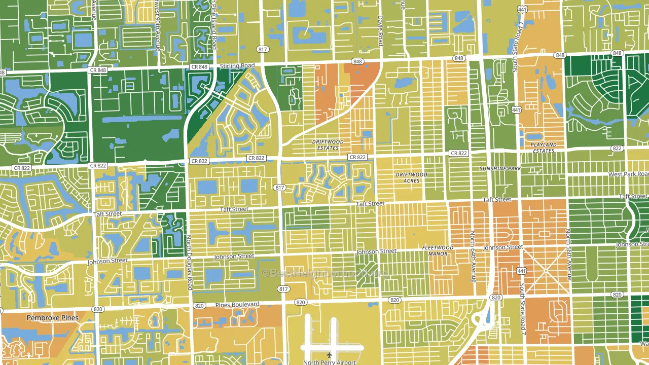
About 53% of adults in Walnut Creek typically vote, below the U.S. average of about 62%. Among adults in Walnut Creek, ~32% vote Democratic, ~22% Republican, and ~46% don't vote. The map below shows estimated turnout by block group.
How Walnut Creek compares
Among neighborhoods within 5 miles, Walnut Creek leans more Democratic than 5 of 8 neighbors.
Walnut Creek runs about 31 points more Democratic than Florida as a whole. Florida leans Republican overall, while Walnut Creek is one of the few Democratic-leaning pockets.
Why Walnut Creek leans the way it does
This analysis examined 14,881 data points per neighborhood to find what predicts political lean and turnout. The items below are a few correlations that stood out for Walnut Creek, not a ranked or complete list of what matters most.
Walnut Creek votes against the grain of Florida. Florida leans Republican overall, while Walnut Creek runs about 31 points more Democratic.
Walkability and Democratic lean
Places with a highly walkable street grid tend to lean Democratic; Walnut Creek, Pembroke Pines, FL sits in the top quarter nationally on this measure. A walkable street grid does not change how people vote; it mostly reflects how urban a place is.
Why turnout in Walnut Creek looks the way it does
Areas with limited routine healthcare access turn out at lower rates. Walnut Creek is in the bottom quarter nationally for routine-care measures such as insurance coverage, preventive screenings, and dental visits. Learn more about the findings and methodology on the political spectrum map.
Nearby Neighborhoods
- Driftwood, Hollywood, FL D+6
- 441 Corridor, Hollywood, FL D+11
- Beverly Park, Hollywood, FL D+29
- Lakeshore at University Park, Miramar, FL D+58
- Davie Heights, Davie, FL D+8
- Embassy Lakes, Cooper City, FL D+5
- Hollywood Hills, Hollywood, FL D+6
- Washington Park, Hollywood, FL D+62
- Broadview Park, Fort Lauderdale, FL D+4
- Liberia, Hollywood, FL D+52
Neighborhoods with Similar Populations
- Lowry Hill, Minneapolis, MN D+74
- Madison-Eastend, Baltimore, MD D+85
- Barcroft, Arlington, VA D+48
- Creighton, Richmond, VA D+84
- Rittersville, Allentown, PA D+10
- North Meadow Brook, Norfolk, VA D+29
- Old Town Manchester, Richmond, VA D+64
- Brandywine, Oklahoma City, OK R+26
- Beulah Heights, Pueblo, CO D+10
- Leisureville, Boynton Beach, FL Even
Sources and methodology
Precinct-level voting records used to fit the model come from Florida Division of Elections, distributed by the Voting and Election Science Team. Demographic inputs come from the U.S. Census Bureau (ACS 5-year estimates and the 2020 Decennial Census). Health and environmental inputs come from the CDC (PLACES and the Environmental Justice Index). Land cover comes from the USGS and EPA. Election-day and lead-up weather come from PRISM 4km daily grids and the NOAA Global Historical Climatology Network. Mail-voting and election-administration patterns come from the MIT Election Lab's Survey of the Performance of American Elections. Block-group crime detail comes from CrimeGrade. Internet data and modeling support provided by ISPreports.org.
Modeling and analysis by the BestNeighborhood data science team. Full methodology and findings: political spectrum map.
Methodology reviewed by the BestNeighborhood data team. Last updated May 2026.