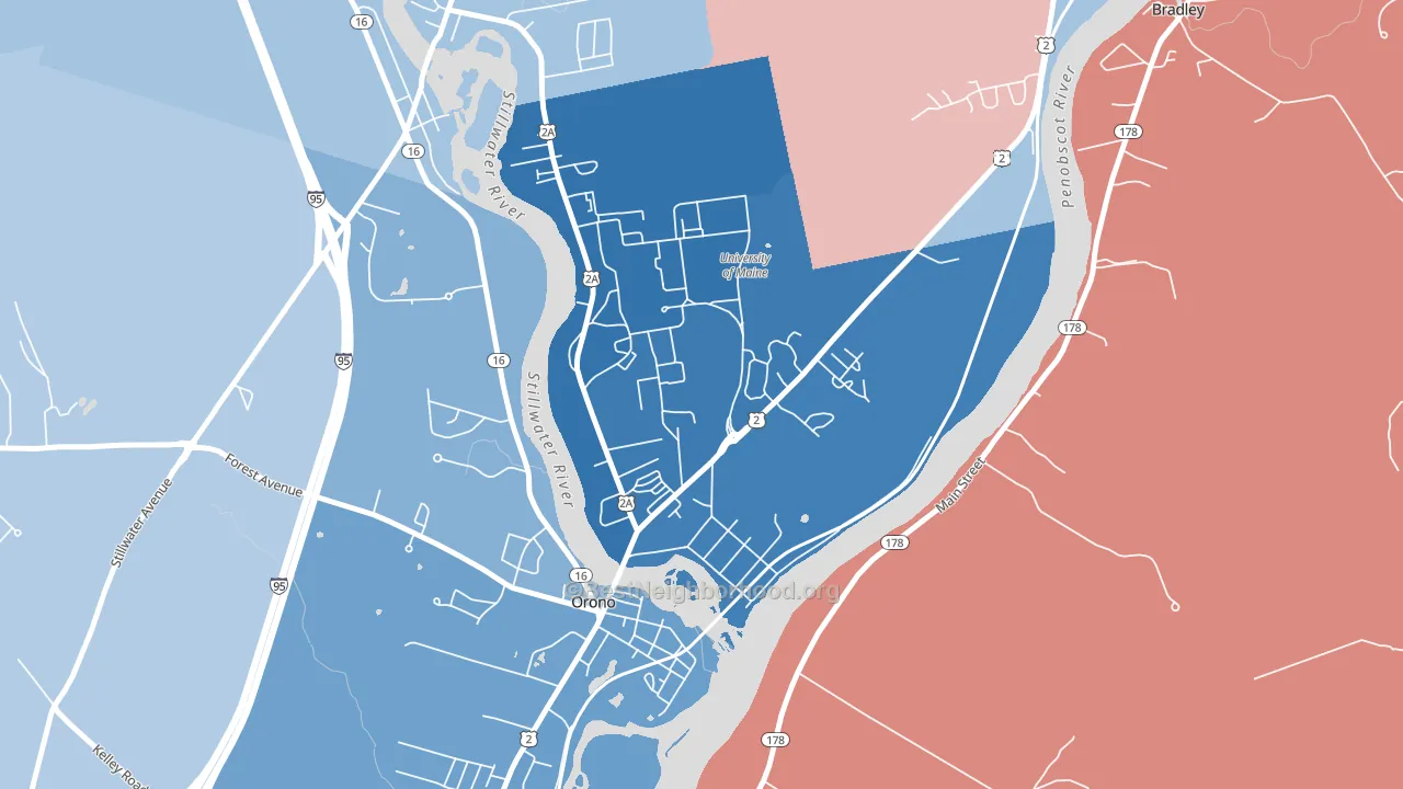
Webster is a Democratic stronghold. About 77% of voters here vote Democratic and 23% Republican. These figures are model estimates: Maine did not have precinct-level voting records available for training, so the numbers above come from demographic and health features rather than local ground truth.
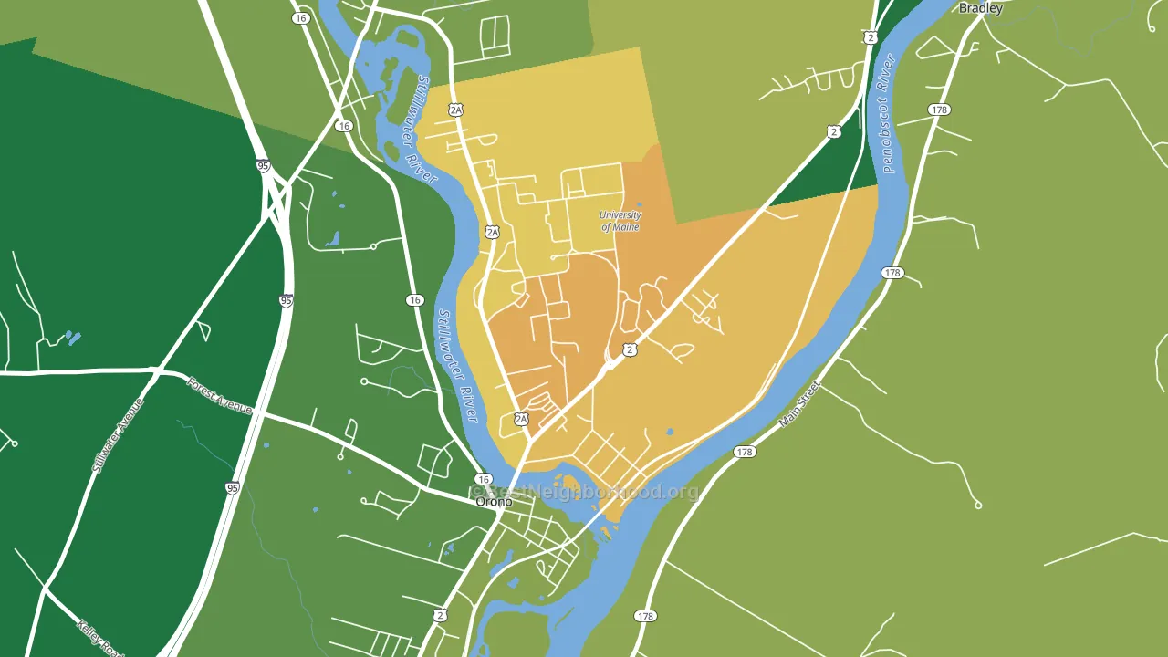
About 51% of adults in Webster typically vote, below the U.S. average of about 62%. Among adults in Webster, ~39% vote Democratic, ~12% Republican, and ~49% don't vote. The map below shows estimated turnout by block group.
How Webster compares
Webster runs about 48 points more Democratic than Maine as a whole.
Politics vary noticeably by block within Webster. The north side is the most Democratic-leaning (D+61) and the southwest side is the least Democratic-leaning (D+38), a spread of about 23 points.
Why Webster leans the way it does
This analysis examined 14,881 data points per neighborhood to find what predicts political lean and turnout. The items below are a few correlations that stood out for Webster, not a ranked or complete list of what matters most.
Areas with high college attainment vote Democratic. About 71% of adults in Webster hold a bachelor's degree, about 43 points above the U.S. average of 28%. A high never-married share predicts Democratic voting, and about 83% of adults in Webster have never been married, in the top fraction of neighborhoods.
Homeownership and voter turnout
Places with renter-heavy households tend to turn out at a lower rate; Webster, Orono, ME sits in the bottom tenth nationally on this measure.
Why turnout in Webster looks the way it does
Renters vote less often than owners. About 75% of households in Webster rent, about 50 points above the U.S. average of 25%. Learn more about the findings and methodology on the political spectrum map.
Nearby Neighborhoods
- West Market Square Historic District, Bangor, ME D+30
- Haines Corner, Lewiston, ME R+23
- New Auburn, Auburn, ME R+2
- East Deering, Portland, ME D+66
- North Deering, Portland, ME D+46
- East End, Portland, ME D+76
- Ocean Avenue, Portland, ME D+77
- Riverton, Portland, ME D+27
- Downtown, Portland, ME D+68
- Oakdale, Portland, ME D+78
Neighborhoods with Similar Populations
- Casa Loma, Bakersfield, CA D+20
- Broad Ripple, Indianapolis, IN D+48
- Lasley, Lakewood, CO D+20
- Arlington Park, Sarasota, FL Even
- West Gate, Columbus, OH D+27
- Camp Curtin, Harrisburg, PA D+73
- Palma Ceia, Tampa, FL D+5
- Atlanta-Inman Park, Atlanta, GA D+56
- Bennington, Vancouver, WA D+19
- Westhaven, Franklin, TN R+31
Sources and methodology
Precinct-level voting records used to fit the model come from Maine Secretary of State, Bureau of Corporations Elections and Commissions, distributed by the Voting and Election Science Team. Demographic inputs come from the U.S. Census Bureau (ACS 5-year estimates and the 2020 Decennial Census). Health and environmental inputs come from the CDC (PLACES and the Environmental Justice Index). Land cover comes from the USGS and EPA. Election-day and lead-up weather come from PRISM 4km daily grids and the NOAA Global Historical Climatology Network. Mail-voting and election-administration patterns come from the MIT Election Lab's Survey of the Performance of American Elections. Block-group crime detail comes from CrimeGrade. Internet data and modeling support provided by ISPreports.org.
Modeling and analysis by the BestNeighborhood data science team. ME did not have precinct-level voting records available for training, so the figures here come from extrapolation across demographic, health, and land-use features rather than local ground truth. Full methodology and findings: political spectrum map.
Methodology reviewed by the BestNeighborhood data team. Last updated May 2026.