Whittier is a Democratic stronghold. About 86% of voters here vote Democratic and 14% Republican.
[sc name="abovemapcta"]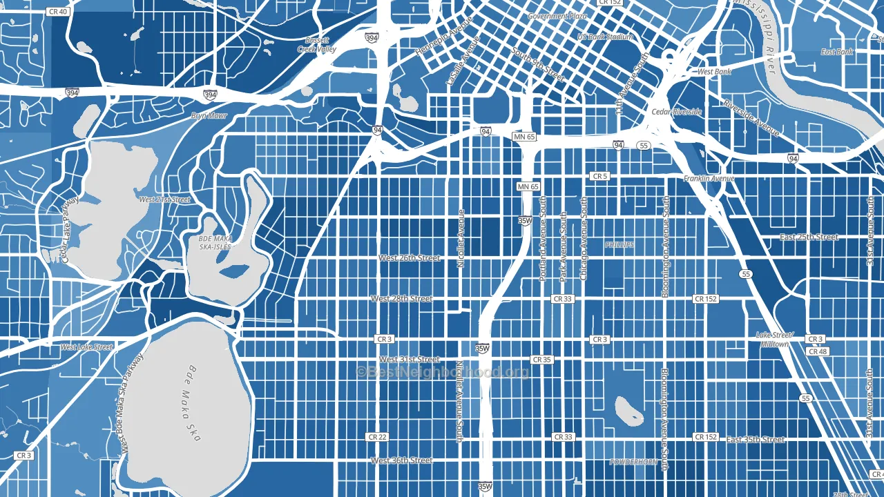 [bestneighborhood_map_controls]
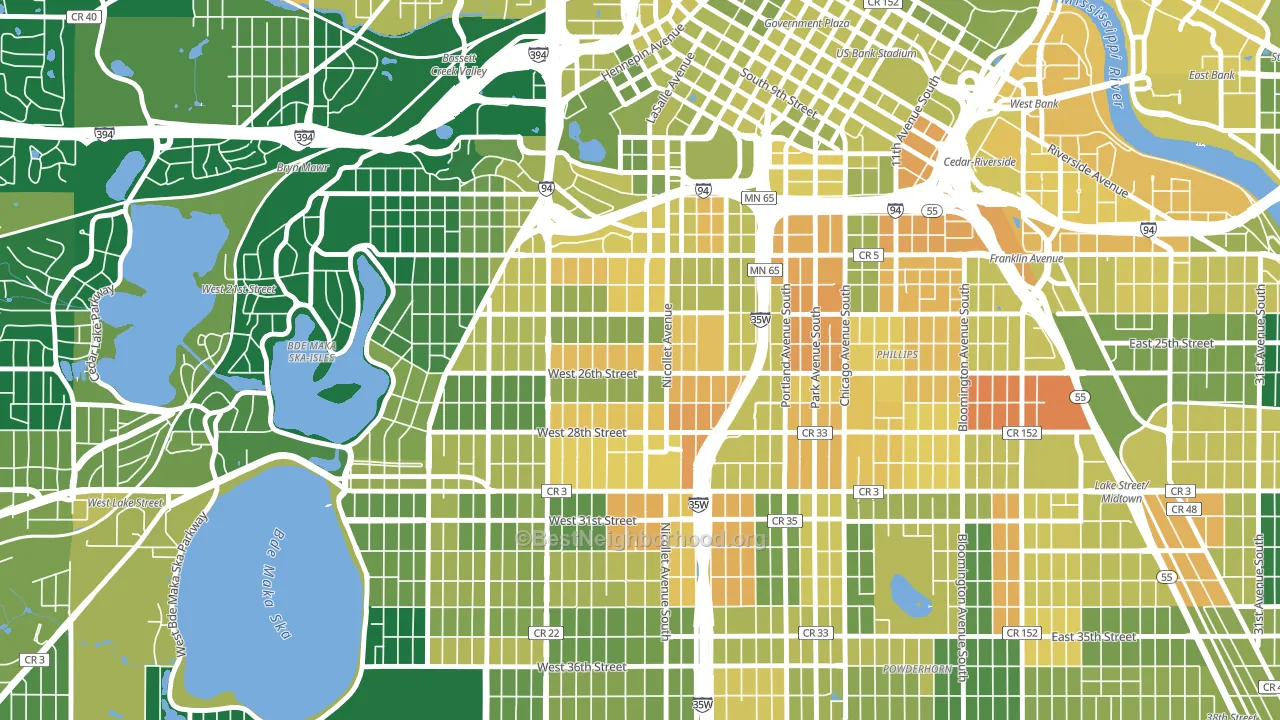
About 54% of adults in Whittier typically vote, below the U.S. average of about 62%. Among adults in Whittier, ~46% vote Democratic, ~8% Republican, and ~46% don't vote. The map below shows estimated turnout by block group.
 [bestneighborhood_map_controls]
How Whittier compares
Among neighborhoods within 5 miles, Whittier leans more Democratic than 39 of 56 neighbors.
Whittier runs about 68 points more Democratic than Minnesota as a whole.
Politics vary noticeably by block within Whittier. The northeast side is the most Democratic-leaning (D+77) and the southeast side is the least Democratic-leaning (D+59), a spread of about 18 points.
Why Whittier leans the way it does
This analysis examined 14,881 data points per neighborhood to find what predicts political lean and turnout. The items below are a few correlations that stood out for Whittier, not a ranked or complete list of what matters most.
Dense areas vote Democratic. More than 99% of residents in Whittier live in densely developed areas, about 64 points above the U.S. average of 36%. A high never-married share predicts Democratic voting, and about 75% of adults in Whittier have never been married, above 98% of neighborhoods.
Paved land cover and Democratic lean
Places with extensive paved surfaces tend to lean Democratic; Whittier, Minneapolis, MN sits in the top tenth nationally on this measure. Paved ground does not change how people vote; it mostly reflects how urban and built-up a place is.
Why turnout in Whittier looks the way it does
Renters vote less often than owners. About 87% of households in Whittier rent, about 62 points above the U.S. average of 25%. High-crime urban areas turn out at lower rates, and Whittier sits in the top 15% on a violent-crime measure. Learn more about the findings and methodology on the political spectrum map.
[one_half]Nearby Neighborhoods
- Stevens Square, Minneapolis, MN D+71
- Lowry Hill East, Minneapolis, MN D+75
- Phillips West, Minneapolis, MN D+54
- Lyndale, Minneapolis, MN D+71
- Loring Park, Minneapolis, MN D+69
- Lowry Hill, Minneapolis, MN D+74
- East Isles, Minneapolis, MN D+81
- Ventura Village, Minneapolis, MN D+62
- Midtown Phillips, Minneapolis, MN D+67
- Central, Minneapolis, MN D+67
Neighborhoods with Similar Populations
- Virginia-Highland, Atlanta, GA D+53
- Midvale Park, Tucson, AZ D+35
- Van Nest, Bronx, NY D+19
- Columbia City, Seattle, WA D+71
- Tottenville, Staten Island, NY R+62
- Winter Gardens, Lakeside, CA R+20
- North Shores, North Bay Village, FL R+7
- South Side, Columbus, OH D+50
- Chambersburg, Trenton, NJ D+39
- Granville Gardens, Chicago, IL D+40
Sources and methodology
Precinct-level voting records used to fit the model come from Minnesota Secretary of State, Elections, distributed by the Voting and Election Science Team. Demographic inputs come from the U.S. Census Bureau (ACS 5-year estimates and the 2020 Decennial Census). Health and environmental inputs come from the CDC (PLACES and the Environmental Justice Index). Land cover comes from the USGS and EPA. Election-day and lead-up weather come from PRISM 4km daily grids and the NOAA Global Historical Climatology Network. Mail-voting and election-administration patterns come from the MIT Election Lab's Survey of the Performance of American Elections. Block-group crime detail comes from CrimeGrade. Internet data and modeling support provided by ISPreports.org.
Modeling and analysis by the BestNeighborhood data science team. Full methodology and findings: political spectrum map.
Methodology reviewed by the BestNeighborhood data team. Last updated May 2026.