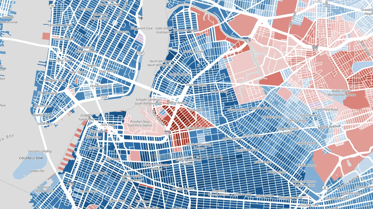
Williamsburg leans Democratic by roughly 16 points: about 58% of voters vote Democratic and 42% Republican.
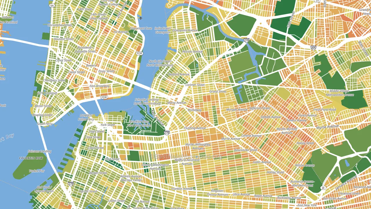
About 49% of adults in Williamsburg typically vote, below the U.S. average of about 62%. Among adults in Williamsburg, ~28% vote Democratic, ~21% Republican, and ~51% don't vote. The map below shows estimated turnout by block group.
How Williamsburg compares
Among neighborhoods within 5 miles, Williamsburg leans more Democratic than 5 of 56 neighbors.
Politically, Williamsburg sits close to the rest of New York.
Politics vary noticeably by block within Williamsburg. The northeast side runs the most Democratic (D+72) and the south side runs the most Republican (R+67), a spread of about 139 points.
Why Williamsburg leans the way it does
This analysis examined 14,881 data points per neighborhood to find what predicts political lean and turnout. The items below are a few correlations that stood out for Williamsburg, not a ranked or complete list of what matters most.
Areas with many never-married adults vote Democratic. About 49% of adults in Williamsburg have never been married, modestly above similar-sized neighborhoods (around 43%).
Population density and Democratic lean
Places with high population density tend to lean Democratic; Williamsburg, Brooklyn, NY sits in the top tenth nationally on this measure.
Why turnout in Williamsburg looks the way it does
Renters vote less often than owners. About 83% of households in Williamsburg rent, about 58 points above the U.S. average of 25%. Crowded housing lines up with lower turnout, and about 16% of homes in Williamsburg have more than one occupant per room, above 97% of neighborhoods. Learn more about the findings and methodology on the political spectrum map.
Nearby Neighborhoods
- Greenpoint, Brooklyn, NY D+65
- Clinton Hill, Brooklyn, NY D+69
- Dumbo, Brooklyn, NY D+76
- Fort Green, Brooklyn, NY D+78
- Lower East Side, Manhattan, NY D+47
- Bedford-Stuyvesant, Brooklyn, NY D+77
- Downtown Brooklyn, Brooklyn, NY D+79
- East Village, Manhattan, NY D+65
- Bushwick, Brooklyn, NY D+61
- Brooklyn Heights, Brooklyn, NY D+75
Neighborhoods with Similar Populations
- Harlem, Manhattan, NY D+78
- Roosevelt, Fresno, CA D+18
- Astoria, Queens, NY D+41
- East Side, El Paso, TX D+18
- Camelback East, Phoenix, AZ D+24
- Spring Branch, Houston, TX D+8
- Alahambra, Phoenix, AZ D+27
- Washington Heights, Manhattan, NY D+49
- North Scottsdale, Scottsdale, AZ R+9
- Southeast Dallas, Dallas, TX D+37
Sources and methodology
Precinct-level voting records used to fit the model come from New York State Board of Elections, distributed by the Voting and Election Science Team. Demographic inputs come from the U.S. Census Bureau (ACS 5-year estimates and the 2020 Decennial Census). Health and environmental inputs come from the CDC (PLACES and the Environmental Justice Index). Land cover comes from the USGS and EPA. Election-day and lead-up weather come from PRISM 4km daily grids and the NOAA Global Historical Climatology Network. Mail-voting and election-administration patterns come from the MIT Election Lab's Survey of the Performance of American Elections. Block-group crime detail comes from CrimeGrade. Internet data and modeling support provided by ISPreports.org.
Modeling and analysis by the BestNeighborhood data science team. Full methodology and findings: political spectrum map.
Methodology reviewed by the BestNeighborhood data team. Last updated May 2026.