Burbank-Hayward leans heavily Democratic by roughly 42 points: about 71% of voters vote Democratic and 29% Republican.
[sc name="abovemapcta"]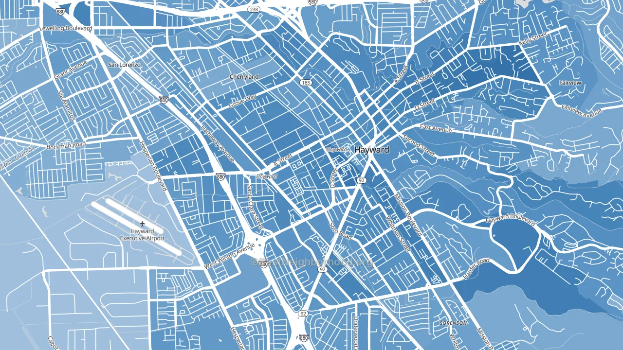 [bestneighborhood_map_controls]
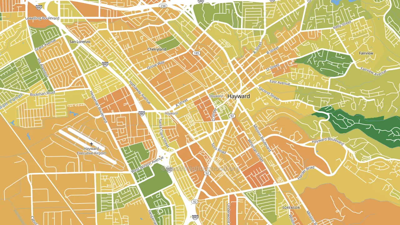
About 46% of adults in Burbank-Hayward typically vote, below the U.S. average of about 62%. Among adults in Burbank-Hayward, ~33% vote Democratic, ~13% Republican, and ~54% don't vote. The map below shows estimated turnout by block group.
 [bestneighborhood_map_controls]
How Burbank-Hayward compares
Among neighborhoods within 5 miles, Burbank-Hayward leans more Democratic than 16 of 22 neighbors.
Burbank-Hayward runs about 22 points more Democratic than California as a whole.
Why Burbank-Hayward leans the way it does
This analysis examined 14,881 data points per neighborhood to find what predicts political lean and turnout. The items below are a few correlations that stood out for Burbank-Hayward, not a ranked or complete list of what matters most.
Dense areas vote Democratic. More than 99% of residents in Burbank-Hayward live in densely developed areas, about 64 points above the U.S. average of 36%.
Paved land cover and Democratic lean
Places with extensive paved surfaces tend to lean Democratic; Burbank-Hayward, Hayward, CA sits in the top tenth nationally on this measure. Paved ground does not change how people vote; it mostly reflects how urban and built-up a place is.
Why turnout in Burbank-Hayward looks the way it does
Crowded housing lines up with lower turnout. About 18% of homes in Burbank-Hayward have more than one occupant per room, above 98% of neighborhoods. Low high-school completion lines up with lower turnout, and about 82% of adults in Burbank-Hayward have completed high school, below 82% of neighborhoods. Learn more about the findings and methodology on the political spectrum map.
[one_half]Nearby Neighborhoods
- Santa Clara Street, Hayward, CA D+39
- Jackson Triangle, Hayward, CA D+38
- North Hayward, Hayward, CA D+42
- Longwood-Winton Grove, Hayward, CA D+37
- Mission-Foothill, Hayward, CA D+43
- Upper B Street, Hayward, CA D+45
- Southgate, Hayward, CA D+39
- Whitman-Mocine, Hayward, CA D+33
- Mt Eden, Hayward, CA D+30
- Harder-Tennyson, Hayward, CA D+37
Neighborhoods with Similar Populations
- North End, Boise, ID D+57
- Penn, North Liberty, IA D+23
- Lasalle, Buffalo, NY D+78
- West Sugar Creek, Charlotte, NC D+71
- Lakeview, New Orleans, LA Even
- Henninger Park, Santa Ana, CA D+32
- Foxhill, Hampton, VA R+16
- Cleveland Heights, Oakland, CA D+74
- Jefferson Park, Chicago, IL D+22
- Glenwood, Glendale, CA D+12
Sources and methodology
Precinct-level voting records used to fit the model come from California Secretary of State, Elections, distributed by the Voting and Election Science Team. Demographic inputs come from the U.S. Census Bureau (ACS 5-year estimates and the 2020 Decennial Census). Health and environmental inputs come from the CDC (PLACES and the Environmental Justice Index). Land cover comes from the USGS and EPA. Election-day and lead-up weather come from PRISM 4km daily grids and the NOAA Global Historical Climatology Network. Mail-voting and election-administration patterns come from the MIT Election Lab's Survey of the Performance of American Elections. Block-group crime detail comes from CrimeGrade. Internet data and modeling support provided by ISPreports.org.
Modeling and analysis by the BestNeighborhood data science team. Full methodology and findings: political spectrum map.
Methodology reviewed by the BestNeighborhood data team. Last updated May 2026.