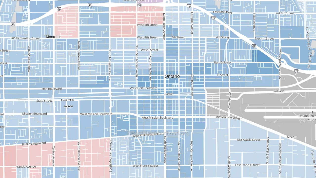
Downtown Ontario leans Democratic by roughly 24 points: about 62% of voters vote Democratic and 38% Republican.
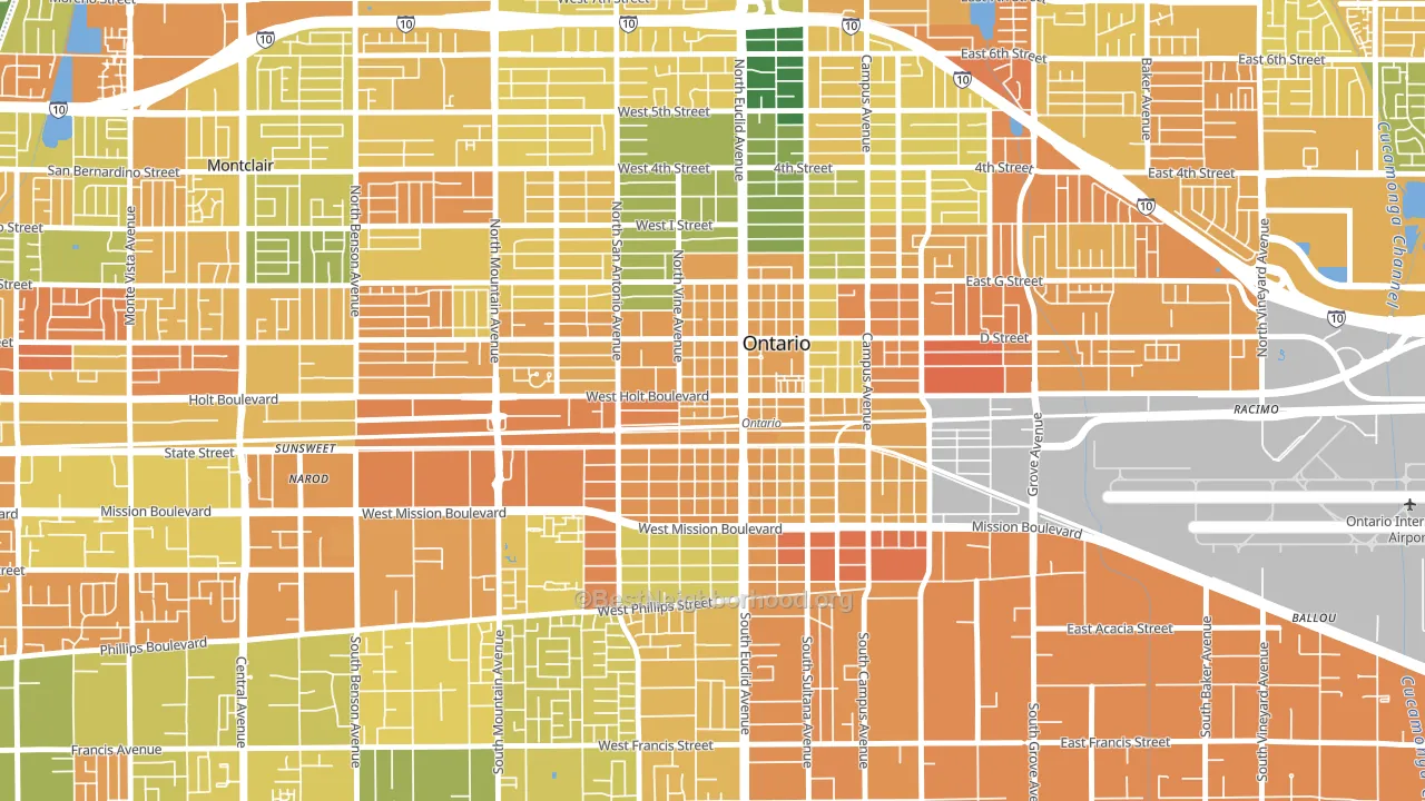
About 32% of adults in Downtown Ontario typically vote, below the U.S. average of about 62%. Among adults in Downtown Ontario, ~20% vote Democratic, ~12% Republican, and ~68% don't vote. The map below shows estimated turnout by block group.
How Downtown Ontario compares
Downtown Ontario runs about 4 points more Democratic than California as a whole.
Why Downtown Ontario leans the way it does
This analysis examined 14,881 data points per neighborhood to find what predicts political lean and turnout. The items below are a few correlations that stood out for Downtown Ontario, not a ranked or complete list of what matters most.
Dense areas vote Democratic. More than 99% of residents in Downtown Ontario live in densely developed areas, about 64 points above the U.S. average of 36%. A high never-married share predicts Democratic voting, and about 50% of adults in Downtown Ontario have never been married, above 82% of neighborhoods.
Paved land cover and Democratic lean
Places with extensive paved surfaces tend to lean Democratic; Downtown Ontario, Ontario, CA sits in the top tenth nationally on this measure. Paved ground does not change how people vote; it mostly reflects how urban and built-up a place is.
Why turnout in Downtown Ontario looks the way it does
Areas with limited routine healthcare access turn out at lower rates. Downtown Ontario is in the bottom quarter nationally for routine-care measures such as insurance coverage, preventive screenings, and dental visits. The dental-visit rate here is about 47%, about 15 points below the California average of 62%. Renters vote less often than owners, and about 75% of households in Downtown Ontario rent, compared to around 35% in nearby neighborhoods. High food insecurity lines up with lower turnout, and about 32% of adults in Downtown Ontario report food insecurity, above 85% of neighborhoods. Learn more about the findings and methodology on the political spectrum map.
Nearby Neighborhoods
- Edison Historic District, Pomona, CA D+36
- Downtown Pomona, Pomona, CA D+36
- Victoria Gardens, Rancho Cucamonga, CA D+11
- West End, Fontana, CA D+13
- Southridge Village, Fontana, CA D+17
- Rancho Fontana, Fontana, CA D+9
- Walnut Valley, Diamond Bar, CA D+9
- Summit Heights, Fontana, CA D+8
- Hunter's Ridge, Fontana, CA R+2
- Charter Oak, Covina, CA D+9
Neighborhoods with Similar Populations
- Northside, Cincinnati, OH D+68
- South Overton, Lubbock, TX D+33
- Athmar Park, Denver, CO D+46
- Piedmont Avenue, Oakland, CA D+84
- South Area, Wichita, KS R+19
- Haywood Park, San Mateo, CA D+52
- Fourth Ward, Houston, TX D+47
- Mount Scott, Portland, OR D+70
- Normandie Heights, Pasadena, CA D+55
- South Oak Park, Sacramento, CA D+40
Sources and methodology
Precinct-level voting records used to fit the model come from California Secretary of State, Elections, distributed by the Voting and Election Science Team. Demographic inputs come from the U.S. Census Bureau (ACS 5-year estimates and the 2020 Decennial Census). Health and environmental inputs come from the CDC (PLACES and the Environmental Justice Index). Land cover comes from the USGS and EPA. Election-day and lead-up weather come from PRISM 4km daily grids and the NOAA Global Historical Climatology Network. Mail-voting and election-administration patterns come from the MIT Election Lab's Survey of the Performance of American Elections. Block-group crime detail comes from CrimeGrade. Internet data and modeling support provided by ISPreports.org.
Modeling and analysis by the BestNeighborhood data science team. Full methodology and findings: political spectrum map.
Methodology reviewed by the BestNeighborhood data team. Last updated May 2026.