Northside is a Democratic stronghold. About 84% of voters here vote Democratic and 16% Republican.
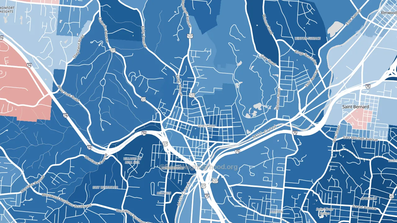
About 69% of adults in Northside typically vote, above the U.S. average of about 62%. Among adults in Northside, ~58% vote Democratic, ~11% Republican, and ~31% don't vote. The map below shows estimated turnout by block group.
How Northside compares
Among neighborhoods within 5 miles, Northside leans more Democratic than 14 of 24 neighbors.
Northside runs about 79 points more Democratic than Ohio as a whole. Ohio leans Republican overall, while Northside is one of the few Democratic-leaning pockets.
Politics vary noticeably by block within Northside. The southeast side is the most Democratic-leaning (D+73) and the north side is the least Democratic-leaning (D+59), a spread of about 14 points.
Why Northside leans the way it does
This analysis examined 14,881 data points per neighborhood to find what predicts political lean and turnout. The items below are a few correlations that stood out for Northside, not a ranked or complete list of what matters most.
Northside votes against the grain of Ohio. Ohio leans Republican overall, while Northside runs about 79 points more Democratic. High college attainment predicts Democratic voting, and Northside sits in the top quarter (about 55%, above 76% of neighborhoods). A high never-married share predicts Democratic voting, and about 49% of adults in Northside have never been married, above 80% of neighborhoods.
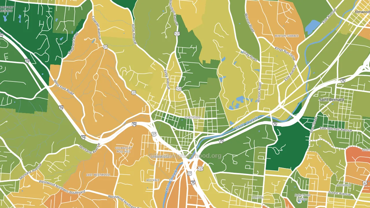
Population density and Democratic lean
Places with high population density tend to lean Democratic; Northside, Cincinnati, OH sits in the top quarter nationally on this measure.
Why turnout in Northside looks the way it does
Turnout in Northside sits close to the national pattern. Learn more about the findings and methodology on the political spectrum map.
Nearby Neighborhoods
- East Westwood, Cincinnati, OH D+80
- Clifton, Cincinnati, OH D+68
- Winton Hills, Cincinnati, OH D+77
- Mount Airy, Cincinnati, OH D+58
- College Hill, Cincinnati, OH D+61
- Cuf, Cincinnati, OH D+54
- Avondale, Cincinnati, OH D+83
- South Fairmount, Cincinnati, OH D+54
- North Avondale, Cincinnati, OH D+81
- Corryville, Cincinnati, OH D+54
Neighborhoods with Similar Populations
- Downtown Ontario, Ontario, CA D+24
- Athmar Park, Denver, CO D+46
- South Overton, Lubbock, TX D+33
- Piedmont Avenue, Oakland, CA D+84
- Haywood Park, San Mateo, CA D+52
- South Area, Wichita, KS R+19
- Fourth Ward, Houston, TX D+47
- Mount Scott, Portland, OR D+70
- Normandie Heights, Pasadena, CA D+55
- South Oak Park, Sacramento, CA D+40
Sources and methodology
Precinct-level voting records used to fit the model come from Ohio Secretary of State, Elections, distributed by the Voting and Election Science Team. Demographic inputs come from the U.S. Census Bureau (ACS 5-year estimates and the 2020 Decennial Census). Health and environmental inputs come from the CDC (PLACES and the Environmental Justice Index). Land cover comes from the USGS and EPA. Election-day and lead-up weather come from PRISM 4km daily grids and the NOAA Global Historical Climatology Network. Mail-voting and election-administration patterns come from the MIT Election Lab's Survey of the Performance of American Elections. Block-group crime detail comes from CrimeGrade. Internet data and modeling support provided by ISPreports.org.
Modeling and analysis by the BestNeighborhood data science team. Full methodology and findings: political spectrum map.
Methodology reviewed by the BestNeighborhood data team. Last updated May 2026.