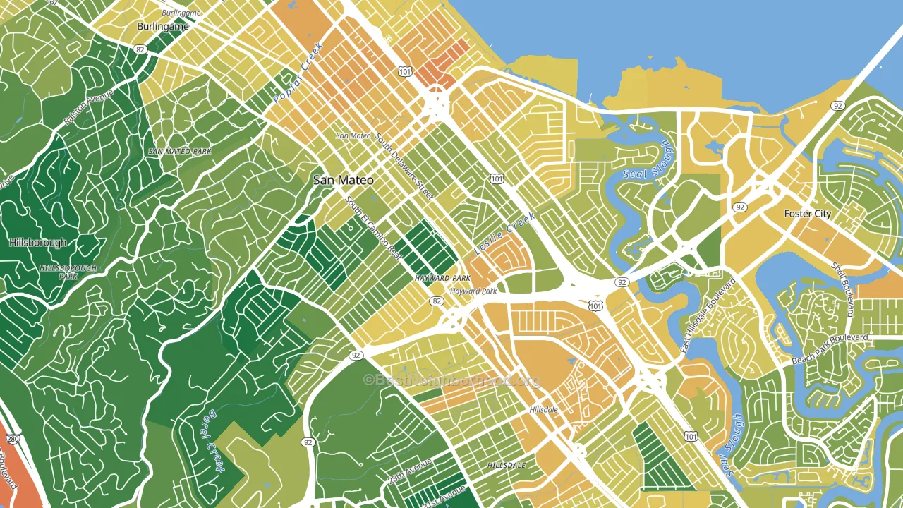
Haywood Park is a Democratic stronghold. About 76% of voters here vote Democratic and 24% Republican.
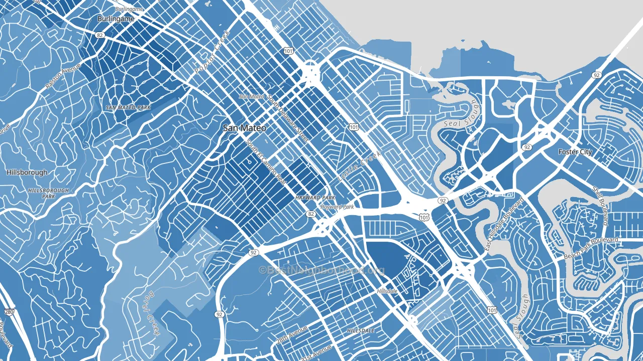
About 66% of adults in Haywood Park typically vote, near the U.S. average of about 62%. Among adults in Haywood Park, ~50% vote Democratic, ~16% Republican, and ~34% don't vote. The map below shows estimated turnout by block group.
How Haywood Park compares
Among neighborhoods within 5 miles, Haywood Park leans more Democratic than 11 of 13 neighbors.
Haywood Park runs about 32 points more Democratic than California as a whole.
Why Haywood Park leans the way it does
This analysis examined 14,881 data points per neighborhood to find what predicts political lean and turnout. The items below are a few correlations that stood out for Haywood Park, not a ranked or complete list of what matters most.
Dense areas vote Democratic. More than 99% of residents in Haywood Park live in densely developed areas, about 64 points above the U.S. average of 36%. High college attainment predicts Democratic voting, and Haywood Park sits in the top quarter (about 61%, above 81% of neighborhoods).
Population density and Democratic lean
Places with high population density tend to lean Democratic; Haywood Park, San Mateo, CA sits in the top quarter nationally on this measure.
Why turnout in Haywood Park looks the way it does
Areas with strong routine healthcare access turn out at higher rates. Haywood Park is in the top quarter nationally for routine-care measures such as insurance coverage, preventive screenings, and dental visits. The dental-visit rate here is about 71%, about 11 points above the U.S. average of 60%. Learn more about the findings and methodology on the political spectrum map.
Nearby Neighborhoods
- Downtown San Mateo, San Mateo, CA D+55
- Baywood-Aragon, San Mateo, CA D+51
- East San Mateo, San Mateo, CA D+40
- Shoreview, San Mateo, CA D+44
- Beresford, San Mateo, CA D+52
- Hillsdale, San Mateo, CA D+50
- North Central San Francisco, San Mateo, CA D+50
- Marina Lagoon, San Mateo, CA D+50
- Sugerloaf, San Mateo, CA D+50
- Western Hills, San Mateo, CA D+41
Neighborhoods with Similar Populations
- South Area, Wichita, KS R+19
- Fourth Ward, Houston, TX D+47
- Athmar Park, Denver, CO D+46
- Northside, Cincinnati, OH D+68
- Downtown Ontario, Ontario, CA D+24
- South Overton, Lubbock, TX D+33
- Piedmont Avenue, Oakland, CA D+84
- Normandie Heights, Pasadena, CA D+55
- South Oak Park, Sacramento, CA D+40
- Secret Cove, Jacksonville, FL D+13
Sources and methodology
Precinct-level voting records used to fit the model come from California Secretary of State, Elections, distributed by the Voting and Election Science Team. Demographic inputs come from the U.S. Census Bureau (ACS 5-year estimates and the 2020 Decennial Census). Health and environmental inputs come from the CDC (PLACES and the Environmental Justice Index). Land cover comes from the USGS and EPA. Election-day and lead-up weather come from PRISM 4km daily grids and the NOAA Global Historical Climatology Network. Mail-voting and election-administration patterns come from the MIT Election Lab's Survey of the Performance of American Elections. Block-group crime detail comes from CrimeGrade. Internet data and modeling support provided by ISPreports.org.
Modeling and analysis by the BestNeighborhood data science team. Full methodology and findings: political spectrum map.
Methodology reviewed by the BestNeighborhood data team. Last updated May 2026.