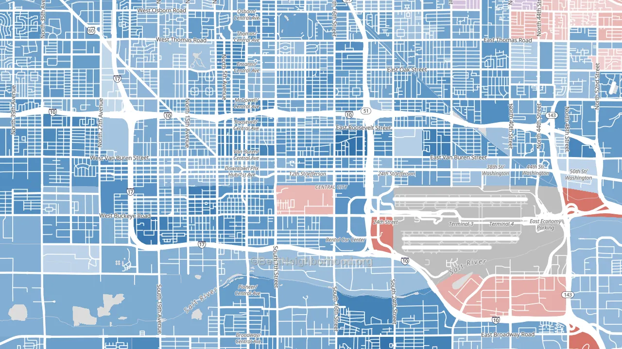
Downtown Phoenix leans heavily Democratic by roughly 46 points: about 73% of voters vote Democratic and 27% Republican.
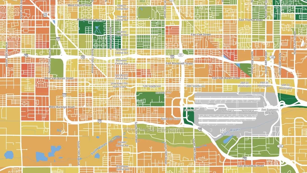
About 35% of adults in Downtown Phoenix typically vote, below the U.S. average of about 62%. Among adults in Downtown Phoenix, ~25% vote Democratic, ~10% Republican, and ~65% don't vote. The map below shows estimated turnout by block group.
How Downtown Phoenix compares
Among neighborhoods within 5 miles, Downtown Phoenix is the most Democratic-leaning.
Downtown Phoenix runs about 51 points more Democratic than Arizona as a whole. Arizona leans Republican overall, while Downtown Phoenix is one of the few Democratic-leaning pockets.
Politics vary noticeably by block within Downtown Phoenix. The northwest side is the most Democratic-leaning (D+59) and the southeast side is the least Democratic-leaning (D+15), a spread of about 44 points.
Why Downtown Phoenix leans the way it does
This analysis examined 14,881 data points per neighborhood to find what predicts political lean and turnout. The items below are a few correlations that stood out for Downtown Phoenix, not a ranked or complete list of what matters most.
Downtown Phoenix votes against the grain of Arizona. Arizona leans Republican overall, while Downtown Phoenix runs about 51 points more Democratic. Density combined with diversity predicts Democratic voting, and non-Hispanic white share in Downtown Phoenix is about 17%, compared to around 33% in nearby neighborhoods. A high never-married share predicts Democratic voting, and about 60% of adults in Downtown Phoenix have never been married, above 93% of neighborhoods.
Cancer-screening access and voter turnout
Places with low colon-cancer-screening access tend to turn out at a lower rate; Downtown Phoenix, Phoenix, AZ sits in the bottom tenth nationally on this measure. Cancer screening does not drive turnout; it reflects income, insurance, and healthcare access.
Why turnout in Downtown Phoenix looks the way it does
Areas with limited routine healthcare access turn out at lower rates. Downtown Phoenix is in the bottom quarter nationally for routine-care measures such as insurance coverage, preventive screenings, and dental visits. The dental-visit rate here is about 35%, about 19 points below the Arizona average of 54%. Renters vote less often than owners, and about 79% of households in Downtown Phoenix rent, compared to around 56% in nearby neighborhoods. High food insecurity lines up with lower turnout, and about 45% of adults in Downtown Phoenix report food insecurity, above 97% of neighborhoods. Learn more about the findings and methodology on the political spectrum map.
Nearby Neighborhoods
- Central Phoenix, Phoenix, AZ D+41
- Encanto, Phoenix, AZ D+38
- Bronze Boot, Phoenix, AZ D+36
- Camelback East, Phoenix, AZ D+24
- South Mountain, Phoenix, AZ D+35
- South Phoenix, Phoenix, AZ D+30
- Sunset, Tempe, AZ D+41
- West Phoenix, Phoenix, AZ D+32
- Riverside, Tempe, AZ D+42
- Alahambra, Phoenix, AZ D+27
Neighborhoods with Similar Populations
- Downtown Village of Holly, Holly, MI R+14
- Bonita Long Canyon, Bonita, CA D+7
- Greenbriar, Glendale, AZ R+4
- East Community Team South, Kansas City, MO D+61
- College Hills, San Angelo, TX R+29
- Lakeview, Buffalo, NY D+51
- University Heights and Rosedale Hills, Indianapolis, IN D+13
- Ypsilanti Historic District, Ypsilanti, MI D+65
- Escalante, Tempe, AZ D+31
- East Carollton, New Orleans, LA D+56
Sources and methodology
Precinct-level voting records used to fit the model come from Arizona Secretary of State, Elections, distributed by the Voting and Election Science Team. Demographic inputs come from the U.S. Census Bureau (ACS 5-year estimates and the 2020 Decennial Census). Health and environmental inputs come from the CDC (PLACES and the Environmental Justice Index). Land cover comes from the USGS and EPA. Election-day and lead-up weather come from PRISM 4km daily grids and the NOAA Global Historical Climatology Network. Mail-voting and election-administration patterns come from the MIT Election Lab's Survey of the Performance of American Elections. Block-group crime detail comes from CrimeGrade. Internet data and modeling support provided by ISPreports.org.
Modeling and analysis by the BestNeighborhood data science team. Full methodology and findings: political spectrum map.
Methodology reviewed by the BestNeighborhood data team. Last updated May 2026.