Crocker leans heavily Democratic by roughly 42 points: about 71% of voters vote Democratic and 29% Republican.
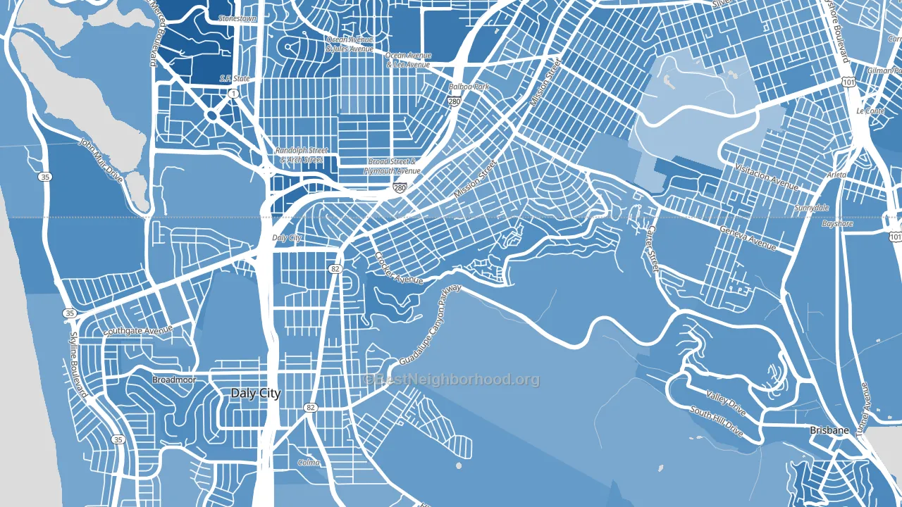
About 54% of adults in Crocker typically vote, below the U.S. average of about 62%. Among adults in Crocker, ~38% vote Democratic, ~16% Republican, and ~46% don't vote. The map below shows estimated turnout by block group.
How Crocker compares
Among neighborhoods within 5 miles, Crocker leans more Democratic than 13 of 42 neighbors.
Crocker runs about 22 points more Democratic than California as a whole.
Why Crocker leans the way it does
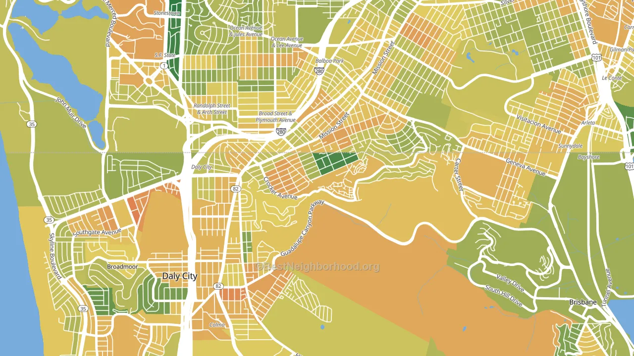
This analysis examined 14,881 data points per neighborhood to find what predicts political lean and turnout. The items below are a few correlations that stood out for Crocker, not a ranked or complete list of what matters most.
Dense areas vote Democratic. More than 99% of residents in Crocker live in densely developed areas, about 64 points above the U.S. average of 36%.
Paved land cover and Democratic lean
Places with extensive paved surfaces tend to lean Democratic; Crocker, Daly City, CA sits in the top quarter nationally on this measure. Paved ground does not change how people vote; it mostly reflects how urban and built-up a place is.
Why turnout in Crocker looks the way it does
Areas with low high-school completion turn out at lower rates. About 84% of adults in Crocker have completed high school, about 5 points below the U.S. average of 90%. Learn more about the findings and methodology on the political spectrum map.
Nearby Neighborhoods
- Crocker Amazon, San Francisco, CA D+34
- Original Daly City, Daly City, CA D+40
- Hillside, Daly City, CA D+39
- Ocean View, San Francisco, CA D+45
- Outer Mission, San Francisco, CA D+48
- Ingleside, San Francisco, CA D+50
- Excelsior, San Francisco, CA D+39
- Broadmoor, Daly City, CA D+36
- Westlake-San Francisco, Daly City, CA D+40
- Lakeshore, San Francisco, CA D+49
Neighborhoods with Similar Populations
- Mosier Valley, Euless, TX D+3
- Comstock, Spokane, WA D+35
- Winton Hills, Cincinnati, OH D+77
- Far North Dallas-Justin, Justin, TX R+23
- Totem Lake, Kirkland, WA D+40
- Finney, Grosse Pointe, MI D+66
- Mapleton-Fall Creek, Indianapolis, IN D+73
- Upper Boggy Creek, Austin, TX D+69
- Houston Suburban Homes, Pasadena, TX R+10
- Lakeland, Baltimore, MD D+56
Sources and methodology
Precinct-level voting records used to fit the model come from California Secretary of State, Elections, distributed by the Voting and Election Science Team. Demographic inputs come from the U.S. Census Bureau (ACS 5-year estimates and the 2020 Decennial Census). Health and environmental inputs come from the CDC (PLACES and the Environmental Justice Index). Land cover comes from the USGS and EPA. Election-day and lead-up weather come from PRISM 4km daily grids and the NOAA Global Historical Climatology Network. Mail-voting and election-administration patterns come from the MIT Election Lab's Survey of the Performance of American Elections. Block-group crime detail comes from CrimeGrade. Internet data and modeling support provided by ISPreports.org.
Modeling and analysis by the BestNeighborhood data science team. Full methodology and findings: political spectrum map.
Methodology reviewed by the BestNeighborhood data team. Last updated May 2026.