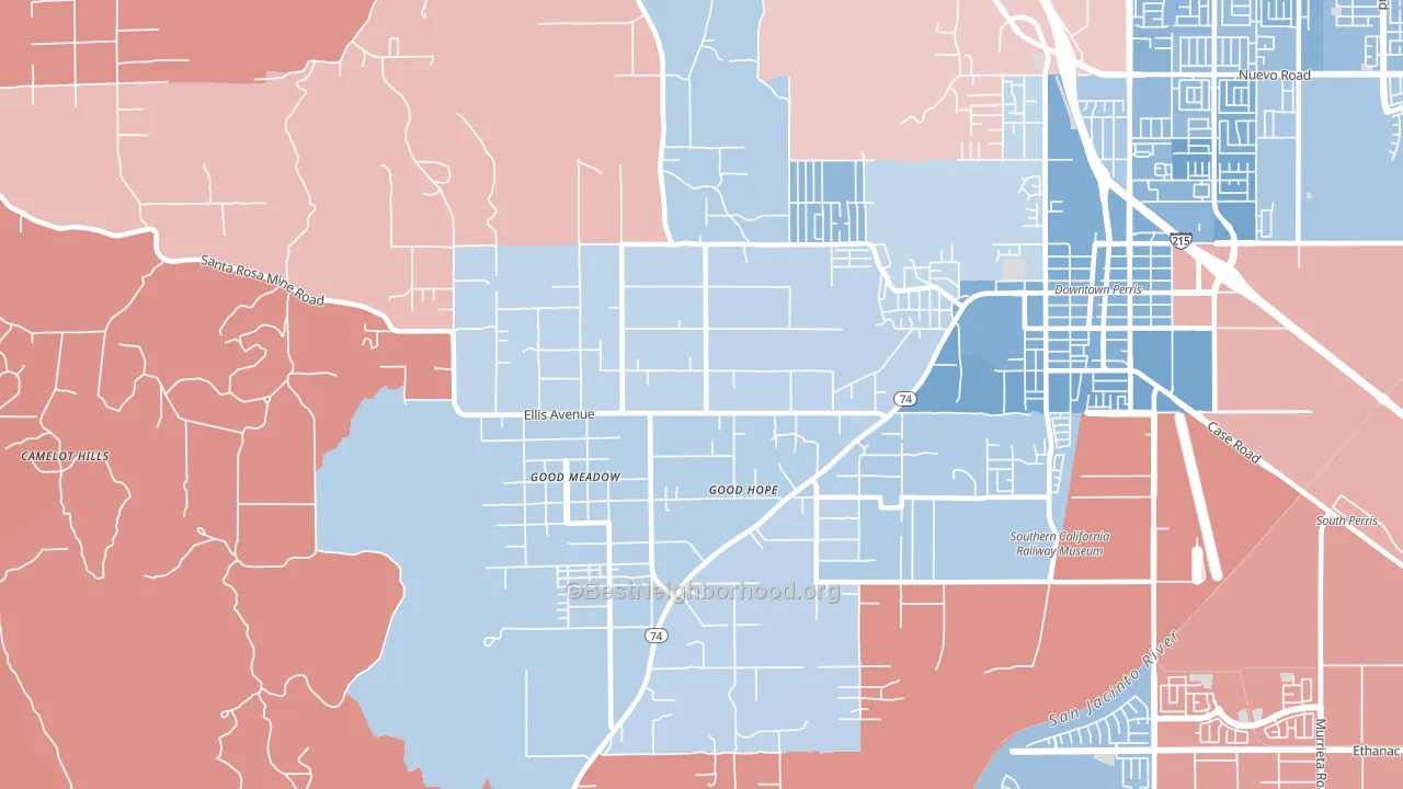
Good Hope is a true toss-up. About 52% of voters here vote Democratic and 48% Republican.
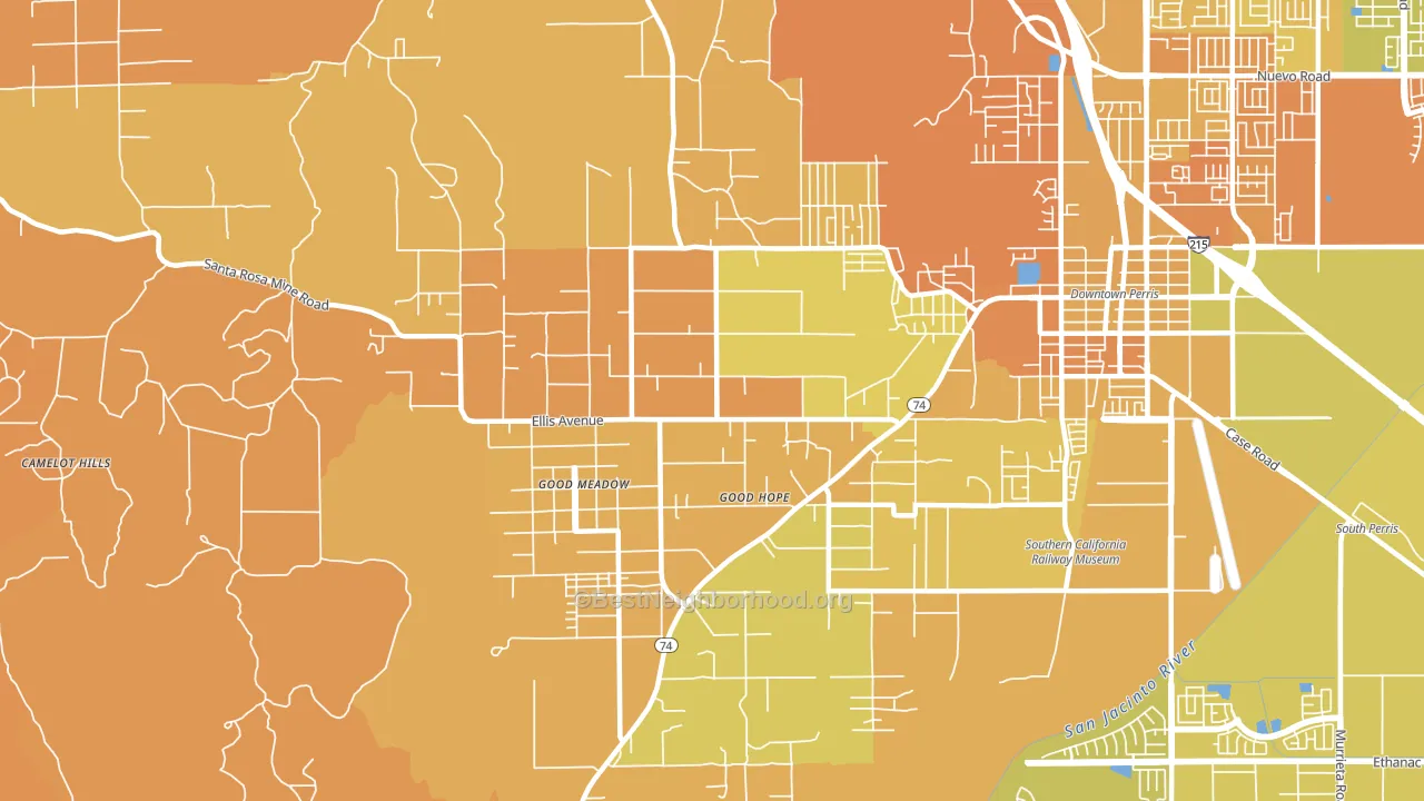
About 40% of adults in Good Hope typically vote, below the U.S. average of about 62%. Among adults in Good Hope, ~21% vote Democratic, ~19% Republican, and ~60% don't vote. The map below shows estimated turnout by block group.
How Good Hope compares
Among cities within 25 miles, Good Hope leans more Democratic than 50 of 60 neighbors.
Good Hope runs about 16 points more Republican than California as a whole.
Politics vary noticeably by neighborhood within Good Hope. The northeast side runs the most Democratic (D+14) and the northwest side runs the most Republican (R+4), a spread of about 18 points.
Why Good Hope leans the way it does
Density, race composition, education, and family structure all sit close to their national averages in Good Hope. The lean here lands roughly where demographic data alone would predict.
Preventive-care access and voter turnout
Places with limited routine preventive-care access tend to turn out at a lower rate; Good Hope, CA sits in the bottom tenth nationally on this measure. Dental visits do not drive turnout; the rate reflects income, insurance, and healthcare access, which line up with who votes.
Why turnout in Good Hope looks the way it does
Areas with limited routine healthcare access turn out at lower rates. Good Hope is in the bottom quarter nationally for routine-care measures such as insurance coverage, preventive screenings, and dental visits. The dental-visit rate here is about 48%, about 14 points below the California average of 62%. Renters vote less often than owners, and about 37% of households in Good Hope rent, above 93% of cities. High food insecurity lines up with lower turnout, and about 36% of adults in Good Hope report food insecurity, above 98% of cities. Learn more about the findings and methodology on the political spectrum map.
Nearby Cities
- Perris, CA D+14
- Meadowbrook, CA R+11
- Mead Valley, CA Even
- Canyon Lake, CA R+24
- Lake Mathews, CA R+30
- Sun City, CA R+15
- Menifee, CA R+14
- Lake Elsinore, CA R+9
- March ARB, CA Even
- Nuevo, CA R+22
Cities with Similar Populations
- Naranja, FL D+12
- Southside, AL R+75
- Adkins, TX R+47
- Montgomery, NY R+19
- Winslow, AZ R+14
- Hernando, FL R+46
- Mentone, CA R+18
- Fort Salonga, NY R+16
- Groton, MA D+23
- Barnhart, MO R+42
Sources and methodology
Precinct-level voting records used to fit the model come from California Secretary of State, Elections, distributed by the Voting and Election Science Team. Demographic inputs come from the U.S. Census Bureau (ACS 5-year estimates and the 2020 Decennial Census). Health and environmental inputs come from the CDC (PLACES and the Environmental Justice Index). Land cover comes from the USGS and EPA. Election-day and lead-up weather come from PRISM 4km daily grids and the NOAA Global Historical Climatology Network. Mail-voting and election-administration patterns come from the MIT Election Lab's Survey of the Performance of American Elections. Block-group crime detail comes from CrimeGrade. Internet data and modeling support provided by ISPreports.org.
Modeling and analysis by the BestNeighborhood data science team. Full methodology and findings: political spectrum map.
Methodology reviewed by the BestNeighborhood data team. Last updated May 2026.