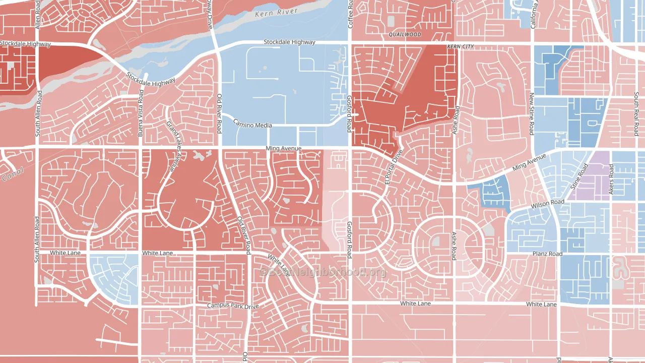
Haggin Oaks leans Republican by roughly 18 points: about 41% of voters vote Democratic and 59% Republican.
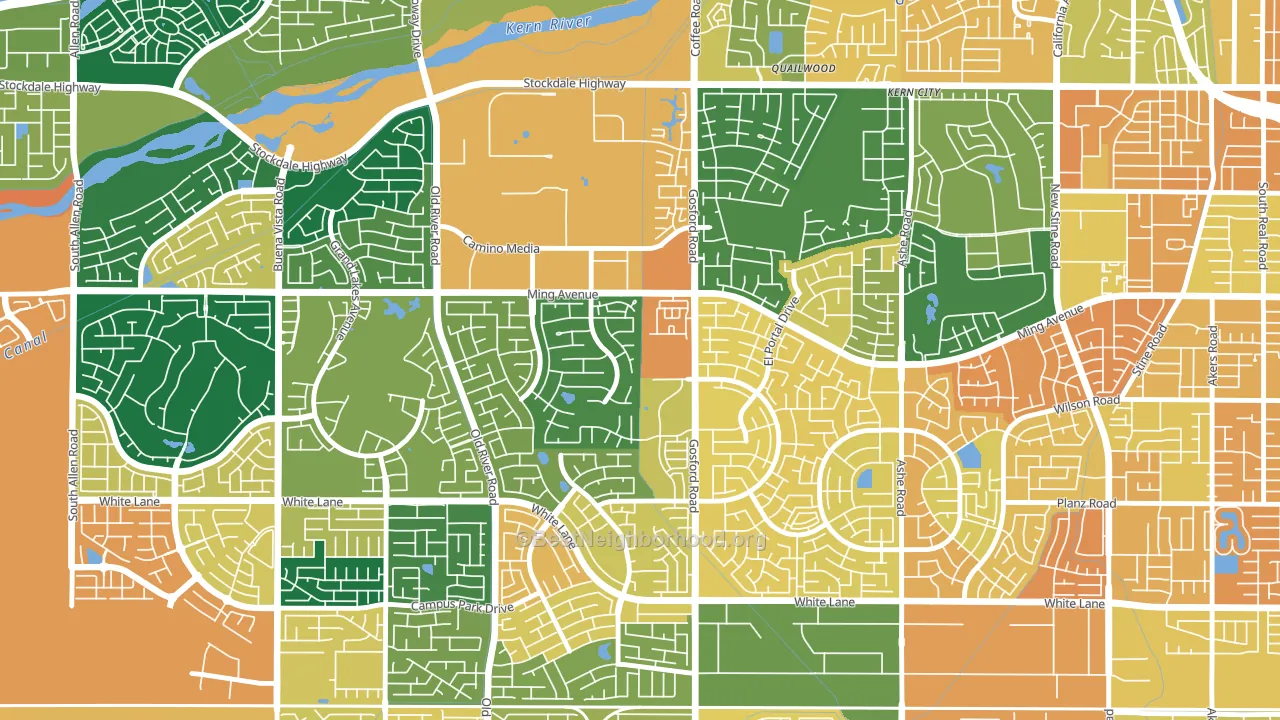
About 56% of adults in Haggin Oaks typically vote, below the U.S. average of about 62%. Among adults in Haggin Oaks, ~23% vote Democratic, ~33% Republican, and ~44% don't vote. The map below shows estimated turnout by block group.
How Haggin Oaks compares
Among neighborhoods within 5 miles, Haggin Oaks leans more Republican than 15 of 20 neighbors.
Haggin Oaks runs about 39 points more Republican than California as a whole. California leans Democratic overall, while Haggin Oaks is one of the few Republican-leaning pockets.
Politics vary noticeably by block within Haggin Oaks. The west side is the most Republican-leaning (R+28) and the southeast side is the least Republican-leaning (R+12), a spread of about 17 points.
Why Haggin Oaks leans the way it does
This analysis examined 14,881 data points per neighborhood to find what predicts political lean and turnout. The items below are a few correlations that stood out for Haggin Oaks, not a ranked or complete list of what matters most.
Car-dependent areas vote Republican. About 85% of residents in Haggin Oaks drive to work alone, about 12 points above the U.S. average of 74%. Haggin Oaks runs against the grain of California, a Republican-leaning pocket in a Democratic-leaning state.
Developed land, local retail density, and voter turnout
Places that combine a heavily developed built environment and sparse local retail within a mile tend to turn out at a lower rate, as Haggin Oaks, Bakersfield, CA does.
Why turnout in Haggin Oaks looks the way it does
Turnout in Haggin Oaks sits close to the national pattern. Routine healthcare access, homeownership, education, and food security all land near their national averages here. Learn more about the findings and methodology on the political spectrum map.
Nearby Neighborhoods
- The Oaks, Bakersfield, CA R+22
- Laurelglen, Bakersfield, CA R+15
- Seven Oaks, Bakersfield, CA R+28
- Tevis Ranch, Bakersfield, CA R+17
- Sagepointe, Bakersfield, CA D+8
- Stockdale Greens, Bakersfield, CA R+15
- Spice Tract, Bakersfield, CA Even
- Seven Oaks at Grand Island, Bakersfield, CA R+22
- Terra Vista, Bakersfield, CA R+7
- Silver Creek, Bakersfield, CA R+5
Neighborhoods with Similar Populations
- Grand Center, St. Louis, MO D+74
- The Hills of Park North, San Antonio, TX D+15
- Town and Country Manor, Milwaukee, WI D+74
- Towson Park, Towson, MD D+61
- Kevanna Park, Vancouver, WA D+13
- Bernon Heights, Woonsocket, RI D+4
- Lance, Kenosha, WI D+7
- Crown Meadows, San Antonio, TX D+22
- Westfield, Baltimore, MD D+66
- Clanton Park-Roseland, Charlotte, NC D+83
Sources and methodology
Precinct-level voting records used to fit the model come from California Secretary of State, Elections, distributed by the Voting and Election Science Team. Demographic inputs come from the U.S. Census Bureau (ACS 5-year estimates and the 2020 Decennial Census). Health and environmental inputs come from the CDC (PLACES and the Environmental Justice Index). Land cover comes from the USGS and EPA. Election-day and lead-up weather come from PRISM 4km daily grids and the NOAA Global Historical Climatology Network. Mail-voting and election-administration patterns come from the MIT Election Lab's Survey of the Performance of American Elections. Block-group crime detail comes from CrimeGrade. Internet data and modeling support provided by ISPreports.org.
Modeling and analysis by the BestNeighborhood data science team. Full methodology and findings: political spectrum map.
Methodology reviewed by the BestNeighborhood data team. Last updated May 2026.