Holy Cross is a Democratic stronghold. About 88% of voters here vote Democratic and 12% Republican.
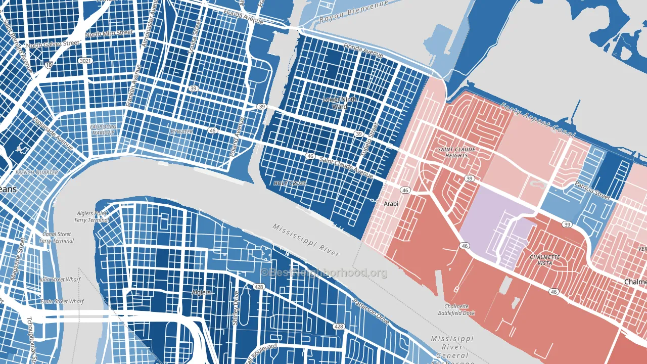
About 68% of adults in Holy Cross typically vote, above the U.S. average of about 62%. Among adults in Holy Cross, ~60% vote Democratic, ~8% Republican, and ~32% don't vote. The map below shows estimated turnout by block group.
How Holy Cross compares
Among neighborhoods within 5 miles, Holy Cross leans more Democratic than 18 of 28 neighbors.
Holy Cross runs about 99 points more Democratic than Louisiana as a whole. Louisiana leans Republican overall, while Holy Cross is one of the few Democratic-leaning pockets.
Politics vary noticeably by block within Holy Cross. The east side is the most Democratic-leaning (D+80) and the southwest side is the least Democratic-leaning (D+67), a spread of about 14 points.
Why Holy Cross leans the way it does
This analysis examined 14,881 data points per neighborhood to find what predicts political lean and turnout. The items below are a few correlations that stood out for Holy Cross, not a ranked or complete list of what matters most.
Holy Cross votes against the grain of Louisiana. Louisiana leans Republican overall, while Holy Cross runs about 99 points more Democratic.
Walkability and Democratic lean
Places with a highly walkable street grid tend to lean Democratic; Holy Cross, New Orleans, LA sits above the national average on this measure. A walkable street grid does not change how people vote; it mostly reflects how urban a place is.
Why turnout in Holy Cross looks the way it does
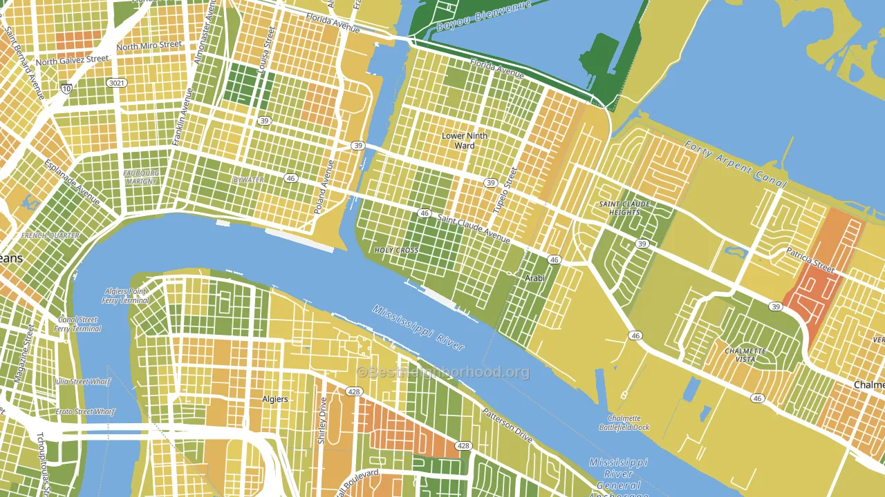
Areas with strong routine healthcare access turn out at higher rates. Holy Cross is in the top quarter nationally for routine-care measures such as insurance coverage, preventive screenings, and dental visits. The dental-visit rate here is about 55%, about 5 points below the U.S. average of 60%. Learn more about the findings and methodology on the political spectrum map.
Nearby Neighborhoods
- Lower 9th Ward, New Orleans, LA D+80
- Bywater, New Orleans, LA D+63
- Saint Claude, New Orleans, LA D+71
- Behrman, New Orleans, LA D+79
- Old Aurora, New Orleans, LA D+56
- Saint Roch, New Orleans, LA D+79
- French Quarter, New Orleans, LA D+46
- Seventh Ward, New Orleans, LA D+78
- Tall Timbers, New Orleans, LA D+65
- Central Business District, New Orleans, LA D+50
Neighborhoods with Similar Populations
- Meyer Park, Tempe, AZ D+29
- Cortez, Bradenton, FL R+23
- Beechwood, Parkersburg, WV R+25
- Carver-Richmond, Richmond, VA D+70
- Newmarket South, Newport News, VA D+59
- Corn Hill, Rochester, NY D+62
- Riverwalk, Porter, TX R+16
- Belaire, San Angelo, TX R+42
- Mercy Drive, Orlando, FL D+72
- Central Hammond, Hammond, IN D+43
Sources and methodology
Precinct-level voting records used to fit the model come from Louisiana Secretary of State, Elections, distributed by the Voting and Election Science Team. Demographic inputs come from the U.S. Census Bureau (ACS 5-year estimates and the 2020 Decennial Census). Health and environmental inputs come from the CDC (PLACES and the Environmental Justice Index). Land cover comes from the USGS and EPA. Election-day and lead-up weather come from PRISM 4km daily grids and the NOAA Global Historical Climatology Network. Mail-voting and election-administration patterns come from the MIT Election Lab's Survey of the Performance of American Elections. Block-group crime detail comes from CrimeGrade. Internet data and modeling support provided by ISPreports.org.
Modeling and analysis by the BestNeighborhood data science team. Full methodology and findings: political spectrum map.
Methodology reviewed by the BestNeighborhood data team. Last updated May 2026.