Lakeshore leans heavily Democratic by roughly 48 points: about 74% of voters vote Democratic and 26% Republican.
[sc name="abovemapcta"]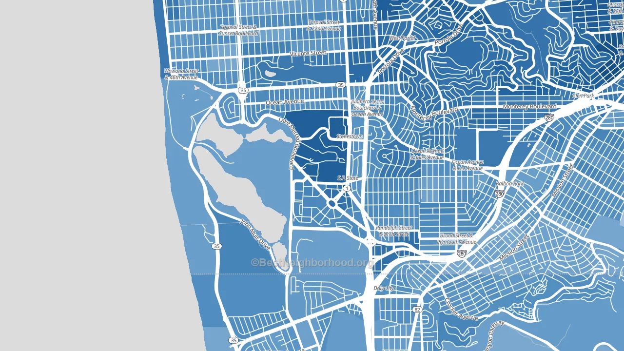 [bestneighborhood_map_controls]
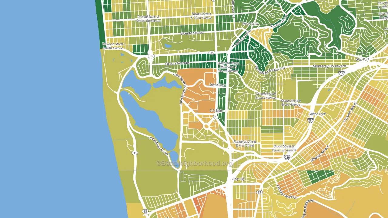
About 61% of adults in Lakeshore typically vote, near the U.S. average of about 62%. Among adults in Lakeshore, ~45% vote Democratic, ~16% Republican, and ~39% don't vote. The map below shows estimated turnout by block group.
 [bestneighborhood_map_controls]
How Lakeshore compares
Among neighborhoods within 5 miles, Lakeshore leans more Democratic than 17 of 40 neighbors.
Lakeshore runs about 28 points more Democratic than California as a whole.
Politics vary noticeably by block within Lakeshore. The northeast side is the most Democratic-leaning (D+59) and the west side is the least Democratic-leaning (D+40), a spread of about 19 points.
Why Lakeshore leans the way it does
This analysis examined 14,881 data points per neighborhood to find what predicts political lean and turnout. The items below are a few correlations that stood out for Lakeshore, not a ranked or complete list of what matters most.
Areas with high college attainment vote Democratic. About 60% of adults in Lakeshore hold a bachelor's degree, about 31 points above the U.S. average of 28%.
Park access and Democratic lean
Places with heavy park coverage tend to lean Democratic; Lakeshore, San Francisco, CA sits in the top quarter nationally on this measure. Park access does not change how people vote; it tends to track denser, higher-income areas.
Why turnout in Lakeshore looks the way it does
Renters vote less often than owners. About 62% of households in Lakeshore rent, about 37 points above the U.S. average of 25%. Learn more about the findings and methodology on the political spectrum map.
[one_half]Nearby Neighborhoods
- Saint Francis Wood, San Francisco, CA D+55
- Ocean View, San Francisco, CA D+45
- Parkside, San Francisco, CA D+48
- Ingleside, San Francisco, CA D+50
- West of Twin Peaks, San Francisco, CA D+62
- Original Daly City, Daly City, CA D+40
- Broadmoor, Daly City, CA D+36
- Outer Mission, San Francisco, CA D+48
- Westlake-San Francisco, Daly City, CA D+40
- Crocker, Daly City, CA D+42
Neighborhoods with Similar Populations
- Orangecrest, Riverside, CA R+8
- Tioga-Nicetown, Philadelphia, PA D+87
- Melrose, Oakland, CA D+59
- Goodyear Heights, Akron, OH D+22
- Wallingford, Seattle, WA D+83
- Lakeview, Stockton, CA D+20
- Far Southwest, Portland, OR D+61
- Woodrow, Staten Island, NY R+58
- Rice, Houston, TX D+39
- Gibson Springs, Henderson, NV D+8
Sources and methodology
Precinct-level voting records used to fit the model come from California Secretary of State, Elections, distributed by the Voting and Election Science Team. Demographic inputs come from the U.S. Census Bureau (ACS 5-year estimates and the 2020 Decennial Census). Health and environmental inputs come from the CDC (PLACES and the Environmental Justice Index). Land cover comes from the USGS and EPA. Election-day and lead-up weather come from PRISM 4km daily grids and the NOAA Global Historical Climatology Network. Mail-voting and election-administration patterns come from the MIT Election Lab's Survey of the Performance of American Elections. Block-group crime detail comes from CrimeGrade. Internet data and modeling support provided by ISPreports.org.
Modeling and analysis by the BestNeighborhood data science team. Full methodology and findings: political spectrum map.
Methodology reviewed by the BestNeighborhood data team. Last updated May 2026.