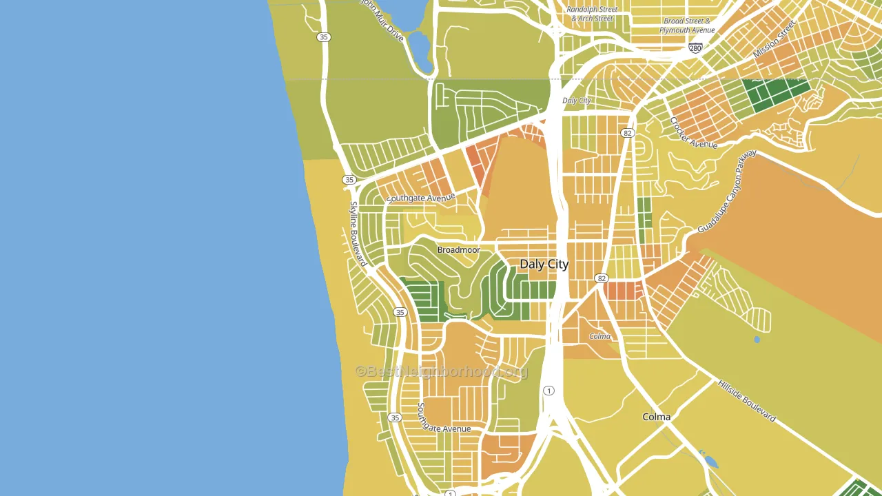
Westlake-San Francisco leans heavily Democratic by roughly 40 points: about 70% of voters vote Democratic and 30% Republican.
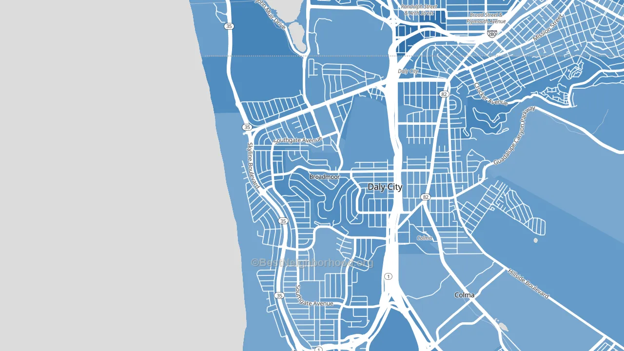
About 47% of adults in Westlake-San Francisco typically vote, below the U.S. average of about 62%. Among adults in Westlake-San Francisco, ~33% vote Democratic, ~14% Republican, and ~53% don't vote. The map below shows estimated turnout by block group.
How Westlake-San Francisco compares
Among neighborhoods within 5 miles, Westlake-San Francisco leans more Democratic than 9 of 33 neighbors.
Westlake-San Francisco runs about 20 points more Democratic than California as a whole.
Why Westlake-San Francisco leans the way it does
Density, race composition, education, and family structure all sit close to their national averages in Westlake-San Francisco. The lean here lands roughly where demographic data alone would predict.
Paved land cover and Democratic lean
Places with extensive paved surfaces tend to lean Democratic; Westlake-San Francisco, Daly City, CA sits in the top quarter nationally on this measure. Paved ground does not change how people vote; it mostly reflects how urban and built-up a place is.
Why turnout in Westlake-San Francisco looks the way it does
Crowded housing lines up with lower turnout. About 17% of homes in Westlake-San Francisco have more than one occupant per room, above 97% of neighborhoods. Learn more about the findings and methodology on the political spectrum map.
Nearby Neighborhoods
- Broadmoor, Daly City, CA D+36
- St. Francis, Daly City, CA D+35
- Original Daly City, Daly City, CA D+40
- Hillside, Daly City, CA D+39
- Lakeshore, San Francisco, CA D+49
- Ocean View, San Francisco, CA D+45
- Crocker, Daly City, CA D+42
- Fairmont, Pacifica, CA D+38
- Serramonte, Daly City, CA D+36
- Ingleside, San Francisco, CA D+50
Neighborhoods with Similar Populations
- Sandy Beach, Fall River, MA Even
- Schuylkill Southwest, Philadelphia, PA D+79
- Sandalwood, Jacksonville, FL R+6
- Franklin Park, Toledo, OH D+2
- Del Rio, Jacksonville, FL R+20
- Bernal Heights, San Francisco, CA D+78
- Sterling Ridge, The Woodlands, TX R+29
- Flat Rock Area, Flat Rock, MI R+11
- Kenwood, Chicago, IL D+84
- Upper State, Santa Barbara, CA D+51
Sources and methodology
Precinct-level voting records used to fit the model come from California Secretary of State, Elections, distributed by the Voting and Election Science Team. Demographic inputs come from the U.S. Census Bureau (ACS 5-year estimates and the 2020 Decennial Census). Health and environmental inputs come from the CDC (PLACES and the Environmental Justice Index). Land cover comes from the USGS and EPA. Election-day and lead-up weather come from PRISM 4km daily grids and the NOAA Global Historical Climatology Network. Mail-voting and election-administration patterns come from the MIT Election Lab's Survey of the Performance of American Elections. Block-group crime detail comes from CrimeGrade. Internet data and modeling support provided by ISPreports.org.
Modeling and analysis by the BestNeighborhood data science team. Full methodology and findings: political spectrum map.
Methodology reviewed by the BestNeighborhood data team. Last updated May 2026.