Parkside leans heavily Democratic by roughly 48 points: about 74% of voters vote Democratic and 26% Republican.
[sc name="abovemapcta"]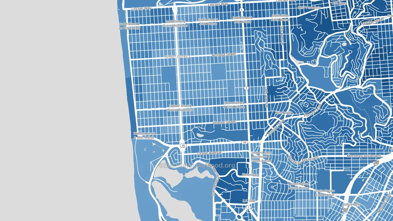 [bestneighborhood_map_controls]
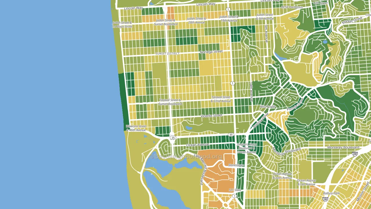
About 67% of adults in Parkside typically vote, near the U.S. average of about 62%. Among adults in Parkside, ~50% vote Democratic, ~17% Republican, and ~33% don't vote. The map below shows estimated turnout by block group.
 [bestneighborhood_map_controls]
How Parkside compares
Among neighborhoods within 5 miles, Parkside leans more Democratic than 11 of 38 neighbors.
Parkside runs about 28 points more Democratic than California as a whole.
Politics vary noticeably by block within Parkside. The northeast side is the most Democratic-leaning (D+52) and the north side is the least Democratic-leaning (D+41), a spread of about 12 points.
Why Parkside leans the way it does
This analysis examined 14,881 data points per neighborhood to find what predicts political lean and turnout. The items below are a few correlations that stood out for Parkside, not a ranked or complete list of what matters most.
Areas with high college attainment vote Democratic. About 55% of adults in Parkside hold a bachelor's degree, about 27 points above the U.S. average of 28%.
Paved land cover and Democratic lean
Places with extensive paved surfaces tend to lean Democratic; Parkside, San Francisco, CA sits in the top tenth nationally on this measure. Paved ground does not change how people vote; it mostly reflects how urban and built-up a place is.
Why turnout in Parkside looks the way it does
Turnout in Parkside sits close to the national pattern. Routine healthcare access, homeownership, education, and food security all land near their national averages here. Learn more about the findings and methodology on the political spectrum map.
[one_half]Nearby Neighborhoods
- Outer Sunset, San Francisco, CA D+49
- Saint Francis Wood, San Francisco, CA D+55
- Lakeshore, San Francisco, CA D+49
- Inner Sunset, San Francisco, CA D+72
- West of Twin Peaks, San Francisco, CA D+62
- Twin Peaks, San Francisco, CA D+67
- Ocean View, San Francisco, CA D+45
- Outer Richmond, San Francisco, CA D+57
- Ingleside, San Francisco, CA D+50
- Cole Valley, San Francisco, CA D+82
Neighborhoods with Similar Populations
- Cal Young, Eugene, OR D+41
- Paradise Hills, San Diego, CA D+21
- Highland Hills, San Antonio, TX D+25
- Indian River, Chesapeake, VA D+34
- Powellhurst-Gilbert, Portland, OR D+27
- City Center East, Philadelphia, PA D+71
- Sommerset West-Elmonica North, Bethany, OR D+39
- North End, Tacoma, WA D+58
- Bridgeport, Chicago, IL D+27
- South Philadelphia, Philadelphia, PA D+22
Sources and methodology
Precinct-level voting records used to fit the model come from California Secretary of State, Elections, distributed by the Voting and Election Science Team. Demographic inputs come from the U.S. Census Bureau (ACS 5-year estimates and the 2020 Decennial Census). Health and environmental inputs come from the CDC (PLACES and the Environmental Justice Index). Land cover comes from the USGS and EPA. Election-day and lead-up weather come from PRISM 4km daily grids and the NOAA Global Historical Climatology Network. Mail-voting and election-administration patterns come from the MIT Election Lab's Survey of the Performance of American Elections. Block-group crime detail comes from CrimeGrade. Internet data and modeling support provided by ISPreports.org.
Modeling and analysis by the BestNeighborhood data science team. Full methodology and findings: political spectrum map.
Methodology reviewed by the BestNeighborhood data team. Last updated May 2026.